Tips for Better Custom Design Woven Labels
A custom woven label may be small, but it carries a large share of your brand identity. It is often the final detail a customer sees when they try on a garment, open a package, or handle a handmade product. Done well, it makes the item feel finished, intentional, and worth remembering.
Better custom design woven labels are not just about choosing a nice logo and sending it to production. They require thinking about scale, thread, texture, fold, placement, comfort, and how the label will look after repeated use. Because woven labels are made with threads rather than ink, the best designs are created with the weaving process in mind from the start.
The following tips will help you design woven labels that look sharper, read more clearly, and support your brand for the long term.
Start with the purpose of the label
Before choosing colors or label dimensions, decide what job the label needs to do. A woven label can act as a main brand label, a size marker, a side seam detail, a hem accent, or a premium finishing touch on packaging and soft goods. Each purpose requires a slightly different design approach.
A main neck label needs to be readable, comfortable, and aligned with the garment's perceived value. A hem label can be more minimal and logo-driven because it works like a subtle badge. A side seam loop label may need to communicate quickly from a distance, so a short brand name or icon usually works better than a detailed design.
Ask yourself these questions before you design:
- Where will the label be placed?
- Will the customer see it before, during, or after purchase?
- Does it need to show a full logo, a symbol, a size, or a short message?
- Will it touch the skin?
- Should it feel bold, refined, playful, technical, or handmade?
A clear purpose prevents overcrowding and helps you choose the right size, fold, and artwork style.
Design for weaving, not for a digital screen
A logo that looks perfect on a website or packaging mockup may not translate perfectly into thread. Woven labels are built from yarns crossing each other, so extremely fine lines, tiny lettering, complex gradients, and photographic details can lose clarity.
This does not mean your label has to be plain. It means the artwork should be adapted for the medium. The strongest custom design woven labels usually use simplified shapes, clean typography, and strong contrast.
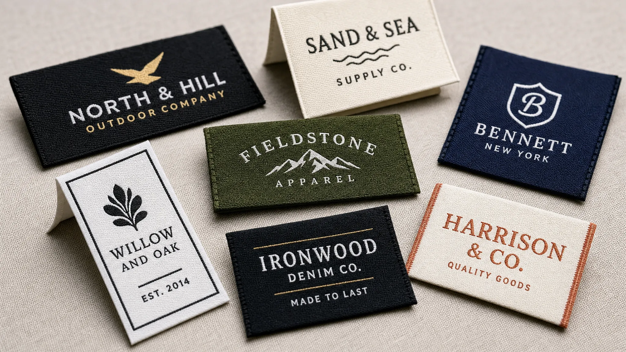
If your logo has several versions, use the one with the clearest silhouette. If your brand mark includes very fine decorative elements, consider creating a simplified label version specifically for woven production.
| Digital design feature | Better woven label approach |
|---|---|
| Thin script lettering | Use a slightly bolder font or simplified script |
| Gradients or shadows | Convert to solid thread colors |
| Detailed illustration | Use a simplified icon or cropped mark |
| Long tagline | Move it to packaging, a hangtag, or a care label |
| Low-contrast colors | Choose thread colors with clearer separation |
This translation step is one of the most important differences between an average label and a professional one.
Keep the logo simple and recognizable
Woven labels work best when the customer can recognize the brand quickly. If the viewer has to squint, rotate the garment, or guess what the letters say, the label is doing too much.
For small labels, use your primary logo, a monogram, or a distinct brand symbol. If you want to include a slogan, website, country of origin, or product line name, make sure each element has enough breathing room. When space is limited, it is usually better to create a system of labels rather than force everything onto one piece.
A practical approach is to build a hierarchy. Your brand name or mark should be the first thing people notice. Secondary information should be smaller, simpler, or moved to another label type. HiLabels also offers care labels, patches, ribbons, and zipper pulls, which makes it easier to spread brand information across different touchpoints instead of overloading one woven label.
Choose the right label size and fold
The size and fold of your label affect both appearance and usability. A beautiful design can look awkward if the label is too large for a delicate garment or too small for the amount of text you want to include.
Think about the garment first. A luxury coat can support a larger woven label than a lightweight baby bodysuit. A beanie or T-shirt hem may only need a compact logo tab. Bags, blankets, and home textiles often allow for larger branding elements.
| Label style | Common use | Design tip |
|---|---|---|
| Straight cut | Main labels, accessories, packaging | Keep enough margin around all sides for sewing |
| Center fold | Neck labels, waistbands, side seams | Place important artwork away from the fold line |
| End fold | Hem labels, exterior branding, flat applications | Keep the logo centered between folded edges |
| Loop fold | Side seam labels, scarves, towels, soft goods | Use simple artwork that reads from both visible sides |
| Miter fold | Hems, sleeves, premium exterior details | Best for compact logos and clean brand marks |
Always account for seam allowance. The visible label area is not always the same as the total label size. If the design sits too close to the edge, stitching may cover part of the logo or make the layout feel cramped.
Prioritize readability at actual size
One of the easiest ways to improve a woven label is to test the design at the exact finished size before ordering. Looking at a label design on a large screen can create a false sense of clarity. What looks readable at six inches wide may become muddy at one inch wide.
Print the design at actual size, place it on a garment, and view it from a realistic distance. If the logo feels too tight on paper, it will likely feel even tighter in thread. This simple test helps you spot issues with font weight, letter spacing, margins, and overall balance.
Pay close attention to:
- Letter spacing that becomes crowded at small sizes
- Thin strokes that may disappear in weaving
- Small symbols inside logos
- Words placed too close to fold or stitch areas
- Decorative elements that compete with the brand name
If you are unsure whether a detail will weave cleanly, simplify it or ask for guidance during the proofing process.
Use color with intention
Color has a major impact on the look of a woven label. It can make the label feel luxury, sporty, playful, organic, minimalist, or bold. But because woven labels use thread, color should be selected with realism in mind.
Thread colors do not always match digital colors exactly. A bright RGB color on screen may appear slightly different once translated into yarn. For that reason, focus on strong overall harmony rather than expecting a screen-perfect match.
High contrast usually improves readability. Black on white, white on navy, cream on black, and charcoal on ivory are classic choices because they make the logo easy to see. Tonal labels, such as black on black or cream on beige, can look refined, but they are better suited for simple logos and brands that want a subtle impression.
Good customization is about making every detail fit the final product. The same principle appears in other design industries, such as customizable designer lighting, where choosing the right length, finish, and color helps a piece feel made for the space rather than generic. Your woven label should feel just as intentional within the garment.
Match the label to the fabric and product category
A label should feel like it belongs on the product. A heavy, bold woven label may work well on denim, outerwear, or workwear, while a softer and smaller label may be more appropriate for lingerie, babywear, lightweight knits, or premium basics.
For garments worn close to the skin, comfort matters as much as appearance. Consider fold style, edge finish, placement, and label size. A label that looks beautiful but irritates the wearer can create a negative brand experience.
For exterior labels, durability and placement become more important. Hem labels, sleeve labels, and side seam tabs may experience friction from washing, sitting, carrying bags, or repeated handling. A clean woven design with strong construction helps the branding stay attractive over time.
Create a consistent brand system
The best apparel brands do not treat labels as isolated pieces. They build a consistent visual system across woven labels, care labels, patches, ribbons, packaging, and other branded details.
Your woven label should coordinate with your broader identity. That does not mean everything has to match perfectly, but the fonts, colors, tone, and level of detail should feel connected. A minimalist fashion label, for example, might use a clean woven neck label, a subtle hem tab, and a simple care label. A bold streetwear brand might use a larger woven label, exterior patch, and branded ribbon packaging.
Consistency builds recognition. When customers encounter the same brand cues across the garment and packaging, the product feels more professional and memorable.
Prepare clean, production-ready artwork
Good production starts with good artwork. The cleaner your file, the easier it is to translate your design into a woven label that matches your expectations.
When preparing artwork for custom design woven labels, provide the clearest version of your logo available. Vector artwork is ideal when possible because it preserves sharp edges and scalable proportions. If you upload a raster image, use a high-resolution file and avoid blurry screenshots or compressed images.
Include the key specifications your label maker needs:
- Finished label size
- Fold style
- Desired thread colors
- Placement on the garment
- Logo file or artwork file
- Any text that must appear on the label
- Notes about softness, subtlety, or visibility
HiLabels makes this process easier with an online label creation tool and an upload artwork feature, so you can create custom woven labels with your own branding while still receiving support when details need refinement.
Review your proof carefully
A proof is not just a formality. It is your opportunity to confirm that the label will look right before production begins. Take time to review the layout, spacing, color, fold, and overall scale.
Look at the proof the way a customer would see the finished garment. Is the logo centered? Is the text readable? Is the fold line in the right place? Are the margins wide enough for stitching? Does the design feel balanced for the label size?
If something feels slightly off in the proof, do not ignore it. Small issues can become more noticeable once the label is woven and sewn into a product. A careful proofing stage protects your budget and helps ensure the finished label supports your brand image.
Avoid common woven label design mistakes
Most woven label problems come from trying to fit too much into too little space. The goal is not to show everything about your brand at once. The goal is to communicate the right thing clearly.
| Common mistake | Why it hurts the label | Better choice |
|---|---|---|
| Using very tiny text | It may not weave or read clearly | Use fewer words and larger type |
| Keeping complex logo details | Fine lines can blur in thread | Simplify the logo for woven use |
| Choosing low contrast | The design may disappear | Use clearer light and dark separation |
| Ignoring seam allowance | Stitching can cover artwork | Add safe margins around the design |
| Selecting size before placement | The label may feel too big or too small | Match size to garment and location |
| Skipping proof review | Errors can reach production | Check scale, fold, color, and spacing |
A restrained design often looks more premium than a crowded one. If your label feels too full, remove one element before making the label larger.
Know when woven labels are the right choice
Woven labels are ideal when you want a durable, premium, fabric-based branding element. They are especially strong for brand names, logos, monograms, garment labels, hem labels, and soft goods. Because the design is woven into the label rather than printed on the surface, it can maintain a high-quality appearance through regular use.
Printed labels can still be useful for dense information, such as detailed care instructions, fiber content, compliance details, or variable data. Many brands use both: a woven label for the main brand impression and a care label for practical garment information.
This combination gives customers the best experience. The woven label communicates brand value, while the care label provides the information needed to maintain the product properly.
Think beyond the first order
If you are creating labels for a growing brand, design with future products in mind. A label that works only for one garment may become limiting as your collection expands. A flexible label system can adapt to T-shirts, hoodies, outerwear, hats, bags, and packaging.
Consider whether your label design can scale across different sizes and formats. A strong brand mark can appear on woven labels, patches, ribbons, and zipper pulls without losing recognition. This makes future product launches easier and keeps your brand presentation consistent.
It is also worth saving your final specifications after production. Keep a record of label dimensions, fold style, thread colors, artwork version, and placement notes. This makes reorders smoother and helps maintain consistency across batches.
Frequently Asked Questions
What makes custom design woven labels look professional? A professional woven label has clear artwork, readable text, balanced spacing, suitable color contrast, the right fold style, and a size that matches the garment or product.
How many colors should I use in a woven label? Many strong woven labels use one to three colors. More colors can work, but a simpler palette often improves readability and gives the label a cleaner, more premium appearance.
Can woven labels include small text? Yes, but small text has limits because it must be created with thread. If the text is very fine, long, or decorative, it may be better to enlarge it, simplify it, or place it on a separate care label.
What is the best size for a custom woven label? The best size depends on placement, garment type, fold style, and how much information the label contains. A main neck label can be larger than a hem tab or side seam label, but all labels need enough margin for stitching.
Are woven labels only for clothing? No. Woven labels can be used on accessories, bags, blankets, handmade goods, packaging, ribbons, and many other soft products where a durable fabric brand detail adds value.
Create better custom design woven labels with HiLabels
A better woven label starts with thoughtful design and ends with skilled production. When you simplify the artwork, choose the right size and fold, consider placement, and review the proof carefully, your label becomes more than a tag. It becomes a lasting part of the customer experience.
HiLabels helps brands create high-quality custom woven labels, care labels, patches, ribbons, and zipper pulls with a fast, user-friendly ordering process. With over 31 years of experience, superior European loom quality, bespoke product options, and personalized customer service, HiLabels can help turn your label idea into a polished branding detail.
Ready to bring your label design to life? Start creating your custom woven labels with HiLabels and give your products the professional finish they deserve.


