Design Tips for Durable Custom Military Patches
Military-inspired patches carry more than decoration. They can represent a unit, a veteran organization, a tactical apparel brand, a security team, a commemorative event, or a tight-knit crew with its own identity. Because they are often worn on jackets, uniforms, bags, hats, and field gear, they need to do more than look good on a screen. They need to stay readable, resist fraying, hold their shape, and feel intentional after repeated handling and wear.
That durability starts at the design stage. The strongest custom military patches are not necessarily the most complicated ones. They are the patches planned with the right artwork, size, edge, backing, thread detail, and use case in mind.
Below are practical design tips to help you create patches that look sharp, communicate clearly, and stand up to real use.
Start With the Patch’s Mission
Before choosing colors or shapes, define what the patch needs to do. A shoulder patch for a uniform has different demands than a morale patch for a gear bag, and a commemorative patch for a reunion has different priorities than a brand patch for tactical apparel.
Ask three questions at the beginning of the project:
- Where will the patch be worn or attached?
- Will it be washed, exposed to weather, or removed often?
- Does it need to follow any official unit, agency, or organizational guidelines?
If the patch represents an active military unit, government agency, school program, or formal organization, check approval requirements before production. Official insignia, ranks, seals, and heraldic elements may be restricted or require permission. For veteran groups, reenactment organizations, and private brands, it is still smart to avoid designs that could be confused with official insignia unless you have the right authorization.
A clear mission also helps prevent overdesign. A field-ready patch should be readable at a glance. A collector patch can carry more detail. A commemorative event patch can include dates, locations, and special wording, but it still needs enough contrast and spacing to remain legible.
Choose the Right Patch Style for Detail and Durability
The construction style affects how much detail your patch can show and how it will feel on the garment or gear. For military-style designs, the most common considerations are texture, clarity, thickness, and long-term wear.
| Patch style | Best for | Design considerations |
|---|---|---|
| Woven patches | Fine lettering, detailed emblems, clean lines, small symbols | Best when the design needs precision and a smooth surface |
| Embroidered patches | Bold icons, traditional military texture, raised dimension | Works best with simpler artwork and larger shapes |
| Printed patches | Gradients, photo-like artwork, many colors | Durability depends heavily on material, print method, and use case |
| Leather or faux leather patches | Heritage, outdoor, lifestyle, or rugged branding | Better for branding than detailed military insignia |
For custom military patches with small text, coordinates, flags, badges, or detailed linework, woven construction is often a strong choice because it can hold crisp shapes without the bulk of heavy embroidery. Embroidery has a classic raised look, but very small lettering can become crowded if the stitch density is too high.
If you are deciding between embroidered and woven construction, compare the level of detail in your artwork with the physical size of the patch. HiLabels also has a helpful internal guide on custom embroidered patches vs woven patches that explains how the two options differ in texture, detail, and use cases.
Keep the Artwork Bold, Not Busy
Military patches often include shields, animals, stars, stripes, weapons, wings, maps, mottos, dates, unit numbers, and symbolic icons. Those elements can be powerful, but too many of them can weaken the final patch.
Durability is not only about thread and backing. It is also about visual durability. A patch that becomes unreadable from a few feet away has failed one of its most important jobs.
Strong patch artwork usually has:
- One dominant symbol or central shape
- A short motto or name, not a full paragraph
- Thick lines that can be stitched or woven cleanly
- High contrast between background and foreground
- Open space around letters and key icons
If your design includes a motto, keep it short. If it includes a location or year, make those supporting details smaller than the main identifier. If the patch includes a mascot, crest, or unit-style emblem, simplify it so it still reads at reduced size.
A good test is to shrink the artwork on your screen to the size it will be produced. If you cannot read the text or identify the symbol, the patch needs simplification.
Design for the Actual Patch Size
Patch size controls almost every production decision. A design that looks excellent at 5 inches wide may be too cramped at 2 inches wide. Small patches need thicker lines, fewer colors, and shorter text. Larger patches can handle more detail, but they still need balance.
Common military-style patch placements include sleeves, chest areas, hats, plate carriers, backpacks, duffel bags, and jacket backs. Each placement has its own practical size range. A sleeve patch should not restrict movement or feel heavy. A cap patch must fit within the front panel. A gear patch attached with hook-and-loop needs to match the available loop field.
Think of size as a hierarchy tool. The larger the patch, the more storytelling it can carry. The smaller the patch, the more direct the message should be.
| Patch placement | Design priority | Durability note |
|---|---|---|
| Sleeve or shoulder | Instant identification | Keep the edge smooth and the size comfortable |
| Hat or cap | Simple icon or short text | Avoid tiny letters and overly tall shapes |
| Tactical bag or pack | Visibility and attachment strength | Consider removable backing if patches will be swapped |
| Jacket or outerwear | Branding or commemorative value | Choose colors that stand out against the fabric |
| Event merchandise | Symbolic storytelling | Include dates only if they remain readable |
Use Color With Purpose
Color can make a patch memorable, but it can also create problems if the palette is too crowded. For durable custom military patches, a tighter palette often looks stronger and ages better.
Many military-inspired designs use subdued colors such as olive, black, tan, gray, navy, coyote brown, or ranger green. These tones work well on tactical apparel and outdoor gear, but they require careful contrast. Dark green text on black may look sleek in a digital mockup, yet become hard to read on fabric. Tan thread on coyote brown may disappear at a distance.
If the patch is for ceremonial use, full-color designs can be appropriate. For field-inspired apparel or gear, subdued palettes usually feel more authentic. Either way, contrast matters more than the number of colors.
A practical approach is to choose one background color, one main symbol color, and one accent color. This keeps the patch clean, helps production consistency, and makes the design easier to recognize.
Make Lettering Large Enough to Survive Production
Text is one of the most common weak points in patch design. Small letters, thin fonts, tight spacing, and long mottos can all create readability issues.
For military-style patches, avoid overly decorative fonts unless the patch is large enough to support them. Block lettering, condensed sans serif fonts, and clean stencil-inspired typefaces usually translate better than thin scripts or distressed fonts. If you want a rugged look, use the overall composition, colors, and border to create that feeling rather than relying on worn-out letter textures.
Pay attention to spacing between letters. Thread and woven details need physical room. When letters are too close together, they may visually merge. This is especially important for abbreviations, callsigns, unit numbers, and names.
If the patch includes a curved top or bottom line of text, review it at actual size. Curved lettering can look professional, but only when the letters have enough room to breathe.
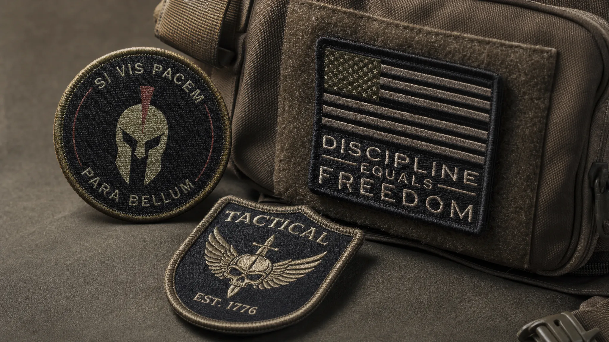
Select a Border That Protects the Patch
The border is more than a decorative frame. It helps protect the edge from wear and gives the patch a finished look. On military-style patches, the border also adds structure and makes the shape feel intentional.
A clean border can prevent the patch from looking unfinished, especially on round, shield, rectangle, and tab shapes. If your design has a dark background, a lighter border can improve visibility. If the patch needs a subdued look, choose a border only slightly lighter or darker than the background.
For simple geometric shapes, a classic stitched or merrow-style edge can create a traditional appearance. For custom-cut shapes, the edge needs to be planned carefully so narrow points and tiny protrusions do not become weak spots. Sharp corners, thin tabs, and complex outlines may look impressive in artwork but can be more vulnerable in use.
When in doubt, simplify the silhouette. A slightly bolder shape will usually last longer and look cleaner than a fragile, overly detailed outline.
Choose the Backing Based on How the Patch Will Be Used
Backing has a major impact on durability. A patch that is sewn onto a jacket has different performance expectations than one removed from a tactical bag every week.
| Backing option | Best use | Durability advantage |
|---|---|---|
| Sew-on | Uniforms, jackets, hats, bags, long-term placement | Strongest permanent attachment when stitched properly |
| Iron-on | Casual apparel, light use, simple application | Convenient, but may not be ideal for heavy field use |
| Hook-and-loop | Tactical gear, morale patches, removable identification | Easy to swap and reposition without sewing each time |
| Adhesive | Temporary use, events, display purposes | Useful for short-term needs, not the best for repeated wear |
For patches that will see frequent washing, abrasion, or outdoor use, sewing is usually the most secure attachment method. Hook-and-loop is useful for morale patches and tactical gear because it allows quick changes, but the loop area on the garment or bag must be durable too.
Iron-on backing can be convenient for some apparel, but it is not always the best choice for thick outerwear, coated fabrics, heat-sensitive materials, or gear that will be flexed and washed heavily. If the patch must last through demanding use, sewing around the edge after heat application can add security.
Match the Patch to the Base Fabric
A durable patch is only as strong as the surface it is attached to. Heavy patches on lightweight fabric can pull, sag, or distort the garment. A stiff patch on a flexible sleeve can feel uncomfortable. A thick patch on a cap may not sit flat.
For tactical apparel, canvas, denim, twill, fleece, ripstop, and heavy cotton blends can often support patches well, but each fabric behaves differently. Stretch fabrics need extra care because a non-stretch patch can restrict movement or cause puckering. Waterproof or coated materials may require special attachment planning.
If the patch will be sewn on, test the needle, thread, and stitch path before full production. If it will be ironed on, confirm that the garment can tolerate the heat. If it will use hook-and-loop, check that the patch size and shape match the available attachment area.
This is especially important for apparel brands ordering patches for a product line. A patch may look perfect on one jacket but feel too rigid on a lighter hoodie. Testing saves time, protects inventory, and helps you avoid inconsistent results across sizes or garment styles.
Prepare Artwork for Production, Not Just Presentation
Patch artwork should be created with production in mind. A polished digital logo may include gradients, shadows, thin outlines, texture effects, or tiny distressed details that do not translate well into thread.
For better results, prepare clean artwork with clearly defined shapes. Vector files are often preferred because they allow clean scaling, but high-resolution artwork can also help when vector files are not available. HiLabels offers an upload artwork feature and an online label creation tool, which makes it easier to start from your existing design and refine it for custom production.
Before submitting artwork, check these details:
- Convert very thin lines into thicker shapes
- Remove unnecessary shadows and tiny texture effects
- Limit small text to essential information
- Make sure each color area is clearly separated
- Confirm that the final design still works at actual patch size
If you are creating a set of patches, such as rank-inspired designs, team identifiers, or event variations, keep the layout system consistent. Use the same border thickness, font family, color logic, and icon placement so the collection feels unified.
Think About Long-Term Wear and Care
Even a well-made patch can wear out early if it is used in the wrong conditions or cared for poorly. Design choices can reduce that risk.
Raised embroidery can snag more easily than flatter woven detail, especially on bags, sleeves, and gear that rub against straps. Very light colors may show dirt faster. Metallic threads and specialty finishes can look impressive, but they may not be ideal for every rugged application. Complex shapes can catch at the edges if they are placed in high-friction areas.
For apparel brands, care labels matter too. If the garment includes custom patches, the care instructions should reflect the patch material and attachment method. HiLabels creates care labels as well as patches, which can help brands keep product presentation and care guidance consistent.
For individual organizations, provide simple care guidance when distributing patches on apparel. Turning garments inside out before washing, using gentle cycles when appropriate, and avoiding excessive heat can help protect both the garment and the patch.
Plan Commemorative and Event Patches Carefully
Custom military patches are often created for reunions, deployments, retirement gifts, memorial events, military balls, fundraisers, and homecoming celebrations. In these cases, the patch carries emotional value, so accuracy and presentation matter.
Double-check names, dates, locations, acronyms, and mottos before approving production. If multiple stakeholders need to review the design, gather feedback early so the final proof does not become crowded with last-minute changes.
For formal events, patches can also coordinate with ribbons, apparel labels, packaging, challenge-style keepsakes, and printed materials. If your patch project is part of a larger military ball, veteran reunion, or recognition ceremony, details such as guest arrival and group movement can affect the overall experience, so it may be useful to coordinate with professional event transportation services as part of the planning.
The more meaningful the patch, the more important it is to slow down during proofing. A durable patch should not only survive physical wear. It should also preserve the memory accurately.
Use a Simple Pre-Production Checklist
Before placing a full order, review the patch as a physical product rather than just an image. This checklist can help catch common problems before production begins.
| Checkpoint | What to confirm |
|---|---|
| Readability | Main text and symbols are clear at actual size |
| Contrast | Foreground and background colors do not blend together |
| Edge strength | Shape and border are not too thin or fragile |
| Attachment | Backing matches the garment, gear, or event use |
| Artwork | Lines, colors, and details are production-ready |
| Approval | Any official or organizational elements are authorized |
| Care | Washing and handling expectations match the patch type |
If possible, order a sample or proof before committing to a large batch. This is especially useful for apparel brands, tactical teams, schools, clubs, and veteran organizations that need consistency across many pieces.
Common Mistakes That Make Military Patches Less Durable
Some patch problems are easy to avoid when you know what to look for. The most common issues usually come from trying to fit too much into too little space.
Avoid designs with tiny lettering, too many colors, very thin outlines, complicated cut shapes, and low-contrast camouflage combinations. Avoid choosing a backing based only on convenience. A removable patch, a permanent uniform patch, and a retail apparel patch all need different attachment decisions.
Also avoid designing only for the front view. Think about how the patch will flex, rub, wash, and age. A beautiful patch placed under a backpack strap may wear faster than the same patch placed on a sleeve or chest panel. A patch on a frequently washed hoodie needs different planning than a collector patch stored in a display case.
Frequently Asked Questions
What is the best material for durable custom military patches? The best choice depends on the design and use case. Woven patches work well for fine detail and small lettering, while embroidered patches are strong for bold, traditional designs with raised texture. For heavy wear, the attachment method and border quality are just as important as the patch face.
Are sew-on patches more durable than iron-on patches? In most demanding applications, yes. Sew-on patches are usually the strongest option for long-term wear, washing, and abrasion. Iron-on backing is convenient for casual use, but sewing can add extra security if the patch will be used heavily.
Can I use official military insignia on a custom patch? Only if you have the proper authorization. Official insignia, seals, ranks, and heraldic symbols may be protected or restricted. Always confirm approval rules before ordering patches that represent an active unit, agency, or formal organization.
How many colors should a military-style patch use? Many strong designs use three to five colors, but there is no single rule. The key is contrast and clarity. Subdued patches may use fewer tones, while ceremonial or commemorative patches can use more color if the design remains readable.
How do I make small text readable on a patch? Use a clean font, increase letter spacing, reduce the number of words, and choose a patch style that supports detail. If the wording is still hard to read at actual size, increase the patch size or simplify the text.
Create Custom Military Patches Built to Last
Durable custom military patches begin with smart design choices: clear artwork, readable text, strong borders, appropriate backing, and materials that match the intended use. Whether you are creating patches for a veteran group, tactical apparel line, team, event, or commemorative project, planning ahead helps the final product look better and last longer.
HiLabels helps brands and organizations create high-quality custom patches, woven labels, ribbons, zipper pulls, and care labels with a user-friendly online process, artwork upload options, personalized support, and over 31 years of craftsmanship experience. If you are ready to turn your design into a patch that feels sharp, durable, and professional, start your custom branding project with HiLabels.


