What Makes a Bespoke Logo Feel Premium on a Woven Label
A bespoke logo on a woven label feels premium when it looks like it belongs to the product, not like it was added at the last minute. The impression comes from small choices that customers may not consciously notice: balanced scale, clean thread definition, controlled color and a label finish that suits the garment. On clothing, accessories or specialty products, the label is often the closest physical expression of the brand. If it feels considered, the whole item feels more considered.
Premium does not always mean ornate. In woven labels, it often means disciplined. The mark has to survive a textile translation, where every curve, letter and symbol is built from interlaced threads rather than ink. That shift changes how a logo should be judged.
Why a bespoke logo feels premium in woven form
A woven label has depth because the design is physically constructed. Printed graphics sit on a surface, but woven artwork becomes part of the material itself. That is why a well-made woven label can feel more permanent, especially on garments that are meant to be worn, washed and handled repeatedly.
In this setting, a bespoke logo should be treated as a small textile object rather than a flat digital asset. Fine hairlines, tight spacing and complex gradients may look refined on a screen, but they can turn muddy when translated into thread. Premium design starts by accepting the medium and using it well.
The best woven marks usually have one strong focal point. That may be a wordmark, a monogram, a symbol or a compact combination of these elements. The goal is not to show everything the brand can say. The goal is to make one branded detail feel confident at a small size.
Restraint is the first premium signal
Luxury branding often looks simple because simplicity gives the eye room to trust what it sees. On a woven label, this matters even more. A crowded mark forces the loom to resolve too much information in too little space, which can make the label feel noisy or mass-produced.
When a bespoke logo is reduced to its strongest elements, the woven result usually feels cleaner. Removing tiny taglines, extra decorative strokes and unnecessary outlines can make the remaining design feel more deliberate. The customer reads that restraint as quality, even if they cannot explain why.
This does not mean every label should be minimal. Heritage brands, outdoor labels and handmade goods can still use character-rich artwork. The difference is that every detail must earn its place. If a stitch or letterform does not improve recognition, it may be weakening the final impression.
For a deeper guide to adapting artwork for thread, HiLabels explains how to prepare artwork for woven details without losing clarity.
The design choices that create a premium label
A label feels premium when the visual decisions work together. No single choice carries the whole effect. Scale, spacing, color and finish all influence whether the customer experiences the logo as refined or ordinary.
| Design choice | Premium effect | Common risk |
|---|---|---|
| Larger negative space | Makes the mark feel calm and legible | Empty space feels accidental if the label is poorly proportioned |
| Limited thread colors | Creates a controlled brand impression | Too few colors can flatten a complex identity |
| Strong letter spacing | Improves readability at small sizes | Over-spacing can make a wordmark feel disconnected |
| Clean edge finish | Makes the label feel complete | Rough edges can distract from good artwork |
| Appropriate fold style | Helps the label sit naturally on the product | The fold can hide or crowd the logo |
Scale and proportion decide how the logo is read
Small labels need larger thinking. A design that works at three inches wide may not work at one inch wide. Letterforms close up, strokes merge and symbols lose their interior detail. This is why woven label design should begin with the final physical size, not only the original logo file.
A bespoke logo can feel expensive when it has enough breathing room around it. Margins give the eye a clean landing area and make the label feel intentionally composed. If the logo touches too close to the edge, even a beautiful mark can feel cramped.
Proportion also includes the relationship between the label and the product. A neck label for a lightweight blouse should not feel heavy. A patch for outerwear can carry more visual weight. Premium is contextual.
Color should feel controlled, not merely accurate
Thread color behaves differently from digital color. Light catches woven threads, shadows form between yarns and small color shifts can appear depending on viewing angle. A premium label accounts for that texture rather than fighting it.
High contrast usually improves clarity, especially for small typography. Black and cream, navy and white or tonal combinations with enough separation can all work. Low contrast can feel sophisticated too, but only when the logo is simple enough to remain readable.
Trying to reproduce too many colors can make a woven label look busy. In many cases, simplifying the palette gives the brand a more elevated presence because it feels edited.
Typography needs textile-friendly structure
Lettering is often where woven labels succeed or fail. Thin serifs, condensed fonts and tight counters can disappear when woven. A font does not need to be plain, but it does need enough structure to hold its shape in thread.
The most refined labels often use type that is slightly adjusted for the medium. That may mean opening up letter spacing, increasing stroke weight or removing a tiny flourish. These changes are practical, but they also make the finished label look more confident.
If your logo is type-heavy, a woven sample or proof is not just a production step. It is the moment when the brand sees whether its voice still sounds clear in textile form.
Material and construction matter as much as artwork
Premium perception comes from the hand feel of the label as well as the image on it. A crisp design woven into a rough or mismatched base can feel less polished. A simple mark woven with the right density, edge and fold can feel surprisingly elevated.
HiLabels focuses on custom woven labels, patches, ribbons, zipper pulls and care labels, so the same brand mark can be carried across more than one physical detail. That consistency helps a product line feel intentional, especially when the woven label, hang detail and packaging ribbon all share the same visual language.
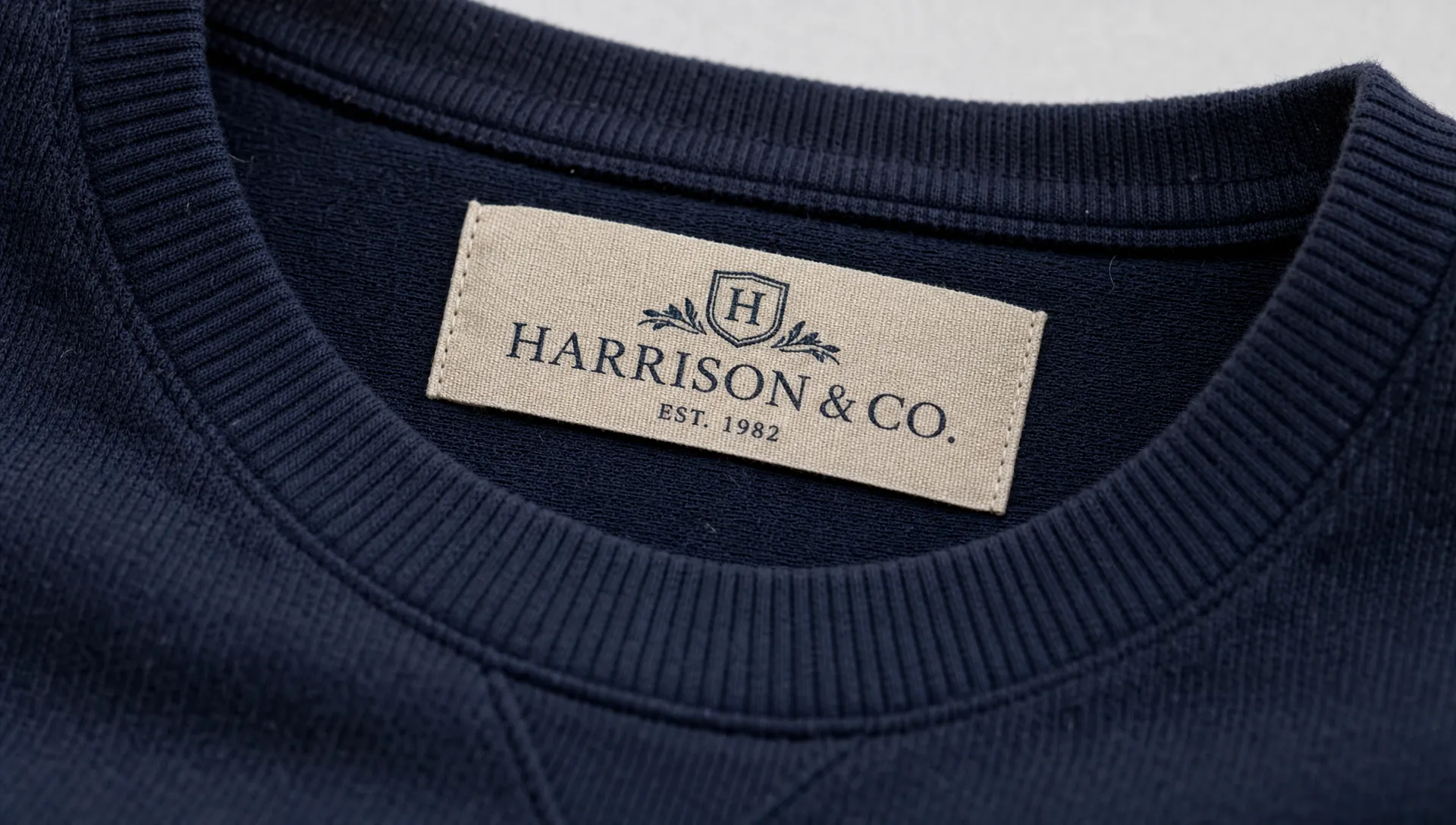
Thread density and edge finish shape the tactile impression
A dense weave can hold finer detail and often feels smoother to the touch. Edge quality matters too. A clean cut, neat fold or well-finished border frames the logo the way a good mat frames artwork. The label should not draw attention because it irritates the skin, curls at the edge or feels out of place.
The finish should match the product category. A soft centerfold label may suit apparel that touches the skin. A more structured woven patch may suit bags, caps or outerwear. Neither option is automatically more premium. The premium choice is the one that feels native to the product.
Placement affects perceived value
Even the best label can lose impact if it is placed carelessly. The customer experiences the label in context: at the neck, on a sleeve, near a hem, inside a bag or on packaging. Placement changes how the mark is discovered and how often it is seen.
A visible exterior label should feel like a design feature. An interior label should feel polished enough to reward closer inspection. A care label can also support brand quality when it is clear, durable and aligned with the overall identity.
For a broader look at how label format supports brand presentation, see how custom logo woven labels can make products look premium.
How to prepare a woven logo without losing refinement
The final version of a brand mark for weaving may not be identical to the master logo, and that is normal. Strong brands often have different logo versions for different uses: full lockup, icon, stacked layout, one-color version and micro mark. Woven labels benefit from that same system.
A bespoke logo that works well on a label usually has a simplified production version. This version keeps the core identity but adapts details for thread. It may use fewer colors, stronger line weights and a slightly different layout. The customer still sees the same brand, but the woven execution looks sharper.
Before ordering, review the design at actual size. If you have to zoom in to read it, the customer will struggle too. Check the spacing between letters, the thickness of lines and the relationship between the logo and the label edge. A good proof should answer practical questions before the label is woven.
HiLabels also offers an online label creation process and an artwork upload option, which can help brands move from logo file to production-ready label without guesswork.
Mistakes that make a woven label feel less premium
A label can lose its premium feel for reasons that seem small during design. Most of these problems come from treating a woven label like a tiny printed sticker instead of a textile detail.
Common issues include using artwork that is too complex, selecting colors with weak contrast, placing the logo too close to the edge and choosing a size that does not fit the garment. Another frequent issue is forcing the same logo lockup onto every product, even when a different format would look cleaner.
If a bespoke logo relies on very thin lines or tiny secondary text, create a woven-specific version before production. This is not a compromise. It is a sign that the brand understands how to protect its identity across materials.
The most premium labels rarely feel like they are trying too hard. They look resolved. The logo, fabric, color and placement all seem to come from the same design decision.
Frequently Asked Questions
What makes a woven label look more premium than a printed label? Woven labels often feel more premium because the design is built into the fabric with thread. This creates texture, depth and durability that printed surfaces may not provide, especially on garments that are washed and worn often.
Should a logo be simplified before weaving? Yes, most logos benefit from a weaving-specific version. Simplifying small details, increasing contrast and adjusting letter spacing can make the final label clearer without changing the brand identity.
How many colors should a premium woven label use? There is no universal number, but fewer well-chosen colors often look more refined than a busy palette. The best choice depends on logo complexity, label size and the amount of contrast needed for readability.
Can a small brand use premium woven labels? Yes. Premium presentation is not limited to large brands. A clear logo, thoughtful label size and good finishing can help a small apparel or product brand look more established.
Create a label detail that feels intentional
A bespoke logo becomes premium on a woven label when the design respects the material. The most successful labels do not simply copy a digital file into thread. They translate the brand into a durable, tactile detail that supports the product every time it is touched.
With over 31 years of experience, HiLabels helps brands create custom woven labels, patches, ribbons, zipper pulls and care labels with a fast online process and personalized customer service. If you are ready to turn your logo into a polished textile detail, start with custom woven label options from HiLabels.


