How to Create Your Company Logo for Small-Scale Branding
Small-scale branding gets much easier when you create your company logo with real products in mind, not just a website header or social media avatar. A logo for a small clothing line, handmade accessory shop, local studio or independent product brand has to work on tiny woven labels, hang tags, stickers, packaging, invoices and profile photos without losing its identity.
That does not mean your logo needs to be plain. It means every design choice needs a job. The goal is to build a mark that feels professional at a small size, is simple enough to reproduce well and gives customers a consistent impression every time they touch your product.
Why small-scale branding changes the logo brief
A large company can afford a complex visual system with dozens of logo variations, custom photography and full packaging suites. A small brand usually needs something more practical: one strong logo system that can carry the brand across many touchpoints without becoming expensive or hard to manage.
When you create your company logo for small-scale branding, you are designing for repetition. The same mark may appear on a neck label, a zipper pull, an embroidered patch, a ribbon, a shipping sticker and a thank-you card. If it changes too much from one place to another, customers may not connect the experience back to the same brand.
Small-scale branding also has tighter physical limits. A delicate line that looks beautiful on a laptop screen can disappear when woven into thread. Thin lettering may blur on fabric. A detailed illustration may need to be simplified before it becomes a durable patch or label. These limits are not a problem if you plan for them early.
Before finalizing your artwork, it helps to clarify your brand personality, product category and most important uses. HiLabels has a helpful guide on how to create your brand identity before ordering labels and patches if you need to define those basics first.
How to create your company logo around real brand uses
Start by listing the places your logo must appear in the first year. Do not design for every possible future use. Design for the touchpoints that matter now, then leave enough flexibility to grow.
For many small brands, the first set of applications includes a website or marketplace store, social profile image, product label, care label, packaging insert and maybe a patch or ribbon. A food brand, craft business or apparel maker may have different priorities, but the principle is the same: your logo should work wherever customers actually see it.
When you create your company logo this way, scale becomes a design filter. Ask whether the mark is still clear at one inch wide. Check whether the brand name remains readable when printed in one color. Look at how the logo feels next to product photography. If the logo only works when it is large and full color, it may not be ready for small-scale branding.
A simple planning table can make this easier:
| Logo use | What matters most | Design implication |
|---|---|---|
| Woven label | Readability, clean edges, thread limits | Use simple shapes and avoid tiny details |
| Patch | Bold silhouette and contrast | Choose strong outlines and fewer colors |
| Ribbon | Horizontal repeat and legibility | Prepare a compact wordmark or icon pattern |
| Care label | Clarity and compliance information | Keep the brand mark secondary and simple |
| Social avatar | Recognition at small digital size | Use an icon, initials or simplified mark |
This table is not a rulebook. It is a way to stop designing in the abstract. A logo becomes stronger when it is tested against real surfaces.
Build a flexible logo system, not just one file
A common small-brand mistake is treating the logo as one single image. In practice, you need a small family of related marks. This does not require a large design budget. It simply means planning a few versions that solve different problems.
Your primary logo can include the full brand name, symbol and any supporting line if you use one. This is the version for your website header, packaging card or larger hang tag. Your secondary logo might remove the tagline or stack the elements differently. Your smallest version could be a monogram, symbol or short wordmark.
When you create your company logo as a flexible system, each version should feel like the same brand. Keep the same letterforms, proportions, shapes and overall mood. Avoid creating one elegant script version, one sporty block version and one playful icon unless your brand is intentionally eclectic. Consistency matters more than variety.
Color should work the same way. Choose a main color palette, then test a single-color version. This is especially important for woven labels, patches and ribbons because production may rely on thread colors rather than unlimited digital gradients. A logo that depends on subtle shadows, transparency or fine color transitions may need a simplified production version.
Spacing is part of the system too. Give your logo enough clear space so it does not feel crowded by seams, borders or nearby text. On a label, a little breathing room can make a modest brand feel more premium.
Choose typography, shapes and colors that hold up small
Typography often decides whether a small logo succeeds or fails. Decorative fonts can work, but they need to remain readable at small sizes. Thin scripts, high-contrast serifs and distressed typefaces may look stylish on a mood board but become hard to read on a small woven label or rubber patch.
If your brand name is long, consider a shorter lockup for physical details. That might mean using initials, a compact wordmark or a small symbol alongside the full name in larger settings. The point is not to hide your name. It is to make sure every version of the logo is legible in its intended format.
Shapes should be easy to recognize. Strong silhouettes, balanced proportions and clean outlines usually reproduce better than highly detailed illustrations. If you use an icon, test it in black and white. If it loses meaning without color, it may need refinement.
Color choices should match both brand personality and production reality. A soft tonal palette can look beautiful on packaging, but low contrast may disappear on fabric. A bold palette can create instant recognition, but too many colors can raise complexity. For many small brands, two or three core colors plus a one-color version is enough.
The U.S. Patent and Trademark Office recommends searching existing marks before investing heavily in a brand identity. Its trademark search guidance is a useful starting point if you plan to use your logo commercially in the United States, though legal advice may still be needed for formal protection.
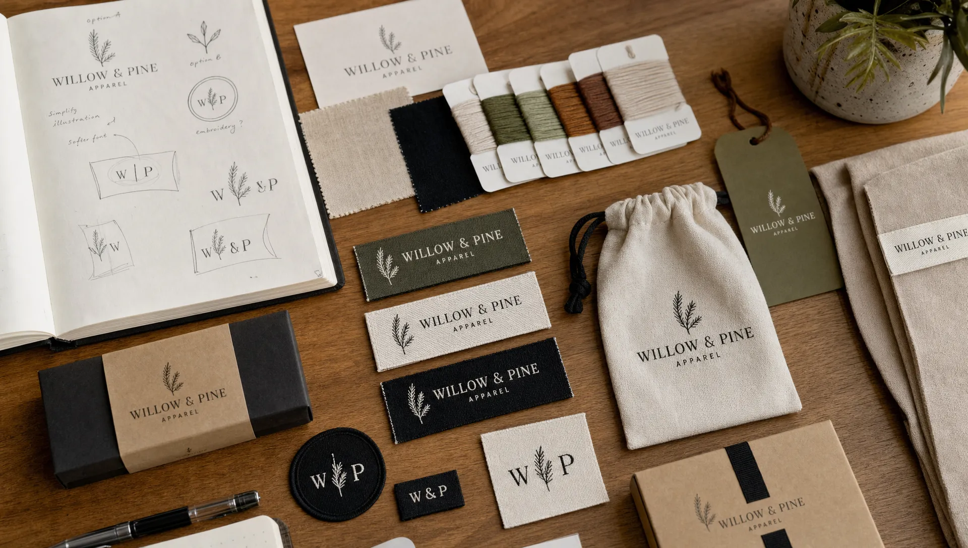
Prepare your artwork for labels, patches and packaging
Once the creative direction is set, prepare files that can move from screen to production without constant redesign. If possible, keep a vector version of your logo, usually in formats such as AI, EPS, PDF or SVG. Vector artwork can be scaled without becoming blurry, which makes it easier to adapt for different product sizes.
When you create your company logo for physical branding, you should also prepare simplified versions. A full-color digital logo may be useful for your website, but a one-color or limited-color version is often better for trims. Remove effects that do not translate well, such as drop shadows, bevels, photo textures and very thin gradients.
For woven labels, thread and loom quality affect the final result. Clean artwork gives the manufacturer a better foundation, but the design still needs to fit the material. HiLabels uses superior European loom quality and gives brands a way to upload artwork or create labels online, which is useful when you already have a logo direction and want to turn it into a durable product detail.
If your next step is specifically a fabric label, this guide on how to create a brand logo that works at label size goes deeper into simplifying shapes, improving contrast and choosing readable typography for small formats.
Test the logo before ordering at scale
Small production runs still cost time and money, so test before committing. Print the logo at the smallest expected size on a home printer. View it from arm's length. Place it next to your product. If the logo feels cramped, fuzzy or too delicate, adjust it before ordering labels, patches or packaging.
Digital mockups are helpful, but physical tests reveal different issues. Fabric texture, stitch density, thread color and label size can change how artwork feels. A logo that looks balanced on a flat screen may need slightly heavier lines or more spacing when translated into thread.
When you create your company logo and test it early, you reduce the chance of reordering later because the name is too small, the symbol is unclear or the colors lack contrast. This is especially valuable for small brands where every production decision affects margin.
A simple feedback round can also help. Show the logo to a few customers, peers or stockists without explaining it first. Ask what kind of product they expect, what price range it suggests and what they remember after a few minutes. The answers will tell you whether the logo is sending the right signal.
Keep the logo consistent as the brand grows
A small brand does not need a 50-page brand manual, but it does need a few rules. Decide which logo version goes on labels, which one appears on packaging and how much space should surround it. Keep your colors and fonts in one easy-to-find document so future products do not drift away from the original look.
Consistency does not mean everything must look identical. A woven label, care label, patch and ribbon each have different constraints. The logo may need to be adapted, but the customer should still recognize the same brand voice. If you are planning multiple trims, HiLabels has a useful article on how to brand your logo across labels, patches and packaging without losing cohesion.
Over time, your logo may evolve. That is normal. The best small-brand logos are built with enough simplicity to last and enough flexibility to support new products, seasonal colors or expanded packaging.
Frequently Asked Questions
Do I need a professional designer to create a small business logo? Not always. A designer can help with strategy, typography and production-ready files, but many small brands start with a simple, well-planned logo. If you use a logo builder, make sure the result is readable, distinctive and available in high-quality file formats.
What file type should I use for labels and patches? Vector files are best when available because they scale cleanly. If you only have a raster file such as PNG or JPG, use the highest resolution version and avoid artwork that is blurry, low contrast or filled with tiny details.
How many colors should a small-brand logo have? Two or three core colors are usually enough, along with a one-color version. Limited colors make the logo easier to reproduce across woven labels, patches, ribbons and packaging.
Can I create your company logo first and adapt it for labels later? Yes, but it is smarter to think about labels from the start. A logo designed only for digital use may need simplification before it works in thread, fabric or small printed formats.
What makes a logo look professional on a small product? Clear typography, balanced spacing, strong contrast and a simple silhouette all help. The logo should be recognizable at a small size and should feel aligned with the quality and price of the product.
Bring your small-brand logo into the real world
A logo becomes valuable when customers see it consistently on the products they buy, wear, gift and remember. Once you have refined your mark, the next step is turning it into brand details that feel durable and intentional.
HiLabels helps small brands create custom woven labels, patches, ribbons, zipper pulls and care labels with a user-friendly online ordering process, artwork upload options and personalized customer service. If you are ready to create your company logo and apply it to professional branding products, visit HiLabels to start building the details that make your products feel finished.


