How to Create a Brand Logo That Works at Label Size
When you create a brand logo for clothing, accessories, gifts or packaging, its hardest job often happens at the smallest size. A logo that looks polished on a website header can lose its shape on a narrow woven tag, a folded seam label or a tiny zipper pull. At label size, every extra line, shadow and thin letter has to earn its place.
The goal is not to make the logo louder. The goal is to make it recognizable with fewer visual cues. That means designing for real production conditions: thread, fabric texture, folding, stitching, color contrast and the distance from which a customer will actually see the mark.
This guide walks through how to create a brand logo that still looks clean, premium and readable when it becomes part of a physical product label.
Why label size changes the rules of logo design
A logo at label size is not just a smaller version of your primary logo. It is a physical object. Woven labels are built from threads, patches have texture and thickness, ribbons repeat over long narrow surfaces and care labels often need to share space with practical information.
That changes what works. Fine outlines may disappear. Tiny type can fill in. Tight spacing can make letters touch. Low-contrast color combinations can look elegant on a screen but become dull on fabric. Even a strong logo can fail if it is forced into the wrong label format.
Good label-size logo design starts with one simple principle: recognition beats decoration. If a customer can identify the brand quickly, the label is doing its job. Detail can support that recognition, but it should never compete with it.
Start with the smallest real use case
Before opening a design file, decide where the logo has to appear at its smallest. A main neck label, hem tag, patch, zipper pull and packaging ribbon each create different constraints. Designing for the smallest use first helps you avoid building a logo that only works in large applications.
| Label application | What the logo needs to do | Best design priority |
|---|---|---|
| Main woven label inside clothing | Identify the brand at close range | Clear wordmark, balanced spacing and fold allowance |
| Side seam or hem label | Act as a quick brand detail | Short wordmark, icon or monogram |
| Patch | Create a visible brand element | Bolder shapes and strong silhouette |
| Ribbon or packaging trim | Repeat consistently across a narrow area | Horizontal logo or simplified mark |
| Care label | Support information without clutter | Small logo version with clear text hierarchy |
If the label format is still undecided, choose it before finalizing the mark. The shape, fold and placement can change how much visual space your logo really has. HiLabels has a practical guide on how to choose the right size of labels if you are comparing label formats before production.
Build a logo system instead of one fixed logo
Strong brands rarely rely on one logo file for every situation. They use a small logo system, with each version made for a different scale or format. This is especially helpful for apparel and product brands because a logo may need to work on a website, hang tag, woven label, care label and shipping detail.
For label-size branding, plan these versions early:
- Primary logo for larger uses such as packaging, web headers and lookbooks.
- Compact wordmark for woven labels, ribbons and small product tags.
- Symbol or monogram for seam labels, zipper pulls and patches.
- One-color version for woven production and high-contrast applications.
- Micro version that removes taglines, thin details and secondary text.
These versions should feel related, not like separate identities. Use the same proportions, core shapes and brand personality across each one. If you already have a broader identity system, your label logo should support it rather than fight it. For a deeper look at aligning labels with colors, type and materials, see this guide on how to create custom labels that match your brand system.
Simplify the logo shape without making it generic
The most common mistake at label size is trying to preserve every detail from the large logo. Small labels reward clarity. Remove anything that does not help the customer recognize the brand.
Start by auditing the artwork at actual size. Look for hairline strokes, tiny stars, delicate leaves, inner shadows, long taglines, fine outlines and decorative textures. These may look intentional when enlarged, but they often become visual noise on a woven label.
Simplification does not mean stripping the logo of character. A distinctive letter shape, a bold icon, an unusual proportion or a memorable negative space detail can carry personality more effectively than a crowded illustration. The best small logos often feel confident because they are edited.
Negative space matters as much as the mark itself. If letter counters, gaps or enclosed shapes are too small, they can close up during production. Give important spaces room to breathe so the logo still reads after weaving, stitching or folding.
Choose typography that survives thread and folding
Type is usually the first part of a logo to fail at small size. A beautiful script, condensed serif or ultra-light sans serif can lose legibility when reduced. That does not mean you have to abandon your brand style, but you may need a label-specific cut of the wordmark.
Look for letterforms with open counters, clear spacing and enough stroke weight to hold their shape. If your brand name has letters that can blur together, such as rn, cl or li, adjust the kerning for the label version. Do not trust the spacing that looks good on a large artboard. Test it at the intended width.
If your main logo includes a tagline, founding year or descriptor, create a version without it. Small labels rarely have room for secondary copy unless the label itself is large enough to support it. A clean brand name usually feels more premium than a crowded miniature logo.
Use contrast as a design tool, not an afterthought
Color has to work harder on fabric than it does on a backlit screen. A navy logo on black fabric may feel subtle in a digital mockup, but the finished label can become hard to read. A pale beige thread on a white background may fit the palette but disappear in real use.
Digital accessibility guidance from the W3C Web Content Accessibility Guidelines treats contrast as a core readability issue. Physical labels are not the same as screens, but the principle is useful: when contrast is weak, recognition becomes harder.
For small labels, a limited color palette is usually stronger. One or two well-chosen colors can look more refined than a complex mix. Always create a one-color version of the logo, even if your main brand identity uses multiple colors. A one-color mark is often the most reliable option for woven labels, patches and small trims.
Design for woven construction
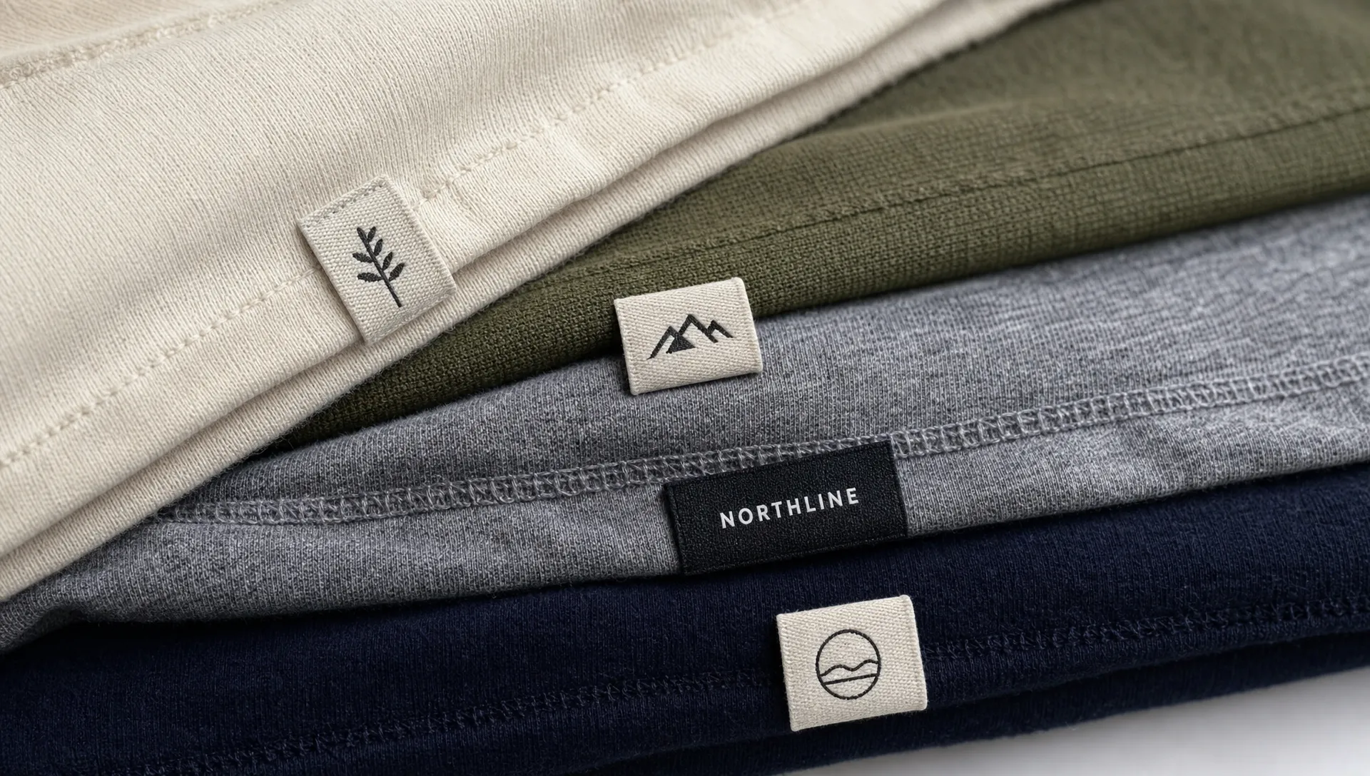
Woven labels are not printed images. They are made by interlacing threads, which means the logo must translate into a physical grid. High-quality looms can achieve impressive detail, but they still cannot rescue artwork that depends on gradients, tiny textures or delicate transparency.
Avoid relying on photographic effects, soft shadows or intricate color transitions. If your logo uses a gradient online, create a flat version for labels. If the identity depends on a detailed illustration, consider turning it into a simplified silhouette or emblem for woven use.
Thread direction can also affect how diagonal lines, curves and small corners appear. Bolder geometry usually holds better than fragile detail. This is one reason custom logo woven labels often look more premium when the artwork is simplified before production.
Test the logo at actual label size
A logo should never go to production after being reviewed only at full screen. Print it, shrink it and view it in context. The actual-size test is the fastest way to catch issues before ordering labels.
| Test | How to do it | What a good result looks like |
|---|---|---|
| Actual-size print test | Print the logo at the intended label dimensions | Brand name and icon are readable without zooming in |
| One-color test | Convert the logo to solid black or white | The core identity still feels recognizable |
| Distance test | Place the mockup on a garment and step back | The mark is clear at the expected viewing distance |
| Fold test | Mark the fold or seam allowance on the mockup | No key detail lands where it will be hidden or bent |
| Contrast test | Place the logo on the intended label background | The logo stands apart from the base color |
If a design fails one of these tests, do not treat it as a production issue. Treat it as a design issue. The cleaner the artwork is before manufacturing, the better the finished label can look.
Prepare artwork for production before you order
Once the label-size version works, prepare the artwork in a production-friendly way. Clean files reduce delays and help the label maker understand what you want.
Use vector artwork when possible, especially for wordmarks and icons. Outline or package fonts so the type does not change when the file is opened. Include the intended label size, colors, fold style and placement notes. If there is a specific version for woven labels, name it clearly so it does not get confused with the web or packaging logo.
If you are uploading artwork online, review the specifications first. HiLabels offers an online label creation process with artwork upload options, and this guide to creating your label online with the right specs first can help you organize the details before you submit a design.
Match the logo to the label format
A logo that works on one label type may need adjustment for another. A long horizontal wordmark can look excellent on ribbon but cramped on a small square patch. A circular icon may look strong on a patch but feel awkward on a narrow side seam label.
Think of the label shape as part of the identity. A center-fold woven label may need the logo to sit above the fold line. A small outer tag may need a symbol instead of the full brand name. A patch may allow more presence, but it still benefits from simplified artwork and strong contrast.
Also consider comfort and placement. Labels inside clothing should not feel bulky or scratchy. External labels should feel intentional, not like an afterthought. The logo has to work visually, but the label also has to belong on the product.
Common logo mistakes that show up at label size
Even experienced brand owners can miss problems because the logo looks good in large digital mockups. The issues below are easier to fix before production than after labels arrive.
| Mistake | Why it fails at label size | Better choice |
|---|---|---|
| Keeping a long tagline | Secondary text becomes too small to read | Use the brand name only on small labels |
| Using thin strokes | Fine lines can disappear or fill in | Increase stroke weight for the label version |
| Choosing low contrast colors | The logo blends into the label background | Use a higher-contrast color pairing |
| Using the full logo everywhere | Some formats become crowded | Create compact and icon versions |
| Reviewing only on screen | Digital scale hides production problems | Print and test at actual dimensions |
A good label-size logo is not necessarily the most detailed version of your brand. It is the version that stays recognizable, balanced and consistent when the customer meets it in real life.
Frequently Asked Questions
What makes a brand logo work at label size? A label-size logo works when it remains readable at the intended dimensions, uses strong contrast, avoids unnecessary detail and has enough spacing for thread, fabric texture or folding.
Should I use my full logo on every label? Not always. Use the full logo when the label has enough space. For small seam labels, zipper pulls or narrow ribbons, a compact wordmark, icon or monogram may be clearer.
How many colors should a small woven label logo use? Fewer colors are usually easier to read. One or two strong colors often look more refined than a complex palette, especially when the logo is small.
Can a detailed logo work on a patch but not on a woven label? Yes. Patches can sometimes support bolder artwork and larger surface area, but woven labels are more sensitive to tiny lines, gradients and tight spacing. Create a simplified version for woven use.
Do I need a separate logo file for labels? In most cases, yes. A label-ready version should be simplified, tested at actual size and prepared with production details such as dimensions, colors and fold notes.
Turn your small logo into a polished label
A strong logo should look just as intentional on a label as it does on your website or packaging. If you are preparing a logo for clothing, accessories or branded packaging, HiLabels can help you turn that artwork into custom woven labels, patches, ribbons, zipper pulls or care labels.
With over 31 years of experience, HiLabels combines an online ordering process with personalized customer service and high-quality craftsmanship. Start with clean artwork, choose the label format that fits your product and create a label that makes your brand feel finished from the first touch.


