Brand Your Logo Across Labels, Patches, and Packaging
A logo becomes more valuable when customers see it repeatedly in the right places. To brand your logo well, treat labels, patches and packaging as one connected system rather than separate finishing touches. The goal is simple: make every product feel unmistakably yours before, during and after the purchase.
For apparel brands, makers, merch teams and small businesses, this matters because the logo is rarely seen in only one setting. It might appear on a neck label, a sleeve patch, a care label, a ribbon around a gift box, a zipper pull or a shipping insert. Each format has different limits, but they should all feel like they came from the same brand.
The challenge is not just placing the logo everywhere. It is choosing where it belongs, how much detail each version can hold and what material will make the mark look intentional. A beautiful digital logo can lose impact if it is squeezed into a tiny woven format or printed on packaging with colors that do not match the garment trim.
Where to brand your logo across the customer journey
Think about the path your product takes from first impression to long-term use. Packaging creates the opening moment, labels confirm quality when the item is handled and patches or trims keep the identity visible while the product is worn or used.
A good brand system gives each touchpoint a job. Your outer packaging may build anticipation. A woven label may make the product feel finished. A patch may turn the logo into a visible design element. A care label may quietly reinforce professionalism while also carrying required garment information.
If your logo is still being refined, start with its smallest use case. A mark that works at label size can usually scale up to packaging, but a complex packaging logo often struggles when converted into woven threads. HiLabels has a helpful guide on how to create a brand logo that works at label size before you move into production.
Choose the right format for each logo moment
Every branded detail should earn its place. When you brand your logo on a patch, for example, you can make it part of the product design. When you place it on a care label, it should stay readable and support function rather than compete with care instructions.
The table below shows how common brand touchpoints can work together without feeling repetitive.
| Touchpoint | Best use | Logo approach | Watch out for |
|---|---|---|---|
| Woven label | Neck labels, hem labels, product seams | Simplified logo, strong contrast, clear shape | Tiny text and delicate lines can fill in |
| Patch | Jackets, hats, bags, uniforms, merch | Bolder logo version or emblem-style design | Overly complex artwork can look crowded |
| Care label | Garment information and brand reassurance | Small logo with readable care details | Compliance information must stay clear |
| Ribbon | Gift wrap, product bundles, retail presentation | Repeating logo or wordmark pattern | Too much spacing can make the logo feel disconnected |
| Zipper pull | Bags, outerwear, accessories | Icon, initials or compact symbol | Full wordmarks may be too narrow |
| Packaging | Boxes, mailers, tissue, hang tags | Primary logo with brand colors | Packaging should match the product trim system |
This kind of planning helps you avoid a common problem: using the same file everywhere without adapting it to the material. A woven label, a patch and a box may all carry the same identity, but each one needs artwork prepared for its own production method.
Start with a logo hierarchy, not just one file
Most brands need more than one version of a logo. That does not mean changing the identity. It means building a practical logo hierarchy that makes the brand easier to apply across products.
A simple hierarchy might include:
- Primary logo for packaging, websites and larger labels
- Simplified wordmark for woven labels and ribbons
- Icon or monogram for zipper pulls, small patches and side tabs
- One-color version for limited thread or print applications
- Stacked or horizontal version depending on the available space
If you brand your logo across several materials, this hierarchy keeps the system flexible. It also helps your production partner choose the best format instead of forcing a detailed artwork file into a space where it will not reproduce well.
For clothing and accessories, the smallest version is often the most important. If the logo is legible on a woven hem tag or compact patch, it will usually look polished on larger packaging. If it only works at large size, you may need to simplify linework, widen letter spacing or create an icon version.
Match material to the feeling of the brand
Materials communicate before the customer reads a word. A soft woven label can feel refined and established. A bold patch can feel rugged, sporty or collectible. A printed care label can feel clean and functional. Ribbon can turn even simple packaging into something giftable.
The best choice depends on how your product should feel in the hand. A premium knitwear brand may lean into subtle woven labels and understated packaging. A streetwear brand may use larger patches, side labels and high-contrast trims. A children’s brand may need soft labels, rounded shapes and easy-to-read care details.
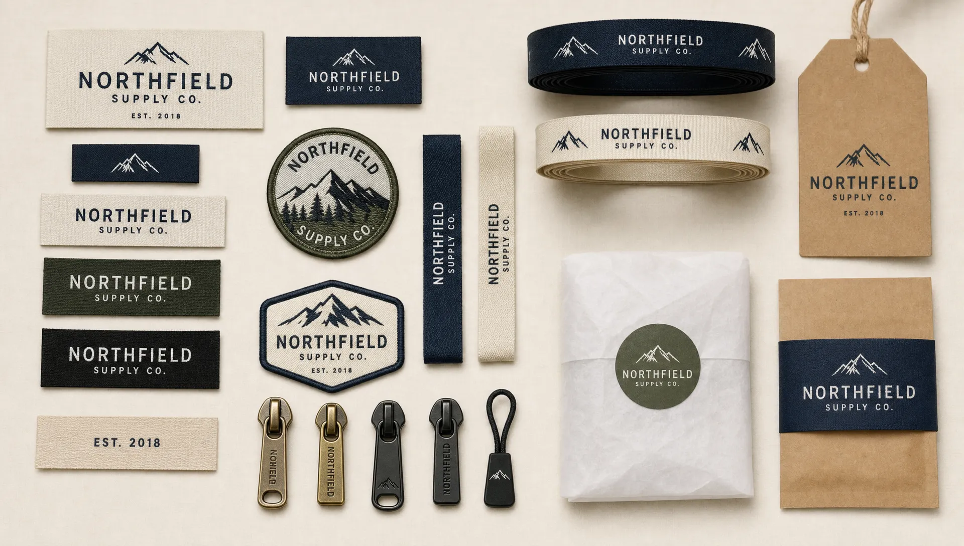
HiLabels offers custom woven labels, patches, zipper pulls, ribbons and care labels, which makes it easier to build a trim system that feels coordinated rather than pieced together from different suppliers. If you are comparing patch applications specifically, their article on custom patches for brands, teams and creators is a useful next step.
Keep color consistent, but understand production limits
Color is one of the fastest ways customers recognize a brand, but it behaves differently across thread, fabric, ink and digital screens. A neon shade on a monitor may not translate exactly to woven thread. A muted thread color may look richer on a label than it does in a flat digital mockup.
Before you brand your logo on multiple items, decide which colors are essential and which can be adapted. Many brands use a primary color palette for packaging and a simplified thread palette for woven trims. This keeps the logo recognizable without fighting the limits of the production method.
Contrast matters as much as color accuracy. A dark navy logo on a black woven label may look sophisticated in theory, but it may disappear in real use. Small labels often need stronger contrast than large packaging because customers see them quickly, at close range and sometimes under poor lighting.
A practical rule is to prepare a full-color version and a high-contrast simplified version. The full-color version can serve packaging and larger applications. The simplified version can serve woven labels, small patches, ribbons and zipper pulls.
Make placement feel intentional
Logo placement is part of the product experience. A neck label is private but expected. A hem label is subtle but visible. A chest patch is part of the design. A ribbon appears before the product is opened. Packaging may be the customer’s first physical interaction with your brand.
Placement should support the product rather than distract from it. On apparel, labels and patches work best when they align with garment structure: neck seams, side seams, hems, cuffs, pockets and outer panels. On packaging, the logo should guide the eye naturally, whether it is centered on a box, repeated on ribbon or placed on a hang tag.
If you are creating a system from scratch, limit the number of placements at first. A woven label, one visible exterior detail and one packaging detail may be enough. You can always expand later once you see how customers respond and which items become most recognizable.
Prepare artwork for production, not just presentation
A logo file that looks good in a pitch deck is not always ready for labels or patches. Production artwork should be clean, scalable and stripped of details that will not reproduce well. Thin lines, gradients, tiny taglines and complex textures often need to be simplified.
Before you brand your logo across different products, prepare artwork in the formats requested by your supplier and check how it will behave at actual size. If a label is only one inch wide, print the artwork at one inch on paper and view it from a normal distance. This quick test reveals problems that are easy to miss on a large screen.
For woven applications, think in terms of shape and contrast. Threads create the design, so the logo should have enough weight to hold its form. For patches, borders, edge details and background shapes become part of the overall look. For packaging, you may have more freedom, but it should still match the trims attached to the product.
If you want a smoother ordering process, HiLabels lets brands upload artwork and create custom labels online. You can also review practical setup advice in their guide to create labels online for apparel, gifts and packaging.
Do not forget care labels and compliance details
Care labels are often treated as an afterthought, but they are part of the brand experience. They tell the customer how to protect the product, and they signal whether the brand has handled the practical details professionally.
In the United States, many textile wearing apparel products must follow the Federal Trade Commission’s Care Labeling Rule, which covers care instructions for garments. A care label can still include your brand identity, but the required information needs to remain readable and accurate.
A small logo at the top or bottom of a care label can reinforce the brand without overwhelming the instructions. For minimalist brands, even consistent typography and spacing can make the care label feel connected to the rest of the trim system.
Build a repeatable brand trim system
The smartest way to brand your logo is to create repeatable rules. Once you define your core label, patch, ribbon and packaging treatments, future products become easier to launch. You do not have to redesign every trim from scratch.
A simple trim system should answer these questions:
- Which logo version is used for small woven labels?
- Which logo version is used for patches and exterior details?
- What background colors are approved for labels and packaging?
- Where should labels and patches be placed on each product type?
- Which details stay consistent across collections?
This documentation does not need to be complicated. Even a one-page brand trim guide can help you maintain consistency when you reorder labels, expand into new products or work with different manufacturers.
Common mistakes to avoid
The biggest mistake is assuming that more logo placements automatically create a stronger brand. Repetition helps only when the details feel coherent. If the patch, label, care tag and packaging all use different colors, proportions and logo versions, the product can feel less polished.
Another mistake is designing only for the digital mockup. Physical branding lives in real conditions: curved fabric, seams, texture, movement, laundering, shipping and handling. Materials need to be durable enough for the product’s use, and the logo needs to remain recognizable after that use.
A final mistake is waiting too long to think about trims. Labels, patches and packaging should be considered before the product is finalized because they can affect seam placement, product photography, perceived quality and unboxing. Early planning gives you more control over the final result.
Frequently Asked Questions
How many logo versions do I need for labels, patches and packaging? Most brands benefit from at least three versions: a primary logo, a simplified wordmark and a small icon or monogram. This gives you flexibility for large packaging, woven labels and compact trims.
Can I use the same logo file for every branded item? You can start from the same master logo, but each application may need adjustments. Woven labels often require simplified details, patches may need stronger outlines and packaging can usually support more visual complexity.
What is the best first product to brand with my logo? For apparel, a woven label is often the best starting point because it appears on every garment and reinforces quality. If your product is more visual or merch-driven, a patch may create stronger recognition.
Should my packaging match my labels exactly? It should feel connected, but it does not need to be identical. Matching colors, typography and logo proportions usually matters more than copying the exact same layout across every touchpoint.
How do I know if my logo will work at label size? Test it at actual size before ordering. If small text, thin lines or detailed icons become hard to read, simplify the artwork or create a compact version for labels and trims.
Create branded details that feel consistent
When you brand your logo across labels, patches, ribbons and packaging, the goal is not to place a mark everywhere. The goal is to make each detail feel considered, durable and aligned with the product your customer receives.
HiLabels helps brands create custom woven labels, patches, zipper pulls, ribbons and care labels with an online ordering process, artwork upload options and personalized customer service. With over 31 years of experience and superior European loom quality, HiLabels can help turn your logo into physical brand details that feel ready for retail, gifting and everyday use.
Start with one strong logo system, then build the trims around it. Your products will look more cohesive, your packaging will feel more intentional and your customers will have more chances to remember your brand.


