Create Product Labels That Look Great and Stay Consistent
When you create product labels, the goal is not just to make one tag, patch, ribbon, or care label look good on a screen. The real goal is to create a label system that keeps your products recognizable every time a customer sees, wears, opens, washes, gifts, or reorders them.
Great labels do two things at once. They add polish to the product in front of the customer, and they create continuity across your full collection. That continuity is what makes a small brand feel established, helps a growing apparel line avoid visual drift, and gives packaging a more professional finish.
The challenge is that label consistency can fall apart quickly. A logo gets resized differently for a new SKU. A care label uses a slightly different font. A ribbon color feels close, but not close enough. A patch looks premium, while the inside neck label looks like it came from another brand.
The solution is to treat product labels as repeatable brand assets, not one-off decorations.
Start with the job each product label needs to do
Before choosing colors, materials, or artwork, define what each label is responsible for. A main woven label on a garment does not have the same job as a care label, a packaging ribbon, a patch, or a zipper pull. If you force every label to carry the same amount of information, some will become cluttered and others will miss their purpose.
A strong label system usually separates brand recognition, product information, care instructions, and presentation details. This makes every label easier to design and easier to keep consistent.
| Label job | Common format | Consistency risk | What to standardize |
|---|---|---|---|
| Brand identity | Woven label, patch, zipper pull | Logo appears at different sizes or proportions | Logo version, minimum size, placement, colors |
| Product information | Size label, product label, care label | Text hierarchy changes across items | Font style, spacing, wording, icon use |
| Packaging presentation | Custom ribbon, packaging label, gift detail | Packaging looks separate from the product brand | Color palette, logo lockup, material finish |
| Durability and utility | Woven patch, zipper pull, sewn-in label | Material quality feels inconsistent | Material choice, attachment method, dimensions |
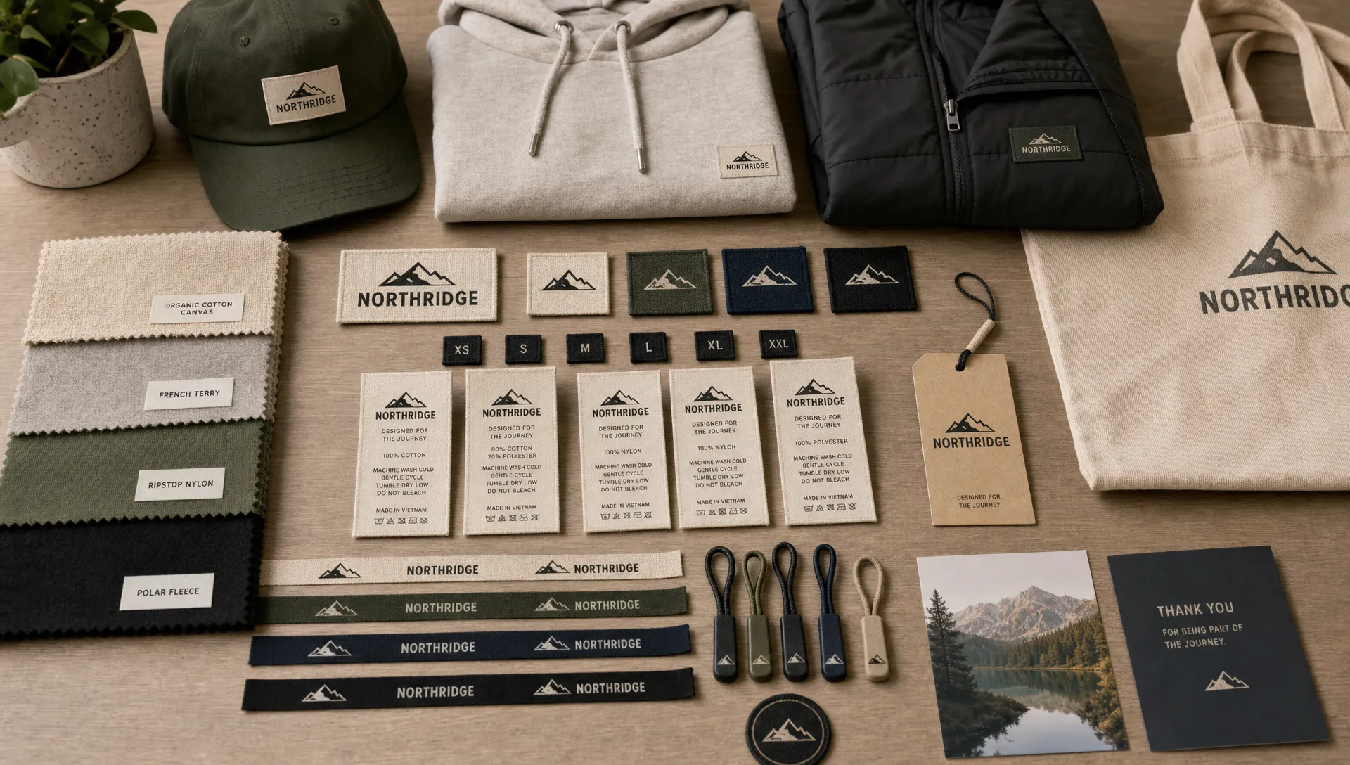
For example, an apparel brand might use a woven neck label for identity, a small side seam label for recognition when worn, a care label for required information, and a branded ribbon for packaging. Each piece can be simple because the full system works together.
If you are still defining the broader visual rules behind your labels, HiLabels has a useful guide on how to create custom labels that match your brand system.
Build a repeatable label system, not a one-off design
The brands that create product labels most effectively do not start over every season. They build a flexible system that can expand as new products, sizes, collections, and packaging needs appear.
Think of your label system as a small brand manual for physical goods. It does not need to be complicated, but it should answer the decisions that tend to create inconsistency later.
At minimum, document these elements:
- Approved logo versions for small labels, wide labels, square patches, and ribbon applications
- Primary and secondary brand colors, including the closest thread or material options where relevant
- Standard label sizes for each product category
- Fold style or finishing style for sewn-in labels
- Typography rules for care content, size labels, and product details
- Placement rules, such as center back neck, side seam, hem, sleeve, zipper, or packaging closure
- File naming and version control for every approved artwork file
This is especially important when you create product labels for more than one item type. A hoodie label, beanie patch, tote bag tag, and ribbon spool may all use the same brand, but they need different proportions. A repeatable system gives each format enough flexibility without letting the brand identity drift.
The simplest rule is this: keep the core brand elements fixed, then adapt only what the product format requires.
Design for readability at real label size
A label can look clean on a large digital mockup and still become unreadable when produced at actual size. Product labels live in tight spaces, often with texture, stitching, folds, seams, and shadows. That means your design needs to be simpler and clearer than a standard digital graphic.
Start with your logo. If it contains very fine lines, complex illustrations, tiny letters, or delicate spacing, you may need a simplified label version. This is not a compromise. It is how strong brands protect recognition in small formats.
For woven labels in particular, artwork is translated into threads. That gives the label texture and durability, but it also means details must be practical. High contrast, clean shapes, and strong spacing usually produce better results than gradients, miniature script, or photographic effects.
Use these design principles to improve consistency:
- Keep the logo proportional across every label format
- Avoid squeezing a horizontal logo into a square label without an approved alternate version
- Leave enough clear space around the logo so stitching or folds do not crowd it
- Choose contrast that remains readable on fabric, not only on a bright screen
- Limit text to what the label truly needs to communicate
- Test artwork at actual size before approving it
If the logo is the most important part of your product label, this article on logo label design tips for cleaner, more readable tags is a helpful next step.
Lock your specifications before uploading artwork
One of the most common reasons labels become inconsistent is that design choices and production specifications are treated separately. In reality, the label size, fold, material, colors, and placement all affect how the design looks.
A beautiful label design can fail if the fold covers part of the logo, if the size is too small for the text, or if the material does not match the rest of the product experience. Before ordering, confirm the technical details that will make the label repeatable.
| Specification | Why it affects consistency | What to decide before production |
|---|---|---|
| Dimensions | Changes logo scale and text readability | Standard width and height for each label type |
| Fold or finish | Affects visible area and sewing method | Center fold, end fold, straight cut, or another finish |
| Material and weave | Influences texture, durability, and perceived quality | Woven label, patch, ribbon, care label, or other format |
| Color translation | Brand colors may look different in thread, fabric, or print | Approved color choices for each material |
| Placement | Determines how customers notice and interact with the label | Exact product location and orientation |
| Artwork version | Prevents accidental use of outdated logos | Final file name, date, and approved proof |
If you are creating labels online, it is worth reviewing the specs before you upload the final artwork. HiLabels explains this process in more detail in its guide to creating your label online with the right specs first.
Plan for consistency across product lines
Consistency does not mean every label must be identical. In fact, forcing the same label onto every product can make a brand feel less refined. A premium jacket, soft children’s garment, handmade accessory, and gift box may need different label formats.
The key is to create controlled variation. Your product labels can change size, shape, or material while still sharing recognizable design cues. These cues might include the same logo lockup, the same thread color family, similar border proportions, matching typography, or a consistent placement strategy.
For example, a brand might use:
- A large woven patch for outerwear
- A smaller folded woven label for T-shirts
- A soft care label for garments that touch the skin
- A custom ribbon for gift packaging
- A zipper pull for bags or jackets
Each item feels different because the product demands it, but the brand still feels unified.
This principle also matters beyond apparel. Food, wellness, personal care, and service-based brands often rely on trust signals, and visual consistency helps customers feel that every touchpoint belongs to the same organization. Brands operating in sensitive categories can learn from trust-led providers such as medically supervised weight loss and coaching programs, where clear, consistent communication supports confidence before a customer or patient ever speaks with a team member.
For product brands, the lesson is simple: every label should reduce doubt. If a customer sees your product online, receives it in packaging, handles it in person, and later checks the care label, the experience should feel connected.
Create artwork files your future self can use
A label system is only as consistent as the files behind it. If your team, designer, manufacturer, or future self cannot tell which artwork is final, inconsistency becomes almost guaranteed.
Keep a clean artwork library with approved production files, not just design drafts. Whenever possible, use vector artwork for logos and simple graphics, since vector files scale cleanly and help preserve sharp edges. If typography is part of the artwork, outline or package the fonts according to your designer’s workflow so the type does not change when files are opened on another computer.
Good file management does not need to be complex. What matters is that anyone placing a reorder can identify the correct file quickly.
A practical file name might include the brand, label type, size, color, and version date. For example: BrandName_WovenNeckLabel_50x25mm_BlackCream_v2026-08. The exact format is up to you, but the habit matters.
Also save notes that are not visible in the artwork file, such as approved thread colors, material choices, fold type, and placement instructions. These details protect consistency when you reorder, add a new product, or work with a different team member.
Review labels like a customer, not just a designer
Before approving a new product label, look at it in context. A label is not experienced as a flat artwork file. It is sewn into a seam, attached to a zipper, wrapped around packaging, touched by hands, and viewed under real lighting.
Ask practical questions during review. Does the label feel right for the product price point? Is the logo readable at arm’s length? Does the color still match the brand when placed on the actual garment or packaging? Does the care label communicate what it needs to without feeling messy? Is the same level of quality visible across the full product range?
This is where many brands catch small issues before they become expensive habits. A label that is slightly too large might look acceptable on one item but awkward across a full collection. A ribbon that is almost the right color may weaken the unboxing experience. A care label with crowded text may make the product feel less premium, even if the main label looks excellent.
Use a pre-order consistency checklist
Before you create product labels for a new product, collection, or reorder, run through a quick consistency check. This prevents small changes from creeping into your brand system unnoticed.
| Checkpoint | Question to ask | What a strong answer looks like |
|---|---|---|
| Brand fit | Does this label match our existing product family? | It uses approved logo, color, proportion, and tone |
| Readability | Can the important details be read at actual size? | Text and logo remain clear without zooming in |
| Material match | Does the label quality match the product quality? | Texture, durability, and finish feel intentional |
| Placement | Will the label sit naturally on the product? | Location is comfortable, visible, and repeatable |
| Reorder readiness | Could we order the same label again later? | Final files, specs, and notes are saved clearly |
This checklist is especially useful for growing brands that add products quickly. It gives you a simple way to protect brand consistency without slowing down every decision.
Common mistakes that make product labels look inconsistent
Most label inconsistency comes from a few avoidable decisions. The first is designing only for the product in front of you. A label might look good on one garment, but if it cannot scale to future colors, sizes, or categories, it may create problems later.
The second mistake is using too many label styles at once. Variety can be useful, but every new shape, color, material, and logo version adds complexity. If customers cannot tell which details are intentional, the brand starts to feel less cohesive.
Another common issue is changing specifications during reorders. Even a small difference in size, fold, or material can make a reorder look separate from earlier inventory. This is why saved specs and approved files are so important.
Finally, many brands underestimate placement. A premium woven label can lose impact if it is attached awkwardly, hidden where customers never see it, or placed inconsistently from product to product. Placement is part of the design, not an afterthought.
Frequently Asked Questions
How do I create product labels that look consistent across different items? Start with a label system instead of a single design. Standardize your logo versions, color choices, label sizes, materials, fold styles, placement rules, and approved artwork files so each new label follows the same brand logic.
What type of product label is best for apparel? It depends on the job of the label. Woven labels are often used for durable brand identity, care labels communicate washing and fiber information, patches add a visible premium detail, and ribbons can extend the brand into packaging.
Can one logo design work for woven labels, patches, and ribbons? Sometimes, but not always. Many brands need simplified or alternate logo versions for small, narrow, square, or textured formats. The goal is to preserve recognition while adapting the artwork to the label format.
How can I avoid mistakes when reordering labels? Save the final artwork, label dimensions, fold style, material, approved colors, placement notes, and order details. Do not rely on memory or screenshots when reordering, since small changes can make labels look inconsistent.
Should product labels match packaging exactly? They should feel connected, but they do not need to be identical. A woven garment label, care label, patch, zipper pull, and ribbon can use different materials while sharing the same logo, color direction, typography, and overall brand tone.
Create consistent product labels with HiLabels
If you want product labels that look polished now and remain consistent as your brand grows, start with clear specs, production-ready artwork, and a label partner that understands branded details.
HiLabels offers custom woven labels, care labels, patches, zipper pulls, and ribbons, with an online label creation process, artwork upload options, personalized customer service, and over 31 years of experience. Whether you are launching your first apparel line or refining a full product system, HiLabels can help you create durable, professional labels that support a stronger brand experience.


