Logo Label Design Tips for Cleaner, More Readable Tags
A clean logo label has a difficult job. It needs to carry your brand identity, fit into a small physical space, survive production, and still be readable when someone picks up a garment, pouch, blanket, bag, or gift box.
That is where many label designs start to struggle. A logo that looks sharp on a website header can feel crowded on a woven tag. Thin lines disappear. Small type fills in. Decorative marks lose their shape. The solution is not always a bigger label. More often, it is better editing, stronger contrast, smarter sizing, and a clearer understanding of how the label will be used.
Whether you are preparing a logo label for clothing, packaging, accessories, or promotional products, the goal is the same: make the tag look intentional, premium, and effortless to read.
Start with the label's real job
Before adjusting colors or fonts, decide what the label must communicate in the first two seconds. A main neck label has a different job than a hem tag, care label, patch, ribbon, or zipper pull. Trying to make one label do everything usually creates clutter.
A clean logo label usually focuses on one primary message. That may be your brand name, a small icon, a size, a care instruction, a product line, or a short phrase. Once you know the purpose, design decisions become easier because every element either supports that purpose or competes with it.
| Label use | Main design goal | What to prioritize |
|---|---|---|
| Main brand label | Brand recognition | Logo clarity, balanced size, strong contrast |
| Hem or side seam tag | Subtle brand detail | Simple icon, short wordmark, minimal colors |
| Care label | Functional readability | Clear text, spacing, durable layout |
| Patch | Visual impact | Bold shapes, simplified artwork, visible edges |
| Ribbon or packaging label | Presentation | Repeating logo, clean spacing, consistent color |
| Zipper pull or small tag | Quick recognition | Icon, initials, or very short text |
If your tag needs to support a premium product experience, consider how it works with the rest of your trims. A woven logo label, hangtag, zipper pull, and care label do not need to match exactly, but they should feel like they belong to the same brand system.
Simplify the logo before shrinking it
One of the most common logo label mistakes is uploading the full brand logo without adapting it for scale. A logo may include a symbol, wordmark, tagline, date, location, and decorative elements. That can look beautiful on a website or storefront, but it often becomes too dense on a small tag.
For label design, simplification is not a compromise. It is what allows your identity to survive at a smaller size. If your logo has multiple components, create a label-ready version that keeps the strongest elements.
A cleaner label version might use:
- The wordmark without the tagline
- The icon without secondary text
- Initials instead of the full brand name
- A single-color version of a multi-color logo
- Thicker linework for small woven details
- Fewer decorative flourishes around the main mark
This is especially important for woven labels because artwork is translated into thread. Woven production can create beautiful texture and durability, but very tiny gaps, hairline strokes, and complex gradients may not reproduce like they do on a screen.
If you are still deciding how to adapt your mark, this guide on turning a label logo into a strong brand detail is a useful next step for thinking beyond simple logo placement.
Choose the right size, not just the smallest size
Small labels can look elegant, but only when the artwork has room to breathe. If the label is too small for the amount of detail, the finished tag may feel cramped or hard to read. If it is too large for the product, it may look heavy or distracting.
Start by thinking about where the tag will live. A neck label on a sweatshirt can usually support more information than a side seam tag on a lightweight tee. A patch on outerwear can handle a bolder layout than a delicate ribbon label used for packaging.
The label's size should be chosen after you know the artwork, not before. If you need a brand name, size, and short tagline, you may need a wider label or a fold style that separates information. If the label only needs an icon, a smaller format may be more refined.
The safest approach is to set the physical label specs early, then design within those boundaries. HiLabels' guidance on how to create your label online with the right specs first can help you think through size, fold, artwork, and production details before placing an order.
Use contrast to make the logo readable
Contrast is one of the fastest ways to improve a logo label. If the logo color and background are too similar, the design may look soft or blurred, even if the artwork itself is accurate. Strong contrast helps the eye recognize shapes quickly.
For woven labels, contrast is not only about light versus dark. Texture, thread sheen, and color interaction also matter. A dark navy logo on black may feel sophisticated in a brand guide, but it can be difficult to read on a small fabric tag. A cream logo on deep navy, black logo on white, or charcoal logo on natural cotton-toned background often gives the eye a clearer edge.
If your brand palette is low contrast, you can still keep the same mood by slightly adjusting values. A warm ivory may read better than pale beige. A deep forest green may hold a mark better than mid olive. The goal is to stay brand-consistent while making the tag functional.
Avoid relying on extremely subtle color differences for essential information. Subtle tone-on-tone effects can work beautifully for decorative tags, but they are less suitable when the label must communicate a brand name, size, or care detail at a glance.
Make typography label-friendly
Typography often causes readability problems on small tags. Fine serif details, tight letter spacing, thin scripts, and condensed fonts can lose definition when translated into a woven or printed label.
This does not mean every logo label needs a plain font. It means the type needs to be appropriate for the label size and material. A refined serif can work if it is large enough. A script can work if it is simplified and not too thin. A modern sans serif can fail if the spacing is too tight.
Good label typography usually has clear letter shapes, enough spacing between characters, and a weight that holds up at the final size. If your logo includes very small supporting text, ask whether that text is truly necessary. A tagline that cannot be read does not add value. It only adds visual noise.
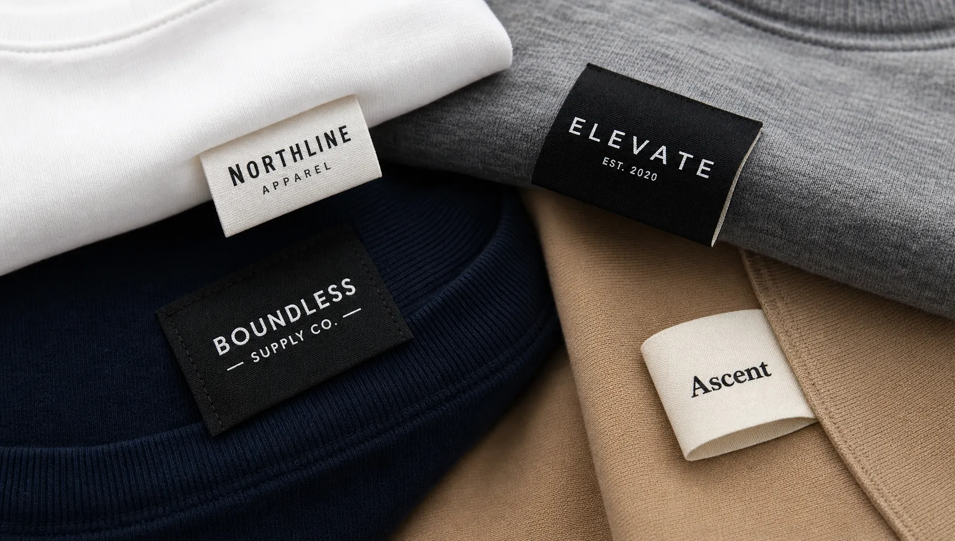
Leave enough breathing room around the logo
Negative space is one of the most underrated parts of logo label design. When a logo sits too close to the label edge, the finished tag can look crowded or unintentionally cropped. When the elements are packed too tightly together, even good artwork can feel messy.
Breathing room gives the logo a cleaner silhouette. It also helps account for sewing, folding, and the way fabric moves. On a folded label, for example, the visible area may be smaller than the total label size. If the logo is placed too close to a fold or seam allowance, part of the design may feel squeezed.
A practical rule is to design the label as a physical object, not just a rectangle on a screen. Consider how it will be attached, whether stitching will pass near the design, and how much of the label will remain visible once sewn into the product.
Match the label format to the logo shape
Different logo shapes work better with different label formats. A long horizontal wordmark may be ideal for a center-fold or end-fold label. A square icon may feel stronger on a patch. A short monogram may work well on a side seam tag, zipper pull, or small woven detail.
If your logo is tall and narrow, do not force it into a long, shallow label unless there is a strong reason. If your logo is wide, avoid compressing it into a vertical tag. Distorting or over-squeezing the mark makes the brand look less professional.
This is where custom label planning can make a major difference. HiLabels offers custom woven labels, patches, ribbons, zipper pulls, and care labels, which gives brands room to choose the format that fits the artwork rather than making the artwork fight the format. For a deeper look at premium woven branding, see these ideas for custom logo woven labels that make products look premium.
Design for real-life viewing conditions
A logo label is rarely viewed in perfect conditions. Customers see it while holding a garment, opening a package, checking a size, packing a bag, or comparing products in a shop. The tag may be bent, partly shadowed, stitched into a seam, or viewed from an angle.
This is why readability matters so much. The design should not only look good in a flat proof. It should still make sense when the product is being used. If your label is for kids' clothing, uniforms, travel goods, workwear, or lifestyle accessories, clarity becomes even more important because users may be looking for quick information.
For example, companies that support families through complex moves, such as relocation services for families moving to Australia, often rely on organized, trust-building materials. Brands creating welcome kits, luggage items, school accessories, or textile products for similar audiences should treat labels as practical wayfinding details as well as brand touches.
Think about the buyer's situation. Are they checking the size in a drawer? Looking for a care instruction before washing? Identifying a pouch inside a suitcase? A clean logo label reduces friction while reinforcing your brand.
Avoid too many colors on small tags
Color can make a label distinctive, but too many colors can reduce clarity. Every added color creates another boundary, another production consideration, and another opportunity for the design to feel busy.
For small logo labels, one to three colors are often enough. A single-color woven label can feel modern and premium. Two colors can create strong contrast. Three colors can work when each has a clear purpose, such as background, logo, and accent.
If your main logo uses many colors, consider creating a simplified label version. This does not weaken your brand. Most established brands have multiple approved logo versions for different contexts, including full color, one color, reversed, stacked, horizontal, and icon-only versions.
The goal is not to remove personality. The goal is to make the final tag look intentional instead of crowded.
Check line thickness and small details
Thin lines are one of the first things to fail at label scale. They may disappear, break up, or look uneven. Small counters inside letters, tiny stars, detailed illustrations, and fine borders can also become unclear.
Before ordering, zoom out until your artwork appears close to the final physical size on screen. Then ask a simple question: can someone recognize the logo immediately? If not, increase the size, simplify the detail, or choose a label format that gives the artwork more room.
It also helps to print the design at actual size on paper. While paper is not the same as woven material, it can reveal obvious problems with spacing, type size, and visual hierarchy.
Prepare clean artwork files
Cleaner production starts with cleaner artwork. High-quality files help reduce interpretation issues and give the production team a better foundation. If you upload a blurry image or low-resolution file, the finished result may not capture the logo as crisply as you expect.
For best results, prepare artwork that is simple, high contrast, and as close as possible to the final design. Avoid screenshots, compressed images, and logos copied from social media profiles. If you have vector artwork, use it. If not, use the highest-quality file available and remove anything that should not appear on the label.
A final pre-order check should include these points:
- Is the logo readable at actual label size?
- Are unnecessary taglines or micro-details removed?
- Does the color contrast work on the chosen background?
- Is there enough space around the logo for folds, seams, or stitching?
- Does the label format match the shape of the artwork?
- Are care, size, or compliance details separated from brand artwork when needed?
This review is especially helpful for small brands placing their first custom label order. A few careful decisions before production can prevent a label from looking crowded, unclear, or inconsistent with the rest of the product.
Think in systems, not one-off tags
The best logo labels rarely stand alone. They are part of a larger brand system that may include apparel labels, care labels, packaging ribbons, patches, zipper pulls, and hangtags. When these elements share a consistent visual language, the product feels more complete.
Consistency does not mean every item must use the same layout. A main woven label might use the full wordmark, a zipper pull might use the icon, and a ribbon might use a repeating logo pattern. Together, they create recognition without forcing one design to do every job.
This system-based approach is especially useful as your product line grows. Instead of redesigning from scratch each time, you can build a flexible set of label rules: approved colors, minimum logo size, preferred fold styles, icon-only uses, and spacing guidelines.
Frequently Asked Questions
What makes a logo label easier to read? A readable logo label uses simplified artwork, strong contrast, clear typography, enough spacing, and a label size that fits the amount of information. The fewer unnecessary details you include, the easier it is for customers to recognize the brand quickly.
Should I include my tagline on a small logo label? Only include a tagline if it remains legible at the final label size. If it becomes too small or crowded, remove it or use it on a larger packaging element instead.
How many colors should a logo label use? Many small labels work best with one to three colors. This keeps the design clean and helps the logo stand out. More colors can work, but only when the label is large enough and each color has a clear purpose.
Are woven labels good for detailed logos? Woven labels can look premium and durable, but very fine details may need to be simplified. Bold shapes, clear type, and strong contrast usually translate best into woven thread.
What file should I upload for a custom logo label? A clean vector file is ideal when available. If you do not have one, use the highest-resolution logo file you can, avoid screenshots, and make sure the artwork is clear at the final label size.
Create a cleaner logo label with HiLabels
A strong logo label is not just a small version of your logo. It is a carefully designed brand detail that considers size, thread, spacing, contrast, fold style, and real-life use.
HiLabels helps brands create custom woven labels, patches, ribbons, zipper pulls, and care labels with an easy online ordering process, artwork upload options, and experienced support. If you want your next tag to look cleaner, more readable, and more professional, start with a simplified logo, choose the right label format, and build the design around clarity from the beginning.


