How to Turn a Label Logo Into a Strong Brand Detail
A label logo has one job: make your product feel unmistakably yours at the exact moment someone touches it. On a website, hangtag, or social profile, your logo can rely on space, color, animation, and context. On a woven label, patch, ribbon, zipper pull, or care label, it has to work in miniature, in fabric, and in real use.
That is what makes it powerful. A great label logo is not just decoration. It is a brand detail customers notice when they try on a garment, open a package, gift a handmade item, or recommend your product to someone else. It can signal quality, reinforce your aesthetic, and turn a simple product into something that feels finished.
The key is not to shrink your logo and hope it works. The key is to translate your identity into a label format that is legible, durable, and intentional.
Start with the label's job, not the logo file
Before choosing thread colors, label size, or fold style, decide what role the label should play in the product experience. A label logo can do different jobs depending on where it appears and how visible it is.
A main woven label inside a collar or waistband often works as a trust marker. It tells the buyer who made the product and helps them remember the brand after purchase. A hem label or outer patch works more like a visible signature. It adds identity while the product is being worn or used. A care label supports compliance and clarity, but it can still feel branded when the typography and layout match your visual system.
This is where many small brands miss an opportunity. They treat every label as a place to repeat the same full logo. In reality, strong brands use different versions of the same identity. Your full wordmark might belong on the main label, while a monogram, icon, or simplified mark may work better on a sleeve, hem, zipper pull, or ribbon.
Ask three questions before designing the detail:
- Will the customer see this label before, during, or after purchase?
- Should this detail feel subtle, premium, playful, technical, handmade, or bold?
- Does the logo need to be read instantly, or simply recognized over time?
Those answers will shape better decisions than size alone.
Make the label logo readable at real size
A logo that looks beautiful on a screen may become difficult to produce on fabric if it contains thin strokes, tiny lettering, complex gradients, or delicate spacing. Woven labels are created with thread, so the design needs enough contrast and simplicity to translate cleanly.
This does not mean your label has to be plain. It means every element should earn its place. Small text, fine outlines, narrow gaps, and multiple color changes can reduce clarity when the label is only a few centimeters wide. If your logo includes an intricate symbol, consider creating a simplified label version that preserves the idea without forcing every detail into the weave.
For apparel and soft goods, legibility often improves when you:
- Use fewer colors with stronger contrast.
- Avoid very thin lines and tiny secondary text.
- Increase spacing between letters where possible.
- Choose a label size that gives the mark room to breathe.
- Test the logo at actual label size before ordering.
If you are preparing artwork for production, HiLabels has a practical guide with more detail on better custom design woven labels that can help you think through artwork, sizing, and fold choices before finalizing your order.
Translate visual identity into touch
A label logo is not only visual. It is tactile. The customer feels it against fabric, sees it from different angles, and judges its quality in the context of the product. That is why material, weave, edge finish, and placement matter as much as the artwork itself.
Think of the label as a small product component. It has to look right, feel right, and hold up. In technical fields, from apparel production to engineering solutions for industry and innovation, small details often determine whether the final result performs well in real conditions. Branding works the same way. A label that is scratchy, oversized, hard to read, or poorly placed can weaken the product experience, even if the logo itself is strong.
A polished label detail should match the product's promise. A luxury knitwear brand may want a soft, refined woven label with a restrained palette. A streetwear brand might choose a bolder patch or visible hem label. A children's product may benefit from softer edges, clear care information, and friendly color choices. A handmade gift line might use custom ribbon to make packaging feel personal before the product is even opened.
The point is consistency. If your brand voice is minimal, the label should not feel noisy. If your brand is expressive, the label should not feel generic.
Choose the right label format for the brand moment
Different label types create different impressions. The best choice depends on how the logo will be used, where the detail will sit, and how much visibility you want.
| Label format | Best use for a label logo | Brand effect |
|---|---|---|
| Woven label | Main brand label, neck label, waistband label, side seam label | Durable, professional, classic |
| Patch | Outerwear, bags, hats, uniforms, statement pieces | Bold, visible, textured |
| Ribbon | Packaging, gift wrap, product presentation, boutique details | Decorative, premium, memorable |
| Zipper pull | Jackets, bags, pouches, accessories | Functional, subtle, branded in motion |
| Care label | Garment information, fiber content, washing instructions | Practical, trustworthy, complete |
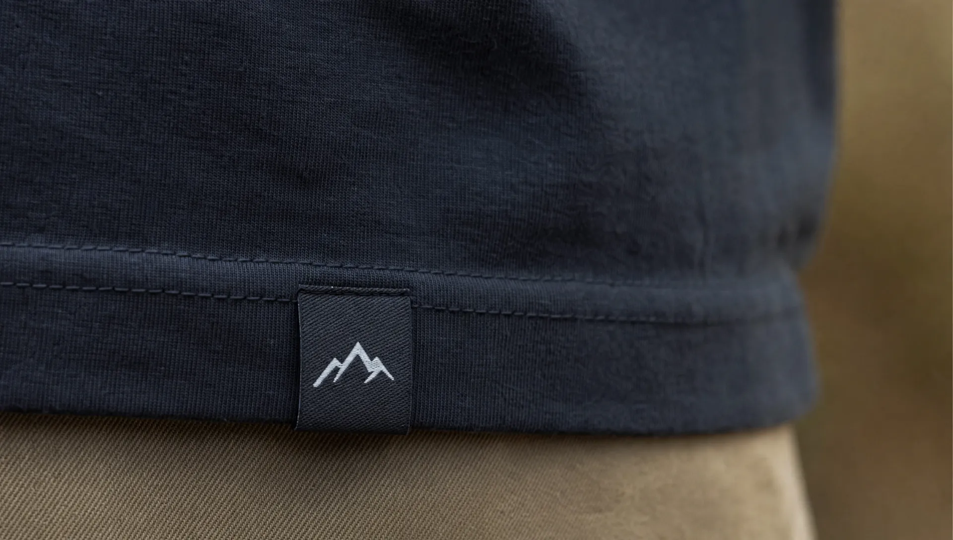
| Hem label | Sleeves, lower hems, side hems, small exterior signatures | Premium, subtle, recognizable |
A hem detail is especially useful when you want the logo to be visible without overwhelming the design. If that fits your product line, this guide on why custom hem labels add a premium finish explains how placement and scale can change the perception of a garment.
Build a small label logo system
A strong brand detail often comes from a small system, not one isolated label. Instead of using the same logo everywhere, create a hierarchy of logo applications.
Your full logo can appear on the main woven label. A shorter mark or icon can appear on zipper pulls, patches, or side seams. A small wordmark can appear on ribbon or packaging. Care labels can use the same typography or brand color logic without competing with the main logo.
This approach makes your product feel more considered. Customers may not consciously analyze each label, but they notice when everything belongs together. The product feels cohesive because each detail repeats the same visual language in a different way.
A simple label logo system might include:
- A primary woven label with the full brand name.
- A small exterior label using a symbol, initials, or short wordmark.
- A care label with clean typography and brand-consistent spacing.
- A ribbon or packaging detail that repeats one recognizable color or mark.
The goal is not to add labels everywhere. It is to make each label feel purposeful.
Use placement to make the logo feel intentional
Placement changes how a label logo is perceived. The same woven mark can feel discreet inside a neckline, premium on a hem, utilitarian on a care label, or bold on the outside of a bag.
For clothing, think about how the garment moves and how the wearer interacts with it. A neck label is seen during dressing. A hem label is seen in public. A sleeve label can become part of the silhouette. A waistband label can reinforce quality in denim, activewear, or loungewear. On accessories, a zipper pull or patch can turn a functional part into a recognizable brand cue.
For packaging and gifts, the label experience starts before the product is used. Custom ribbon, branded patches, or woven details can make the unboxing feel more personal. This is especially valuable for small brands, boutiques, handmade sellers, and designers who rely on repeat customers and word of mouth.
Good placement feels natural. Poor placement feels like an afterthought. Before ordering, place a paper mockup or printed sample on the product and view it from the customer's perspective. Check whether it competes with seams, pockets, closures, prints, or hardware.
Refine color, contrast, and finish
Color is one of the fastest ways to connect a label to the rest of your brand. But label color should be chosen for production and use, not only for brand guidelines.
A color combination that works on a backlit screen may not have enough contrast in thread. Very subtle tone-on-tone designs can look premium, but only if the logo remains visible enough for the intended use. High contrast can improve recognition, but too much contrast may feel harsh on a delicate garment.
Finish matters too. A folded edge can make a label easier to sew into seams. A centered fold can suit necklines and waistbands. A straight cut label can work well for patches or flat applications. The right construction helps the logo feel integrated into the product rather than simply attached.
When in doubt, simplify. Strong label design usually comes from clear choices, not extra decoration.
Proof the detail before production
The final step is to review your label logo like a customer, a designer, and a manufacturer at the same time. Look at the actual size, not a zoomed-in preview. Consider the fabric it will touch, the way it will be sewn, and the amount of wear it will receive.
Before approving a label, check:
- The logo is readable at final size.
- Colors have enough contrast for the chosen material.
- The fold, seam allowance, or stitch area does not cover important artwork.
- The label type matches the product's price point and personality.
- The design still feels like your brand when viewed without other packaging.
If you already have a logo and want to move from artwork to production, this walkthrough on ordering woven labels with your own logo can help you understand the practical steps, from preparing your file to reviewing the final details.
Common mistakes that weaken a label logo
One common mistake is trying to include too much information on a small label. A logo, tagline, website, location, social handle, and icon may all be useful in other contexts, but together they can make a woven label feel crowded. Choose the information that matters most for that specific label.
Another mistake is ignoring the product's material. A label that works beautifully on heavy denim may not suit silk, baby clothing, or lightweight knits. The weight, texture, and softness of the product should guide the label choice.
A third mistake is treating labels as an end-of-production task. Labels should be part of product planning early enough to influence placement, seam construction, and packaging. When labels are designed late, they are more likely to feel forced.
Finally, many brands forget to create a simplified logo version for small applications. A flexible identity gives you more control. It lets you maintain recognition without sacrificing clarity.
Frequently Asked Questions
What makes a label logo different from a regular logo? A label logo must work at a small size and in a physical material such as woven thread, fabric, or trim. It often needs simpler shapes, stronger contrast, and fewer details than a logo used on a website or printed marketing piece.
Should I use my full logo on every label? Not always. A full logo is useful for main brand labels, but smaller details such as hem labels, zipper pulls, and patches may work better with initials, an icon, or a simplified wordmark.
What is the best label type for a premium brand detail? Woven labels are a classic choice for a durable, professional finish. Hem labels, patches, ribbons, and zipper pulls can also create premium details when they match the product style and are placed intentionally.
How small can my label logo be? It depends on the complexity of your artwork, the number of colors, and the label type. As a rule, test the logo at actual size and remove details that become unclear or crowded.
Can a care label still support branding? Yes. Even when a care label is mainly functional, clean typography, consistent spacing, and a subtle brand mark can make it feel connected to the rest of your product identity.
Turn your logo into a detail customers remember
A label logo becomes powerful when it feels designed for the product, not copied onto it. The right size, material, placement, and finish can make a small label carry a big part of your brand experience.
HiLabels helps brands create custom woven labels, patches, ribbons, zipper pulls, and care labels with a straightforward online process and support for uploaded artwork. Whether you are refining a clothing line, launching accessories, or upgrading packaging, start with the detail your customer will touch, see, and remember.


