How Small Can Text Be in Woven Label Design?
Small text is often the first thing to fail in woven label design. A tagline can look crisp on a monitor yet become difficult to read when its thin strokes and narrow spaces are reproduced in thread.
For an initial layout, aim for capital letters around 2 mm tall. Treat lettering around 1.5 mm or smaller as something to confirm with your manufacturer before ordering. These are conservative design starting points, not universal production limits or HiLabels specifications. The workable minimum depends on the font, weave, colors and space around each letter.
A practical starting point for small text
There is no single minimum font size that works for every woven label. A bold, open letterform may remain readable at a height where a delicate script loses its shape.
Use the following table to decide which parts of your artwork need closer review. The measurements refer to the visible height of capital letters, not the font size shown in your design software.
| Capital-letter height | How to approach it |
|---|---|
| Around 1 mm or less | High-risk detail. Consider enlarging or removing it, and request production-specific confirmation. |
| Around 1.5 mm | A small-text option to discuss with the manufacturer, especially if the font has narrow openings or thin strokes. |
| Around 2 mm | A conservative starting point for simple lettering, still subject to artwork review. |
| Around 2.5 mm or more | Provides more room for recognizable letter shapes, although complex fonts can still cause problems. |
None of these measurements guarantees readability. A woven sample provides stronger evidence than a size rule alone, particularly when essential information is small.
Why woven label design needs more than a point size
A font’s point size measures its nominal type body, not the visible height of its letters. That distinction matters when you are working within a few millimeters.
One typographic point equals approximately 0.353 mm. A 6-point font therefore has a nominal size of about 2.12 mm, but its capital letters will generally be shorter than that. Two fonts set to 6 points can have noticeably different visible letter heights.
For small text, check three separate measurements:
- Capital height: The visible height of uppercase letters such as H or E.
- Lowercase x-height: The height of lowercase letters such as x, excluding ascenders and descenders.
- Stroke and opening width: The thickness of the lettering and the clear space inside characters such as e, a and B.
A font with a generous x-height can make mixed-case wording easier to read without increasing its nominal point size. However, large lowercase letters do not solve thin strokes or cramped spacing.
Measure the actual letter shapes at the intended output size. Do not approve tiny text simply because the software reports a familiar font size.
Choose letterforms that remain distinct in thread
Open shapes matter more than font categories
A simple sans serif is often a useful starting point, but “sans serif” is not a guarantee of readability. Some styles are tightly condensed or have nearly closed openings.
Look closely at the smallest wording in your woven label design. Can you distinguish an uppercase I from a lowercase l? Does an e still have a visible opening? Does the space inside an a remain clear?
Favor moderate stroke thickness, open interior spaces and recognizable character shapes. Very thin lettering can disappear, while very heavy lettering can close up its own openings. Increasing weight is helpful only until it starts filling those spaces.
Avoid forcing a long phrase into a narrow area by horizontally compressing the font. Shortening the wording or using a second line usually preserves the letter shapes better.
Contrast helps, but it cannot restore missing detail
Strong light-dark contrast makes small lettering easier to distinguish from its background. Pale gray on white or two similar mid-tone colors leave less visual separation.
Still, contrast cannot rescue a letter whose opening has become too small to reproduce. White lettering on black also deserves careful review: the dark spaces inside and between the letters must remain distinct.
Ask the manufacturer whether the proposed weave and thread choices suit the smallest details. Finer thread and an appropriate weave can help reproduce detail, but neither creates unlimited resolution. HiLabels’ guide to choosing woven damask labels for fine detail explains the material considerations worth discussing.
Calculate usable space before making text smaller
The ordered label dimensions are not always the same as the visible design area. Folded ends, seam insertion and stitching can reduce the room available for lettering.
For example, suppose your proposed label is 40 mm wide. If the construction requires 5 mm at each end for attachment, the remaining central area is 30 mm wide before any additional clearance. Those figures are a layout example, not a standard allowance: confirm the actual dimensions for your chosen construction.
In woven label design, reducing text should come after checking whether the layout can use space more effectively. Try removing a nonessential tagline, placing secondary wording on another line or choosing a wider label before reducing letter height.
Keep the brand name visually dominant. A tiny slogan adds little if customers cannot read it without effort.
Placement matters too. A label that looks clear when flat may curl, fold or sit partly inside a seam after attachment. Check the installed position, especially on small accessories, soft necklines and narrow garment seams.
Test the lettering at its actual finished size
Start with a measured paper mockup
Create a layout at the intended physical dimensions, including fold lines and attachment areas. Print it at 100% scale, with “fit to page” disabled, then verify a known measurement with a ruler. Printer settings can change the output size without making the change obvious.
Cut out the mockup and place it where the label will be sewn. Read it at an ordinary viewing distance rather than bringing it close to your face. If someone unfamiliar with the brand can review it, ask them to read the smallest line without prompting.
This is a useful screening test for woven label design, but it is not a production test. Paper reproduces smooth edges and fine details that thread may not reproduce in the same way.
If the wording is difficult to read on paper at actual size, revise it before moving to a production proof.
Separate digital approval from woven verification
A digital proof helps confirm wording, dimensions, placement and intended colors. Enlarging it on screen is useful for spotting spelling errors, but it does not establish small-text readability in thread.
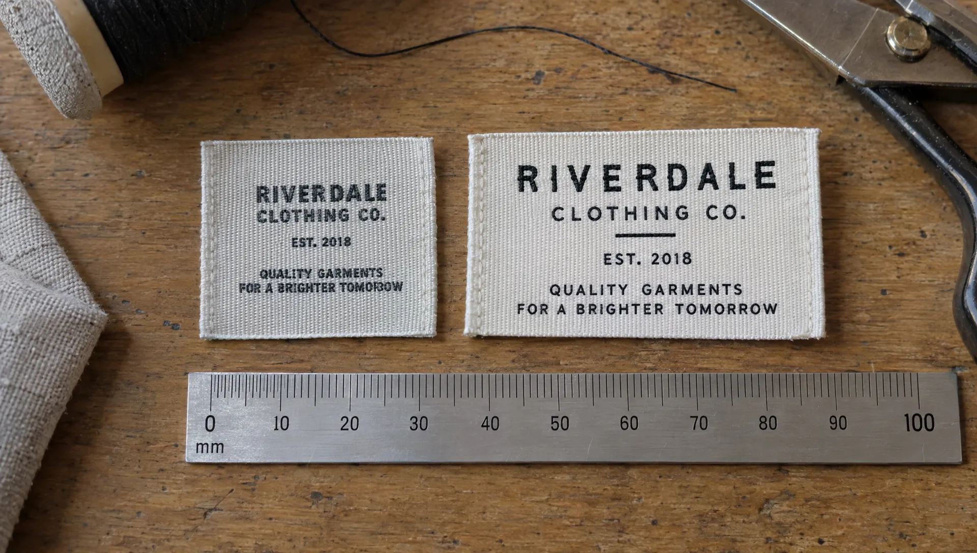
Ask whether the proof is an artwork layout, a production simulation or a photograph of an actual woven sample. These are different forms of evidence. If a photograph is supplied, request a clear view with a size reference rather than relying only on a magnified close-up.
For critical small lettering, ask about physical sampling, any associated costs and whether the sample represents the intended production construction. Do not assume sampling is included with every order.
If the label will touch skin, use a physical sample to evaluate comfort as well. Edge finish, fold position and attachment can affect how it feels when worn. A paper mockup cannot answer those questions.
Prepare artwork that makes small-text review easier
Give the manufacturer enough information to assess the lettering rather than asking only, “Will this font size work?” A focused artwork handoff reduces ambiguity.
Include the following in your woven label design submission:
- Finished dimensions: State the width, height and measurement units, and clarify whether these refer to the open or folded label.
- Construction details: Identify the intended fold, sewing position and any required clear areas.
- Measured lettering: Call out the smallest capital height or lowercase x-height rather than supplying only a point size.
- Suitable artwork: Ask which file formats are accepted. A vector file such as PDF, AI or SVG can preserve shapes when supported; embedding or outlining fonts helps prevent substitutions.
- Color references: Specify the intended colors and ask how artwork colors will be matched to available threads.
- Approval priorities: Identify wording that must remain readable and details that may be simplified if necessary.
Keep an editable original before converting text to outlines. If you supply raster artwork, provide it at the manufacturer’s requested resolution and final dimensions. Upscaling a small screenshot does not restore missing detail.
For help organizing the wider ordering process, HiLabels’ guide to designing woven labels online without the guesswork covers artwork preparation and proof review.
Avoid these small-text compromises
The most common mistake is treating every line as equally important. A brand name, collection name, slogan, website and size designation can overwhelm a compact label. Establish a hierarchy, then remove information that does not need to occupy that space.
Another mistake is adding tracking without checking the total width. Slightly more space between letters may help separate them, but excessive spacing can force you to shrink the entire line. Review both the individual letters and the complete word.
Finally, do not make mandatory information unreadably small just to preserve a branding layout. For US apparel, fiber content, country of origin, business identification and care instructions can involve separate requirements and exceptions. Consult the FTC’s textile labeling guidance and Care Labeling Rule guidance, then verify the rules for the product and markets involved.
A separate information label may be more suitable than crowding everything onto the branding label.
Frequently asked questions
Is 6-point text large enough for a woven label? Not necessarily. Point size does not equal visible letter height, and fonts vary considerably. Measure the actual characters, inspect their openings and ask the manufacturer to assess the artwork at its finished size.
Can woven label design include text smaller than 1.5 mm? Some combinations of lettering, thread and weave may support it, but treat that size as a production-specific question rather than a dependable default. Request confirmation and, where readability is critical, evaluate a woven sample.
Are uppercase letters always easier to weave? No. Uppercase lettering avoids lowercase ascenders and descenders, but narrow capitals, thin strokes and tightly spaced letters can still be difficult to reproduce. Evaluate the actual font and wording.
Should I enlarge the label or remove the tagline? If the tagline is optional, removing it is often the simplest solution. Enlarge the label when the information genuinely needs to remain and the garment has room for it without compromising placement or comfort.
Check the smallest line before you order
Before ordering, confirm the visible design area, measure your smallest letters and review an actual-size mockup. If anything remains borderline, ask for artwork feedback rather than assuming it will become clearer in production.
Ready to prepare your label? Explore HiLabels’ custom woven label options and submit your artwork with the dimensions, intended placement and small-text questions clearly identified.


