How to Choose Woven Damask Labels for Fine Detail
Woven damask labels are one of the best options when your brand mark includes small lettering, clean linework or a refined finish that needs to last through wear and washing. They are commonly used for fashion labels, accessories, handmade goods, premium home textiles and any product where the label should feel like part of the item rather than an afterthought.
The challenge is that fine detail does not happen automatically. A label is not printed ink on paper. It is built from threads, so every curve, letter and border must be translated into a woven structure. The right choices in artwork, size, color, fold and supplier guidance can make the difference between a crisp brand label and one that feels crowded or hard to read.
This guide explains how to choose woven damask labels for fine detail without overcomplicating the process.
Why damask is the best woven label type for fine detail
Damask is known for its tight weave, soft feel and smooth surface. Compared with many standard woven label styles, damask can usually hold sharper detail because it uses finer threads and a denser construction. That makes it a strong choice for logos with small type, thin shapes, compact symbols or an elevated retail presentation.
If you are still deciding whether damask is the right label type for your product, HiLabels has a helpful breakdown of when to choose custom damask woven labels based on appearance, texture and durability.
Damask works especially well when the label needs to look polished up close. A neck label in a premium garment, a brand tab on a handbag, a woven label on a scarf or a small signature mark on a handmade item can all benefit from damask. The woven threads create depth and permanence, so the branding does not sit on top of the fabric like a surface print.
That said, damask still has limits. It can capture fine detail better than many woven options, but it cannot reproduce every effect from a digital logo. Tiny gradients, photographic texture, hairline strokes and very small decorative flourishes may need to be simplified before weaving.
Start by identifying the detail that matters most
Before choosing size or colors, decide which parts of your design must remain clear. Many labels fail because every detail is treated as equally important. In a small woven format, hierarchy matters.
For most brands, the priority is usually one of these elements:
- The brand name or initials
- A simple icon, monogram or symbol
- A short product line name
- A small border, frame or decorative accent
- A size, origin or short descriptor
If your logo includes several fine elements, choose the one that carries the most brand recognition. A cleanly woven brand name is usually more valuable than preserving a tiny tagline that nobody can read. If the tagline is essential, consider increasing the label size or moving supporting information to a care label, hang tag or packaging insert.
A useful test is to view your artwork at the actual label size on screen, then step back from it. If the detail disappears before weaving, it will not become clearer once translated into thread.
Translate your artwork into a woven format
Fine detail begins with artwork that is suitable for weaving. A woven label is built on a grid of interlaced threads, so very thin lines, soft shadows and tightly spaced shapes can merge together.
Vector artwork is usually the best starting point because it keeps edges clean and scalable. If you only have a small image file, the weaver may need to redraw or simplify it before production. Uploading the highest quality artwork you have helps preserve the parts of the design that matter.
For more general label design guidance, the HiLabels article on better custom design woven labels covers practical ways to simplify artwork, improve readability and avoid common design issues.
Here is how common design elements behave in woven damask labels:
| Design element | What helps fine detail | What can reduce clarity |
|---|---|---|
| Small lettering | Open letterforms, medium weight fonts, enough spacing | Thin scripts, condensed type, tight tracking |
| Lines and borders | Slightly thicker strokes, simple geometry | Hairline strokes, multiple borders close together |
| Icons and symbols | Solid shapes, clear negative space | Tiny internal cutouts, complex illustrations |
| Color transitions | Strong contrast between thread colors | Gradients, shadows, soft fades |
| Logo marks | Simplified vector artwork | Low resolution images, overly detailed crests |
The goal is not to strip away personality. It is to make sure the label preserves the feeling of your brand in a physical woven material.
Choose a label size that gives the design room to breathe
Size has a direct impact on detail. The larger the woven area, the more room there is for threads to define letters and shapes. When a detailed logo is forced into a tiny label, the weave has fewer opportunities to show separation between lines.
A common mistake is choosing label dimensions first, then squeezing the logo into that space. A better approach is to begin with the logo or information that must appear, then choose the smallest label size that keeps it readable.
For fine detail, pay close attention to three areas:
- Letter height: Small text needs enough vertical space to form recognizable characters.
- Spacing: Letters, icons and borders need breathing room so they do not blur together.
- Safe area: Important details should sit away from the cut edge, fold line or seam allowance.
If you want a very small exterior tab, simplify the artwork to a monogram or icon. If you want the full brand name, tagline and decorative border, a wider label will usually produce a better result.
Use contrast to sharpen the woven design
Thread color has a major effect on how crisp woven damask labels appear. Fine detail is easiest to see when there is clear contrast between the foreground and background colors. Black on white, white on navy, cream on charcoal or deep green on ivory are easier to read than two colors with similar values.
Color value matters as much as color family. A pale gray logo on a light beige background may look refined in a digital mockup, but it can lose definition once woven. If subtle branding is your goal, that may be acceptable. If fine detail and readability are priorities, stronger contrast is safer.
Limit the number of colors when the design is small. Too many thread colors in a compact label can make the surface feel busy. A two or three color design often looks more premium and more legible than a label trying to reproduce every color in a digital brand palette.
Thread colors may also appear slightly different from screen colors because woven labels are made from physical yarns, not pixels. If an exact shade is critical, provide brand color references and be prepared for the closest thread match rather than a perfect digital match.
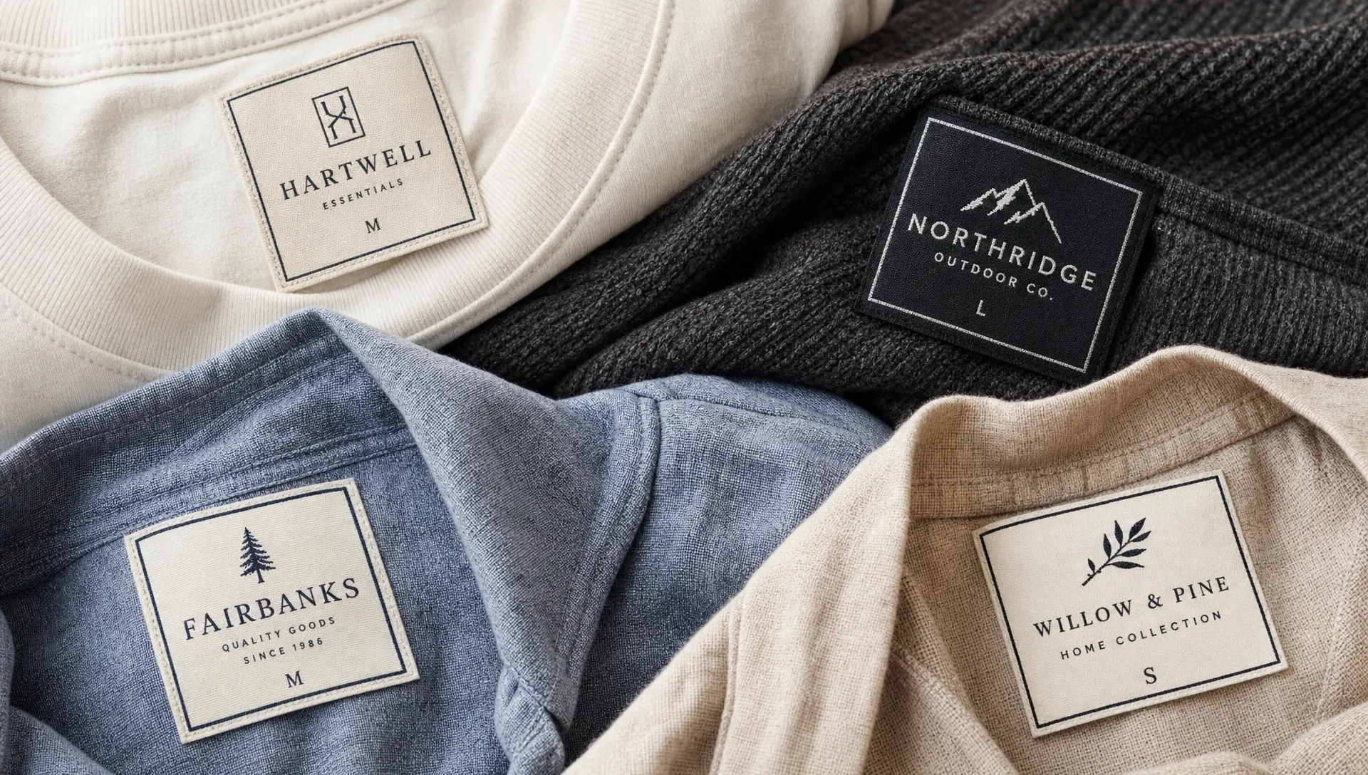
Match the fold style to the placement
The fold style affects both the look of the label and the amount of usable design space. Fine detail should never sit too close to a fold, seam or cut edge. If it does, part of the design may be hidden, distorted or sewn into the garment.
Common options include straight cut labels, end fold labels, center fold labels and loop fold labels. Each one has a different purpose.
Straight cut labels can work well when the label is sewn flat on all sides or used as a visible brand patch. End fold labels create a clean finish on the left and right sides, which is useful for apparel and accessories. Center fold labels are often used at necklines or seams because the front can show branding and the back can include basic information if the format allows. Loop fold labels work well as side seam tags or small exterior accents.
For fine detail, ask yourself where the viewer will see the label and how it will be sewn. A beautifully woven logo can still look poor if stitching cuts through a letter or if a fold line runs through a delicate icon.
Consider the feel of the label against the product
Damask is often chosen not only for detail but also for comfort. Its smoother surface can feel softer against the skin than rougher label types, making it suitable for neck labels, children’s clothing, lingerie, scarves and premium garments.
The finished feel still depends on the label construction, edge finish, thread density and placement. A detailed damask label used inside a lightweight shirt should be soft, flexible and proportionate to the garment. A larger exterior brand label on denim, outerwear or bags can be more structured because it is not sitting directly against the skin.
Think about the product category before approving the design. A luxury dress label, a streetwear hem tag and a handmade quilt label may all use woven damask, but they should not necessarily use the same size, fold or thread contrast.
Decide what belongs on the damask label and what does not
Fine detail improves when the label has a clear job. A brand label does not need to carry every piece of product information.
Use woven damask labels for information that benefits from a premium, permanent presentation: brand name, logo, size marker, collection name or a simple origin statement. Move dense information such as washing instructions, fiber content, compliance text or long product copy to a dedicated care label or another format.
This separation keeps your main woven label clean and readable. It also helps customers experience the brand label as a design element rather than a block of required text.
Work with a supplier that understands fine woven detail
Choosing the right label supplier matters because fine detail depends on both design preparation and weaving quality. A supplier with experience can tell you when a line is too thin, when a label should be larger or when a color combination may lose clarity.
HiLabels offers custom woven labels, damask options, care labels, ribbons, patches and zipper pulls, with an online label creation tool and artwork upload for brands that already have a design prepared. The company also emphasizes European loom quality and personalized customer service, which is especially useful when your design includes small details that need careful handling.
If you are preparing to place an order, the process is easier when you provide clear artwork, final label dimensions, intended placement, fold preference and any brand color references. You can also use HiLabels resources on how to design your own woven labels online if you want a guided approach before submitting your design.
Before approving production, confirm these points with your supplier:
- The smallest text or line in the artwork can be woven clearly
- The label size supports the level of detail you want
- The chosen fold does not interfere with the logo or text
- The color contrast is strong enough for readability
- The artwork file is clean enough for weaving
- Any legal, care or fiber information is placed on the correct label type
A little clarification before production is better than discovering after delivery that your logo needed more space or fewer details.
Avoid common mistakes with fine detail
The first mistake is treating a woven label like a printed sticker. Print can handle tiny dots, gradients and delicate photographic effects. Weaving needs thread paths, contrast and simplified shapes.
The second mistake is reducing a detailed logo without adapting it. If a logo was designed for a website header, storefront sign or packaging, it may need a label version. Many strong brands use simplified marks for small applications while keeping the full logo for larger surfaces.
The third mistake is choosing subtle colors for a label that needs to be read quickly. Low contrast can look elegant, but only when the design is simple enough to support it.
The fourth mistake is placing fine elements too close to the edge. Leave room for cutting, folding and stitching. Safe spacing protects the design and makes the finished label look intentional.
A simple decision framework
If your design includes fine detail, choose woven damask labels when you want a premium woven finish, soft hand feel and long lasting brand presentation. Increase the label size when the full brand name or multiple design elements must remain legible. Simplify the artwork when the label needs to be small. Use stronger contrast when readability matters. Choose the fold only after you know exactly where and how the label will be sewn.
This approach keeps the decision practical. You do not need to know every technical detail of weaving to make a better label. You need a clear design priority, a realistic label size and a supplier that can translate your artwork into thread.
Frequently Asked Questions
Are woven damask labels good for small text? Yes, damask is one of the better woven options for small text because it can produce a tighter, smoother weave. Small text still needs enough height, spacing and contrast to remain readable.
Can damask labels reproduce a detailed logo exactly? They can reproduce many detailed logos well, but not every digital effect. Gradients, shadows, hairline strokes and very small internal details may need to be simplified for weaving.
How many colors should I use for a detailed damask label? Many detailed labels look best with two or three thread colors. More colors can work, but too many in a small space may reduce clarity.
What file type is best for woven damask label artwork? Vector artwork is usually best because it keeps lines and shapes clean. If you do not have vector artwork, provide the highest resolution version available and ask whether adjustments are needed.
Should I choose a larger label for fine detail? In many cases, yes. A larger label gives the weave more room to define letters, icons and borders. If the label must stay small, simplify the design instead of shrinking every element.
Create woven damask labels with confidence
Fine detail is possible when the label is designed for the woven medium from the start. Keep the artwork clean, choose enough space, use readable contrast and match the fold to the final placement.
If you are ready to turn a detailed logo into a premium woven finish, HiLabels can help you create custom woven damask labels with durable craftsmanship, online ordering tools and support for uploaded artwork.


