How to Create a Logo for Your Brand That Works on Labels
A logo for your brand has to do more than look good on a website header. If it will appear on woven labels, patches, ribbons, zipper pulls, care labels or packaging, it also has to survive scale, texture and production limits. A mark that looks polished on a large screen can become muddy when it is stitched in thread or reduced to a tiny clothing tag. The goal is not to make a plain logo. The goal is to make a flexible logo system that keeps its character when it becomes a physical brand detail customers can touch.
Build a logo for your brand with label production in mind
Labels are small, tactile and often viewed quickly. That changes the design brief. Instead of asking only whether the logo feels stylish, ask whether it can be recognized in a few seconds on fabric, folded into a seam, stitched onto a patch or repeated along ribbon.
When you create a logo for your brand with labels in mind, you are designing for real-world use before you fall in love with a complicated concept. This saves time later because the artwork is less likely to need heavy simplification before production.
A label-friendly logo usually has three traits: a clear outer shape, limited fine detail and strong contrast between the logo and the background. It may include a wordmark, symbol or monogram, but each element needs a job. If a flourish, texture or tiny tagline does not help recognition at label size, it probably belongs in a larger brand application instead.
Start with the label format before refining the design
Different label products reward different logo choices. A woven center-fold clothing label has different constraints than a patch on a jacket or a printed care label inside a garment. Your logo for your brand should therefore have at least one version that suits the format you plan to order most often.
Use the table below as a practical starting point, not as a fixed rule. Production methods, materials and sizes can vary, so always check your chosen product specifications before approving artwork.
| Label or trim type | What the logo needs most | Design choice that usually helps |
|---|---|---|
| Woven label | Clean shapes and readable letters | Simplified wordmark or icon with limited detail |
| Patch | Strong silhouette and clear border | Bold emblem, badge or monogram |
| Ribbon | Repeatable rhythm | Horizontal logo lockup or small symbol pattern |
| Zipper pull | Instant recognition at tiny size | Single icon, initials or simplified mark |
| Care label | Legibility and hierarchy | Text-first layout with logo used sparingly |
If you are planning several applications, it helps to define your broader label system early. HiLabels has a helpful guide on how to create custom labels that match your brand system if you want to align logo, material, color and placement before ordering.
Design a core mark, then create label-safe versions
Many brands make the mistake of treating one logo file as the answer to every use case. A better approach is to create a core mark first, then prepare simplified versions for small formats.
A practical logo family might include a primary logo, a compact version, a symbol-only version and a one-color version. The primary logo can be used on packaging, websites and lookbooks. The compact version can work on woven labels or patches. The symbol-only version can fit zipper pulls, ribbon repeats or very small tags.
Before you finalize a logo for your brand, shrink it on screen and print it at the approximate size of the label. If the letters blur together, the icon loses its outline or the tagline becomes unreadable, simplify the artwork before production. Removing detail at this stage is not a compromise. It is what makes the logo more useful.
Choose typography that stays readable when woven or printed
Typography often fails before the symbol does. Thin strokes, extreme contrast between thick and thin lines, tight spacing and decorative serifs can disappear when reduced or woven. Script fonts can look beautiful on a hangtag but become difficult to read on a narrow clothing label.
For label use, start with letterforms that have open counters, steady stroke weight and enough spacing between characters. Counters are the enclosed spaces in letters such as a, e, o and p. If those spaces close up at small size, the brand name becomes harder to read.
You do not have to choose a boring font. You do need a type style that supports the personality of the brand without fighting the production method. A luxury label may use an elegant serif with simplified details. A streetwear label may use bold sans serif type or a compact monogram. A handmade brand may use a warm custom wordmark, but it should still be tested at actual label size.
Plan color around thread, fabric and contrast
Color on labels is not the same as color on a backlit screen. Threads, fabrics and printing methods all affect how a color appears. A soft beige logo on cream fabric may look refined in a digital mockup but nearly invisible on the finished tag. A neon accent may be part of your identity but may need adjustment depending on the product type.
A practical logo for your brand should include a one-color version and a high-contrast version. These versions protect consistency when the full color palette is not practical.
| Color decision | Why it matters on labels | Safer approach |
|---|---|---|
| Low contrast logo and background | Details can disappear in fabric texture | Pair light with dark or dark with light |
| Too many colors | Small woven details may become cluttered | Limit the label version to key brand colors |
| Gradients or shadows | They may not translate cleanly into thread | Use flat colors for production artwork |
| Very fine outlines | Lines can break up or look uneven | Thicken outlines or remove them |
For digital contrast principles, resources such as the WebAIM contrast checker can help train your eye, even though physical labels still need production-specific review.
Test the logo at actual label size
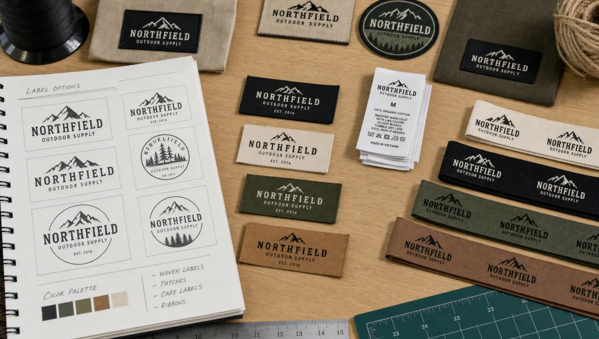
The safest way to judge a logo for your brand is to stop viewing it only at presentation size. Zooming out on screen helps, but printing a rough test is even better. Place the test on fabric, fold it if the final label will be folded and view it from the distance a customer would normally see it.
Use this quick review before sending artwork into production:
- Can you read the brand name without squinting?
- Does the symbol still have a recognizable silhouette?
- Is there enough empty space around the artwork?
- Does the logo work in one color?
- Does the design still feel like your brand when simplified?
- Will the shape fit the label, patch, ribbon or zipper pull format?
If the answer is no to one or two items, do not assume production will fix it. Production can make good artwork tangible, but it cannot make overly complex artwork simple. For more focused design checks, the HiLabels article on cleaner, more readable logo labels goes deeper into spacing, contrast and small-format clarity.
Prepare artwork so the finished label matches the idea
Good logo design still needs clean file preparation. Vector artwork is often the safest working format because it can scale without losing sharpness. If your logo exists only as a low-resolution image, rebuild it before ordering labels. Blurry files, tiny textures and unclear edges make it harder to achieve a clean physical result.
Keep a master file with editable shapes and text, plus production-ready versions for each label use. Convert fonts to outlines only in the final production copy, not in the editable master. This preserves flexibility if you need to change spacing, adjust the brand name or prepare another label size later.
If you are uploading artwork through an online ordering process, check the preview carefully and ask for help when something is unclear. HiLabels offers custom woven labels, patches, ribbons, zipper pulls and care labels, along with an online creation process and upload artwork option. That does not replace good design judgment, but it makes ordering easier once your logo is ready.
Think beyond one label and build a repeatable brand detail
A flexible logo for your brand should feel consistent across products without looking forced. The logo on a neck label, the emblem on a patch and the mark on a ribbon do not need to be identical in size or layout. They do need to feel related.
One useful method is to define which part of the logo carries the most recognition. For some brands, it is the full wordmark. For others, it is a symbol, set of initials, border shape or color pairing. Once you know the strongest identifier, you can use it across label types without overcrowding every piece.
For example, a clothing brand might use the full wordmark on a main woven label, a symbol on a sleeve patch, initials on a zipper pull and a small repeat pattern on ribbon packaging. The customer sees variation, but the system still feels unified. If this is your next step, you may find it useful to review how to create a brand that looks consistent on every product.
Avoid the common mistakes that make logos fail on labels
Most label logo problems come from trying to preserve too much. Designers and founders often want to include the full name, tagline, founding year, icon, border, texture and decorative detail in one small space. On a label, restraint usually looks more premium.
Another common mistake is designing only for the most exciting application. A bold patch may be the hero detail, but the same logo still needs to work on a care label or inside seam tag. If your brand depends on repeat purchasing, those quiet details matter because customers handle them long after the first impression.
Also consider basic legal clearance. If the logo will identify your business in the marketplace, search existing marks before investing in labels and packaging. The USPTO trademark search is a useful starting point for U.S. brands, though legal advice is best for registration decisions.
Frequently Asked Questions
How simple should a logo be for woven labels? It should be simple enough to stay readable when reduced to the planned label size. Keep the strongest shapes, remove tiny details and test a one-color version before ordering.
Do I need different logo files for labels, patches and ribbons? Usually yes. You can keep one brand identity, but prepare different lockups for each format. A patch may need a bold emblem, while a ribbon may need a horizontal or repeating version.
Can I use a tagline on a clothing label? You can, but only if the label is large enough for the tagline to remain readable. For small woven labels, the brand name and symbol are often more important than secondary copy.
What file type is best for label artwork? Vector artwork is generally preferred because it scales cleanly. Keep an editable master file and prepare production copies based on the requirements of the label product you are ordering.
Should my label logo match my website logo exactly? It should feel like the same brand, but it does not always need to be identical. A simplified label version is often better than forcing a detailed website logo into a tiny physical format.
Create labels that give your logo a polished finish
Once your logo system is clear, the label becomes more than a tag. It becomes a small but memorable proof of quality. HiLabels helps brands create custom woven labels, patches, ribbons, zipper pulls and care labels with professional craftsmanship and a straightforward online ordering process.
If you are ready to turn your artwork into durable brand details, start with HiLabels and choose the label format that fits your product best.


