How to Order a Logo That Reproduces Well in Woven Details
Ordering a logo for woven details is not the same as sending a graphic to a printer. If you are ready to order logo labels, patches, ribbons or zipper pulls, the most important question is not whether the design looks good on screen. It is whether the mark can survive being translated into thread, scale, texture and edge definition. A few smart choices before production can protect your brand identity and make the finished detail look intentional instead of blurry or overcrowded.
Why woven details need a different logo mindset
Woven branding is built from threads, not ink. That changes how lines, curves, color transitions and small letters appear. A printer can place tiny dots of ink with very fine resolution, but a woven label uses interlaced threads that create the visible surface. Even with quality looms, thread has thickness, direction and texture.
This is why a logo with hairline strokes, delicate scripts or tiny supporting text may look polished on a website but lose definition on a neck label. Curves can become slightly stepped. Tight counters inside letters such as a, e and o can fill in. Small gaps between shapes can close. Gradients and shadows usually need to become flat thread colors.
That does not mean your logo must be boring. It means the woven version should focus on the parts of the identity that matter most. That may be the wordmark, an icon, a monogram or a single strong shape. The best time to order logo labels is after you have tested the design at the actual finished size, not only at full scale on a design monitor.
Before you order logo artwork, decide what must survive at thread size
Start by identifying the non-negotiable brand cues. If your audience recognizes your brand by a bold wordmark, protect letter clarity first. If your icon carries the identity, give it enough space and contrast to read quickly. If your logo includes a tagline, ask whether that tagline truly belongs on a woven trim or whether it should move to packaging, a hang tag or a care label.
| Logo feature | Weaving risk | Stronger woven approach |
|---|---|---|
| Hairline strokes | Lines can disappear or look broken | Thicken strokes and simplify edges |
| Tiny tagline | Text may fill in or become unreadable | Remove it or use it on a larger trim |
| Gradient or shadow | Thread cannot reproduce smooth digital effects | Convert to solid color areas |
| Very tight spacing | Letters and shapes can merge | Increase spacing and open counters |
| Many small colors | Detail can look noisy at label size | Limit colors to the strongest brand contrast |
When you order logo labels from a file built for a website, packaging mockup or social profile, do not assume every element belongs on the woven version. Create a label-specific version that keeps the recognizable structure but removes anything that will not reproduce cleanly. If you are still shaping the mark itself, HiLabels also has a helpful guide on how to build your own logo for woven labels before you prepare your order.
Match the logo version to the woven product
A single brand may need several logo versions because each trim has a different viewing distance, surface and purpose. A center fold neck label can usually support a brand name and perhaps a small icon. A woven patch can carry a bolder emblem. A ribbon repeat may need a simplified horizontal mark. A zipper pull often works best with a compact symbol or initials.
Before you order logo labels across several trims, decide what each item is supposed to do. The main label may introduce the brand. The size or care label may support utility. A patch may act as a visible style detail. A ribbon may reinforce packaging or presentation.
| Woven item | What usually works well | What to avoid |
|---|---|---|
| Main woven label | Wordmark, icon or monogram with clear spacing | Long taglines and complex illustrations |
| Woven patch | Bold emblem, badge shape or simplified graphic | Fine interior texture and tiny border text |
| Custom ribbon | Repeating wordmark or simple symbol | Tall stacked logos that interrupt the repeat |
| Zipper pull | Initials, icon or short mark | Full logos with small secondary copy |
| Care label | Clear care information and simple branding | Decorative detail that competes with instructions |
If you are building a full trim system, it helps to plan the family together rather than treating each item as a separate design. HiLabels explains this broader approach in its guide to branding your logo across labels, patches and packaging.
Use color and contrast like production materials, not screen effects
Thread color has physical character. It reflects light, sits next to other threads and may appear slightly different depending on the base material, surrounding colors and viewing angle. Screen colors are backlit. Woven colors are material. That difference matters when you choose a logo palette.
Strong contrast is usually the safest path. Dark thread on a light background, light thread on a dark background or a clear two-color combination will often reproduce better than several related mid-tones. If your brand palette uses subtle beige, cream, gray or pastel colors, test whether the contrast is strong enough at the intended label size.
If color accuracy is central to your brand, include reference colors with your artwork. Pantone references, existing brand guidelines or a physical sample can help communicate intent. Still, the goal is the closest woven interpretation, not a perfect digital match. A clean, legible woven result is usually more valuable than forcing too many colors into a small label.
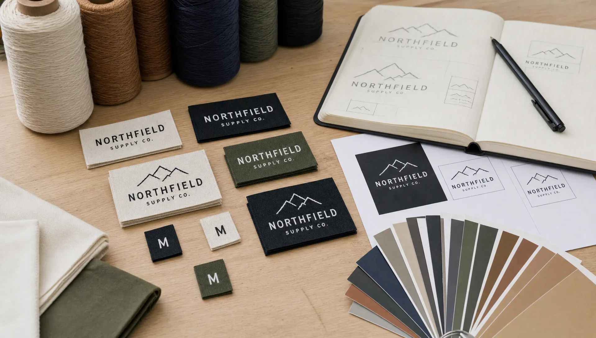
File preparation checklist for clean woven reproduction
Before you order logo labels, send the cleanest artwork you can provide. Production teams can often help adapt artwork, but a clear source file reduces guesswork and helps the proofing process move faster.
A vector file is best because it keeps edges, shapes and type scalable. Common vector formats include AI, EPS, PDF and SVG. If you only have a raster image, use the highest resolution version available and avoid screenshots, compressed social media images or tiny web graphics.
Prepare your file with these details in mind:
- Use vector artwork whenever possible.
- Outline or embed fonts so the wordmark does not change.
- Remove hidden layers, unused effects and background clutter.
- Provide the intended finished label size.
- Include brand color references when available.
- Mention which details are essential and which can be simplified.
- Keep a high-contrast version ready if your main logo is subtle.
HiLabels offers an online ordering process with artwork upload, which makes it easier to submit your file and move into proof review. For a step-by-step walkthrough of the ordering side, see the guide on how to order woven labels with your own logo.
Review the proof like a production designer
A proof is not just a formality. It is the point where digital intent meets woven reality. When you order logo labels, proofing is your opportunity to confirm that the mark has been translated into thread in a way that protects the brand.
Look at the proof at actual size. This is the simplest and most useful check. A logo that looks clean when enlarged on a screen may be too dense when viewed at the size of a neck label or small patch. If possible, print the proof at 100 percent scale and view it from the distance a customer would naturally see it.
Check whether small letters remain open, borders have enough breathing room and the logo does not sit too close to a fold or seam allowance. If the design uses multiple colors, make sure adjacent colors are not so similar that they flatten into one area. Also confirm orientation, fold type, label dimensions and placement notes before approving production.
Common mistakes that make a woven logo look less premium
The most common issue is trying to reproduce the full digital logo with no adaptation. Woven branding rewards clarity. A simplified mark often looks more premium than a complicated one because the texture feels intentional and the shape reads instantly.
Another mistake is choosing label size too late. If the logo needs a certain width to stay legible, the label must support that width. Shrinking a detailed logo into a smaller trim rarely improves the result. It is better to adjust the design, choose a different label format or move secondary information elsewhere.
Also avoid designing only for the flat proof and forgetting the garment. A folded label loses visible space. A patch edge may need room for a border. A ribbon repeat needs spacing that looks balanced when wrapped, tied or sewn. The best woven detail works in the real product context, not just as a standalone graphic.
Frequently Asked Questions
What file type is best for a woven logo? Vector artwork is best because it keeps lines and shapes clean at different sizes. AI, EPS, PDF and SVG files are commonly useful. If you only have an image file, provide the highest resolution version available.
Can a detailed logo be woven? Sometimes, but it may need adaptation. Fine lines, small lettering, gradients and complex illustrations often need to be simplified so the logo reads clearly in thread.
Should I use the same logo on labels, patches and ribbons? Use the same brand identity, but not always the same exact file. A woven label, patch, ribbon and zipper pull may each need a version designed for its size and purpose.
How do I know if my logo is too small for a woven label? View it at the final label size and check whether the smallest text, spaces and shapes are still clear. If you need to zoom in to understand it, the design probably needs simplifying.
Ready to turn your logo into woven brand details?
A strong woven result starts with a logo that respects thread, scale and contrast. HiLabels helps brands create custom woven labels, patches, ribbons, zipper pulls and care labels with an online ordering process, artwork upload and experienced support. If you want your branding to look sharp in the finished product, start with a clean file and build the woven version around clarity first.


