How to Build Your Own Logo for Woven Labels
A woven label is tiny, tactile and permanent. That makes logo design feel different from designing for a website, hang tag or social profile. Every small curve, thin line and color choice has to survive the jump from pixels to thread.
If you want to build your own logo for woven labels, start with the label in mind instead of shrinking a full-size brand mark at the end. The best woven label logos are simple enough to weave cleanly, distinctive enough to remember and flexible enough to work across different label sizes, folds and product categories.
This guide walks through a practical process for creating a logo that looks polished when woven, even if you are not a professional designer.
Start With the Job Your Label Needs to Do
Before sketching icons or choosing fonts, define what the woven label has to accomplish. A neck label for apparel has a different job than a side seam tag, a patch on a beanie or a woven label on handmade goods.
Ask yourself where the label will appear, how far away people will view it and what information must be recognized first. A brand name label on a shirt collar needs instant readability. A small exterior tag may only need a symbol or initials. A patch can often carry more visual detail because it has more room.
This matters because logo design is not only about aesthetics. It is about hierarchy. On a woven label, there is limited space for the brand name, icon, tagline, location, size information or care details. If you try to give every element equal weight, the result often looks crowded.
For most woven label logos, prioritize one of these:
- A readable wordmark
- A simple symbol or monogram
- A short brand name plus a supporting icon
- A heritage-style mark with minimal detail
If you are still refining the larger brand identity, HiLabels has a helpful guide on how to create a brand logo that works at label size before you move into woven production.
Understand What Changes When a Logo Becomes Woven
A woven label is made with thread, not ink. That sounds obvious, but it changes almost every design decision.
Print can reproduce tiny gradients, hairline strokes and photo-like effects. Weaving works through interlaced threads, which means small details are interpreted through texture and thread direction. The result can look premium and durable, but only when the artwork respects the medium.
A strong woven logo usually has:
- Clear outer shapes
- Enough spacing between letters
- Limited small details
- Strong contrast between background and logo colors
- A design that still makes sense in one or two colors
Thin serif details, tiny dots, distressed textures and complex illustrations can lose clarity when reduced. This does not mean your logo has to be boring. It means the personality should come from proportion, shape, typography and color rather than fragile detail.
Think of a woven label as a quality filter. If the mark still works when simplified, it is more likely to look professional across packaging, embroidery, labels and digital use.
Choose the Right Logo Structure
When you build your own logo, choose a structure that fits both your brand and the physical label. There are three common options for woven labels.
Wordmark
A wordmark uses the brand name as the logo. This is often the best choice for apparel startups, makers and small product brands because it builds name recognition quickly.
Wordmarks work best when the brand name is short or medium length. If your name is long, you may need a wider label or a stacked layout. Avoid overly thin script fonts unless you have confirmed that the letterforms will remain legible when woven.
Monogram or initials
A monogram uses initials or a short letter combination. It can feel premium, compact and versatile. It is especially useful for small side labels, limited label space or brands with longer names.
The risk is ambiguity. If customers do not already know the brand, initials may not tell them enough. A good compromise is to use the full name on main labels and the monogram on exterior tags, patches or smaller applications.
Icon plus name
An icon paired with a brand name gives you flexibility. You can use both elements on larger labels, then use only the icon on small tags once the brand becomes more recognizable.
For woven labels, the icon should be bold and simple. Avoid illustrations with many interior lines. A mountain, animal, flower, tool, geometric shape or abstract symbol can all work if the silhouette is clear.
| Logo structure | Best for | Watch out for |
|---|---|---|
| Wordmark | New brands, apparel labels, handmade goods | Long names may need more width |
| Monogram | Small labels, luxury feel, exterior tags | Initials can be hard to recognize without context |
| Icon plus name | Brands that need flexibility across products | Detailed icons can become muddy when woven |
| Badge or seal | Heritage, outdoor, craft or premium products | Too much text can crowd the label |
Sketch Before You Open Design Software
Logo software can make early decisions feel more finished than they are. Start with rough sketches on paper or a tablet. At this stage, you are not trying to make beautiful artwork. You are looking for a strong idea.
Sketch 10 to 20 quick versions. Try different arrangements of the brand name, initials, icon and border. Make some horizontal, some vertical and some square. Woven labels come in many proportions, so it helps to see how the logo behaves in different containers.
Pay attention to the outline of the design. If you blurred the logo or saw it from a distance, would the overall shape still be recognizable? Strong silhouettes tend to translate better into woven labels than marks that rely on tiny internal detail.
Once you have two or three promising directions, move into digital design.
Pick Typography That Can Survive Small Sizes
Typography is often where woven label logos succeed or fail. A font that looks elegant on a screen can become hard to read when reduced to a small label.
Look for fonts with open counters, meaning the spaces inside letters like a, e, o and p are not too tight. Choose moderate stroke contrast rather than extreme thick-and-thin letterforms. Give letters enough spacing so thread does not visually close the gaps.
Script fonts can work, but they need extra care. If the script has thin connectors, elaborate swashes or letters that touch too tightly, it may not weave cleanly at small sizes. A simplified custom script or bold handwritten style is usually safer than a delicate calligraphy font.
A practical test is to view the logo at the actual label size on your screen, then print it at that size. If you have to squint, the woven version will probably need simplification.
Simplify Shapes Without Losing Personality
Simplification is not the same as removing character. It means keeping the parts of the logo that customers will remember and removing the parts that create production risk.
If your first concept includes a detailed illustration, reduce it to the strongest shapes. For example, a detailed bird can become a clean wing shape. A full botanical illustration can become one leaf or a simple flower silhouette. A complex crest can become a border, initials and one central symbol.
Keep asking: what is the smallest number of shapes needed for this logo to still feel like the brand?
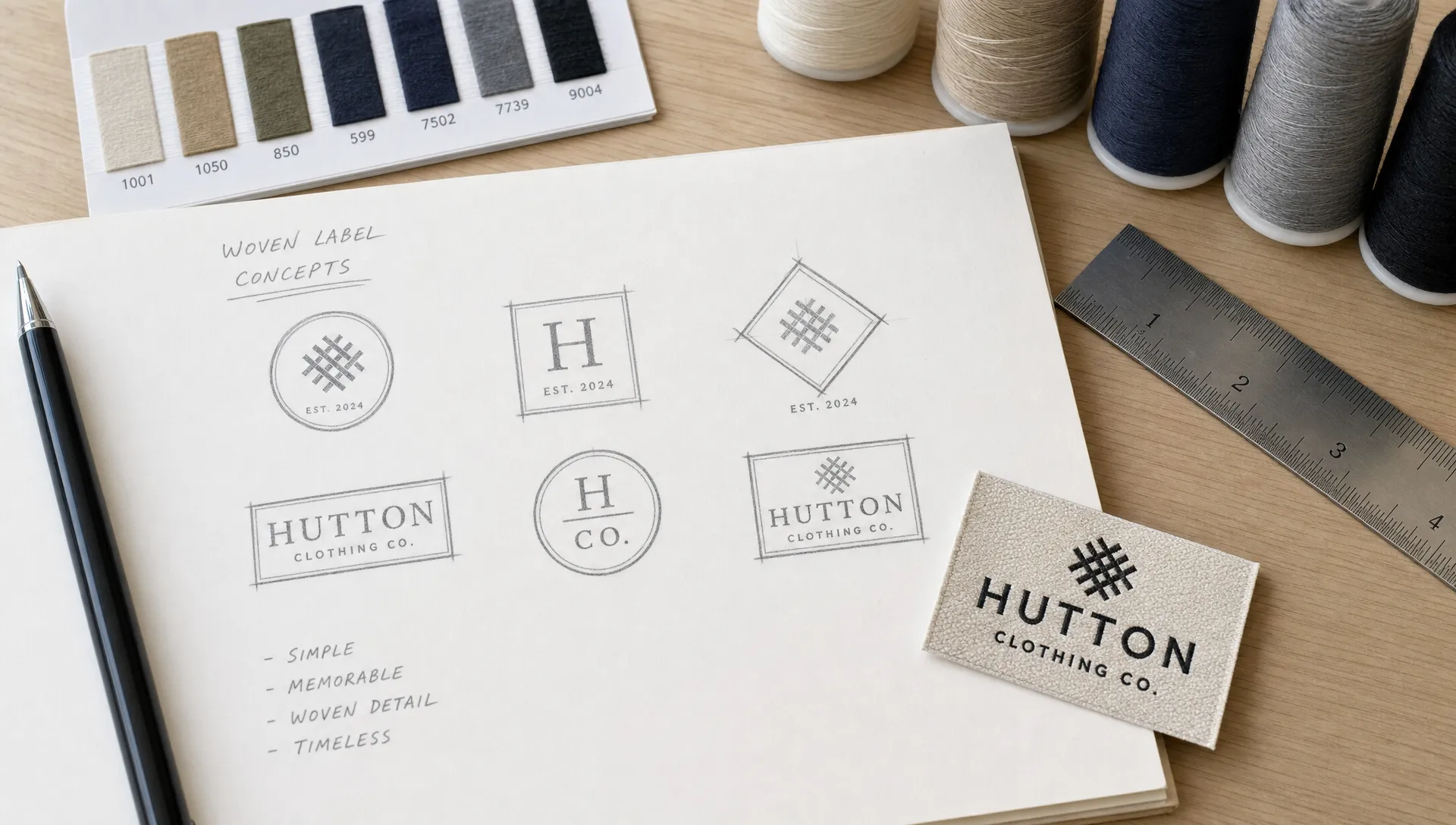
If your brand has a playful feel, use rounded forms, lively spacing or a friendly font. If it feels refined, use balanced proportions, restrained color and cleaner geometry. Personality can come from restraint as much as decoration.
Build a Color Palette for Thread, Not Just Screens
Color on a woven label is created with thread, so it will not behave exactly like RGB colors on a monitor. Thread has texture, sheen and physical depth. Very subtle color differences may disappear, especially at small sizes.
For a first woven logo, use a limited palette. One background color plus one or two logo colors is often enough. Higher contrast usually improves readability. Black and white, navy and cream, charcoal and silver or forest green and off-white can all feel polished when the contrast is clear.
If your digital logo uses gradients, shadows or transparency, create a flat version for woven labels. A flat logo is easier to interpret in thread and tends to look more premium than a complicated effect forced into a small space.
You should also consider the garment or product color. A label that looks beautiful on a white mockup may not stand out against dark denim, black cotton or textured wool. Plan your label background color as part of the product experience, not as a separate design decision.
Design for the Label Shape and Fold
A logo that works on a rectangle may not work on a center-fold label or a small end-fold label. When designing, create the logo inside a realistic label shape as early as possible.
Common woven label placements include neck labels, hem tags, side seam labels, sleeve labels, beanie patches, bag labels and packaging accents. Each has different space constraints.
For a center-fold label, keep critical artwork away from the fold line. For an end-fold label, leave enough side space so the logo does not feel cramped after sewing. For a patch or larger label, a border can help frame the logo, but it should not compete with the brand name.
HiLabels offers custom woven labels with options for artwork upload and configuration, so once your mark is ready you can move into a realistic setup through the custom woven clothing labels page.
Create a Label-Ready Digital File
Once the concept is solid, rebuild the logo cleanly in design software. Vector artwork is usually preferred for logos because it can scale without losing quality. Common vector formats include AI, EPS, SVG and vector PDF, though you should always check the accepted file types before submitting artwork.
If you are working in a beginner-friendly design tool, keep the design simple and export the highest quality file available. Avoid sending a tiny screenshot or low-resolution image. A logo may look sharp on your phone but still be unsuitable for production if the file is too small or compressed.
Before saving the final file, check these basics:
- Convert or outline fonts if required by your designer or supplier
- Remove unnecessary effects such as shadows, gradients and transparency
- Keep the artwork centered in the label area
- Save a version with the full logo and a simplified one-color version
- Keep an editable master file for future changes
You do not need to know every production detail before requesting a proof. A good label maker can help identify issues, but cleaner artwork usually leads to a smoother process.
Test Your Logo at Actual Size
The fastest way to catch problems is to test the logo at the size it will actually be woven. Do not judge only from a zoomed-in artboard.
Print the label layout at 100 percent scale, cut it out and place it where the woven label will go. Put it inside a collar, on a hem, on a hat or on the product packaging. This low-tech test reveals issues that a full-screen mockup hides.
Look for three things: readability, balance and brand feel. Can you read the name quickly? Does the logo sit comfortably inside the label shape? Does it feel like it belongs on the product you are selling?
If possible, test a one-color version too. Strong logos do not depend entirely on color to make sense. This is helpful for future woven labels, hang tags, stamps, packaging or social icons.
Avoid Common Logo Mistakes on Woven Labels
Many logo problems are easy to fix before production. The hard part is noticing them early.
One common mistake is starting with too much information. A woven logo label does not need to include every brand message. If you need size, care instructions or country of origin details, those may belong on a separate care label instead of crowding the main brand label.
Another issue is overusing thin lines. A delicate underline, fine border or small icon detail may look crisp digitally but weak in thread. If an element is not essential, remove it. If it is essential, make it more substantial.
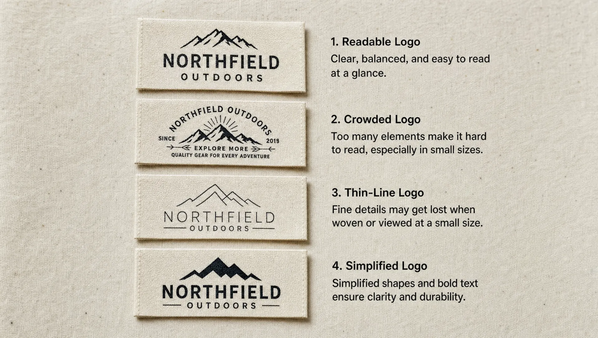
Color complexity can also hurt the final result. More colors are not always better. A restrained palette often looks more intentional, especially for clothing labels where the texture of the weave already adds visual depth.
Finally, do not skip trademark thinking. If the logo will represent a business, search for similar names and marks before committing. In the United States, the USPTO trademark search system is a useful starting point, though legal advice may be needed for formal clearance.
Use a Proof as a Design Tool
A proof is not just an approval step. It is a chance to see how your logo translates into the woven label format before production.
Review the proof at the size you plan to use. Look closely at spacing, letter clarity, color contrast and how the design sits within the border or fold area. If something feels too tight or hard to read, adjust the artwork before moving forward.
This is where working with an experienced label supplier can make a real difference. HiLabels brings more than 31 years of experience to custom woven labels, patches, ribbons, zipper pulls and care labels, which is valuable when you are turning a new logo into a durable branded product.
If you already have your artwork and want the next step after design, the guide on ordering woven labels with your own logo explains how to prepare for the ordering and proofing process.
A Simple Logo-Building Workflow
If you want a straightforward path, use this sequence:
- Define the label purpose: Decide where the label will be used and what the viewer must recognize first.
- Choose a logo structure: Pick a wordmark, monogram, icon plus name or badge format.
- Sketch several layouts: Explore different shapes before committing to one direction.
- Simplify the design: Remove tiny details, fragile lines and unnecessary text.
- Test typography: Check readability at the exact label size.
- Limit the colors: Build a thread-friendly palette with strong contrast.
- Create clean artwork: Use vector files when possible and keep an editable master version.
- Review a proof carefully: Check scale, spacing and clarity before approving production.
Following this process helps you design for the material from the beginning, instead of forcing a screen-first logo onto a woven product.
Frequently Asked Questions
Can I build my own logo if I am not a designer? Yes. Start with a simple structure, use readable type and avoid tiny details. For woven labels, clarity matters more than complex illustration. If you are unsure, create a clean draft and use the proofing stage to refine it.
What type of logo works best for woven labels? Wordmarks, monograms and simple icon-plus-name logos usually work best. The right choice depends on your label size, product type and whether customers already recognize your brand.
Should my woven label logo be in one color or multiple colors? One or two colors are often enough for a polished woven label. Multiple colors can work, but strong contrast and simplicity are more important than adding extra shades.
Can I use a script font on a woven label? You can, but choose a script with enough thickness and spacing. Very delicate calligraphy, thin connectors and elaborate swashes may become difficult to read at small label sizes.
What file should I prepare for a woven label logo? Vector artwork is usually best because it scales cleanly. Keep an editable version of your logo and avoid relying on screenshots or small compressed images. Check the supplier's upload requirements before submitting your file.
Turn Your Logo Into a Woven Label
Building your own logo for woven labels is about making smart choices at small scale. Keep the design clear, test it at actual size and think in terms of thread, texture and durability from the start.
When your artwork is ready, HiLabels can help you turn it into a professional woven label, patch, ribbon, zipper pull or care label with a fast online ordering process and personalized support. Start with a clean logo file, choose the label options that fit your product and use the proofing process to make sure the final result reflects your brand well.


