Custom Woven Labels for Hats That Match Every Style
A hat is small, visible and often worn repeatedly, which makes the label work harder than it would on many garments. On a T-shirt, a woven label may sit quietly at the neck or hem. On a hat, the label can become the focal point, a side detail, a cuff accent or the finishing touch inside the sweatband.
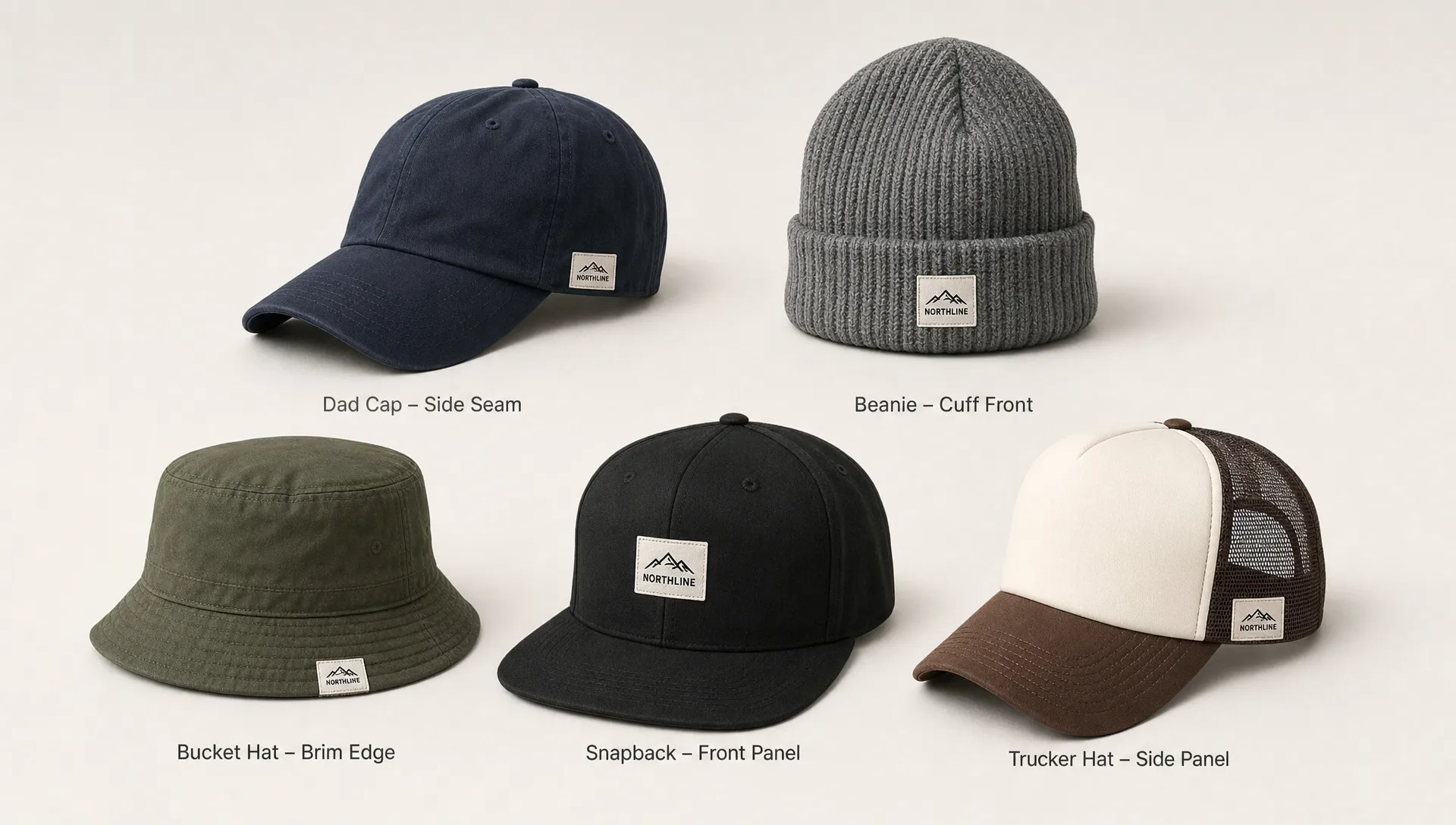
That is why custom woven labels for hats should be designed around the style of the hat, not simply copied from a clothing label. The right label has to respect the hat's shape, the way it is worn and the mood of the collection. A clean woven tab might suit a minimalist beanie. A bold front label might be the right move for a streetwear snapback. A small side label can make a dad cap feel quietly premium.
When the label matches the hat, the whole product feels more intentional.
Why hat labels need a different design approach
Hats create a few design challenges that apparel brands sometimes underestimate. The surface is curved, panels can be narrow and many hat fabrics have texture, stiffness or stretch. A woven label that looks perfect on a flat mockup may feel too large, too stiff or too busy once it is sewn onto a cap crown or knit cuff.
Visibility also matters. A hat label is often seen from several feet away, especially on front panels and cuffs. Tiny text, thin lines and low contrast colors can disappear quickly. A good hat label usually favors strong shapes, simplified logos and enough contrast to stay readable on fabric.
Comfort is another factor. Hats touch the forehead, ears and hairline. Interior labels need to feel smooth. Exterior labels should not create awkward edges that catch, curl or irritate the wearer. Even a beautiful woven label can hurt the product experience if it is placed without considering how the hat is worn.
This is where woven construction is useful. Unlike printed labels, woven labels build the design with thread, giving them a durable texture that feels integrated with textile products. For hats, that tactile quality can make a simple mark feel more substantial, especially when the branding is meant to last through regular wear.
Match the label to the hat style
Different hats carry different style signals. A five panel cap feels different from a cuffed beanie, even when both use the same logo. The label should adapt without losing the brand's core identity.
| Hat style | Label approach | Strong placements | Design tip |
|---|---|---|---|
| Dad cap | Small to mid size woven label with a relaxed look | Side panel, back strap area, front panel | Use soft contrast and avoid overly rigid shapes if the cap has a casual feel |
| Snapback | Bold woven label or woven patch style label | Front center, side panel, back opening | Keep the logo simple enough to read at a distance |
| Trucker hat | Structured label with clear contrast | Front foam or fabric panel, side panel | Make sure the label scale works with the taller crown |
| Five panel cap | Compact label with clean geometry | Front panel, side seam, back panel | Horizontal labels often work well with the panel shape |
| Bucket hat | Flexible, lower profile label | Front, side, brim edge | Avoid labels that feel too stiff against softer fabrics |
| Beanie | Folded cuff label or small woven tab | Cuff front, cuff side, side seam | Test the label on stretched knit fabric before finalizing size |
| Fitted cap | Premium woven mark with crisp detail | Side panel, back, interior band | A subtle side label can feel more refined than oversized front branding |
| Visor | Narrow woven label with strong readability | Front band, side band | Keep height controlled so the label does not overpower the visor shape |
A brand can use one logo system across all these styles, but the label format should not be identical every time. A beanie may need a folded cuff label. A trucker hat may need a stronger front label. A bucket hat may look better with a small side detail that feels part of the silhouette.
If your brand sells several hat styles, think in terms of a label family. The colors, logo and brand personality stay consistent, but the size, fold and placement change to fit the product.
Placement changes the whole impression
Placement is one of the biggest decisions when designing custom woven labels for hats. The same woven label can feel loud, subtle, sporty or premium depending on where it sits.
A front center label gives the strongest brand presence. It works well for streetwear, merch, team products and hats where the label is meant to be seen first. Because the front panel is usually the most visible area, the design should be clean and confident. This is not the best place for long taglines or small decorative details.
A side label feels more understated. It is ideal when the hat already has embroidery, a patch or a design feature on the front. Side placement can also give premium lifestyle brands a quieter signature, especially on dad caps, fitted caps and bucket hats.
Back placement works well near an adjustable strap, snapback closure or rear seam. It is a natural spot for a secondary logo, wordmark or small woven tab. Because this area can include hardware, stitching and openings, size accuracy matters.
For beanies, the cuff is usually the main branding zone. A woven label on the front cuff feels classic, while a side cuff label feels more subtle. On knit hats, it is especially important to account for stretch. A label that is too wide or stiff may pull against the knit or sit awkwardly when the cuff is folded.
Interior labels serve a different purpose. They can reinforce the brand after purchase, add a professional finish and carry information that does not belong on the outside. If a hat has a premium exterior, a clean interior woven label can make the unboxing and first try-on feel more complete.
Design rules for woven hat labels
Hat labels reward restraint. Since the available space is limited, every design choice has to earn its place. A simplified logo usually weaves better than a detailed one, especially at smaller sizes. Thin lines, tiny script lettering and complex gradients often lose clarity when translated into thread.
For stronger results, focus on these fundamentals:
- Keep the artwork simple: Use the clearest version of your logo, not the most detailed one.
- Prioritize contrast: Light thread on a dark ground, or dark thread on a light ground, improves readability.
- Limit small text: If a word is not essential, remove it from the exterior label.
- Respect the hat fabric: A rugged canvas cap can handle a bolder label than a soft knit beanie.
- Think in real size: Review the label at actual scale before approving the design.
Color should support the hat collection, not fight it. Some brands use one label colorway across every hat for consistency. Others create seasonal label variations that match fabric colors. Both approaches can work. The key is to protect recognition, so the customer still knows it is your brand even when the palette changes.
If your design includes a logo, wordmark or icon, woven production can make it feel more premium through texture and depth. For a closer look at how logo choices affect perceived quality, HiLabels has a helpful guide to custom logo woven labels and how they shape the final product impression.
Choose the right label format for the hat
The label format affects both the look and the application. A flat woven label can work well on front panels, side panels or interior areas where it will be stitched around the edges. It gives a clean, direct brand mark and can be scaled to fit different hat shapes.
End fold labels are useful when you want a neat edge finish with stitching on the sides. They can look polished on cap panels and structured placements. Center fold or loop fold labels are often used as tabs, especially on seams, cuffs or edges where the label wraps over fabric.
For hats with a bolder look, a woven patch or patch style label can create more visual weight. This is common on trucker hats, outdoor caps and streetwear styles. A patch style label can give the front panel more structure, but it should still be sized carefully so it does not overwhelm the crown.
| Label format | Best for | Visual effect | Practical note |
|---|---|---|---|
| Flat woven label | Front panels, side panels, interior bands | Clean and versatile | Works best when the label sits smoothly on the hat surface |
| End fold label | Exterior panels and neat stitched applications | Polished edges | Good for designs where side stitching should look tidy |
| Center fold label | Beanie cuffs, seams, side tabs | Compact brand detail | Useful when the label needs to wrap over an edge |
| Loop fold label | Side seams, cuff edges, small signature labels | Subtle and dimensional | Best for simple logos or short wordmarks |
| Woven patch style label | Front crowns, trucker hats, statement caps | Bold and premium | Needs careful sizing on curved or structured panels |
The best format depends on the product, but it also depends on your brand voice. A skate brand may want a bolder front label. A handmade knitwear brand may prefer a soft cuff tab. A golf brand may choose a small side mark with refined contrast. Matching format to style helps the hat feel designed, not decorated as an afterthought.
For more general label design guidance, including readability, sizing and artwork preparation, the HiLabels article on better custom design woven labels is a useful next step before you finalize files.
Build a label system that works across a full collection
If you produce one hat style, the label decision is straightforward. If your brand releases multiple hats, you need a system. A label system keeps the brand recognizable while allowing each hat to have the right placement and proportion.
Start with a primary woven label. This might be your main logo or wordmark in a standard colorway. Use it for your best selling style or the product that represents the brand most clearly. Then create smaller or alternate versions for tighter placements, such as side seams, back closures or beanie cuffs.
A good system might include a front label for statement caps, a folded tab for knitwear, a small side label for premium minimal styles and an interior label for brand finishing. The customer may never analyze those choices, but they will feel the consistency.
This approach is especially useful for brands that sell across seasons. Spring caps, summer bucket hats, fall beanies and winter knit hats can all share a visual thread without using the exact same label in the exact same place.
Consistency also helps with reordering. When your specifications are clear, it becomes easier to repeat successful labels, introduce new colorways and keep production aligned as the brand grows.
Common mistakes to avoid
One common mistake is making the label too large because the logo looks good on a screen. Hat surfaces are smaller than they appear in mockups, and a large woven label can make the product feel heavy or promotional. Always review the design at actual size.
Another mistake is using too many colors. Woven labels can support detailed color work, but hat labels often look stronger with a controlled palette. Two or three well chosen colors can feel more premium than a busy design that tries to include everything.
Brands also sometimes place exterior labels without thinking about seams, curves or closures. A label that crosses an awkward seam may pucker. A label near a snapback opening may compete with hardware. A beanie cuff label may shift once the fabric stretches. Sampling or careful placement review can prevent these issues before production.
Finally, avoid forcing care details, web addresses, social handles and slogans onto one small exterior label. Hats benefit from clean branding. If extra information is needed, consider a separate interior or care label so the outside stays focused.
What to prepare before ordering woven labels for hats
Before you order, gather the details that will affect the final result. A little preparation can reduce revisions and help the label maker understand how the label will be used.
- Hat style: Identify whether the label is for a dad cap, snapback, beanie, bucket hat, visor or another style.
- Placement: Specify front, side, back, cuff, seam, brim area or interior band.
- Finished size: Measure the real area on the hat, not just the artwork file.
- Artwork file: Provide the cleanest logo or design available, ideally with simple shapes and clear edges.
- Color direction: Choose thread and background colors that match or intentionally contrast with the hat fabric.
- Fold or finish: Decide whether the label should be flat, folded or patch like.
- Application method: Confirm how the label will be attached so the size and finish make sense.
HiLabels makes this process easier through its custom woven label configurator, where you can upload artwork and choose key details such as label type, application method, finish, size, colors and design notes. That structure is helpful when you already know the hat style and want to translate your idea into a production ready label.
HiLabels also brings over 31 years of experience in woven branding products, including custom woven labels, patches, ribbons, zipper pulls and care labels. For hat brands, that range matters because one collection may need more than one type of branding element to feel complete.
Frequently Asked Questions
What size should custom woven labels for hats be? The best size depends on the hat style and placement. A front label can usually be larger than a side tab or beanie cuff label. Always measure the actual hat area and review the artwork at finished size before ordering.
Are woven labels better than printed labels for hats? Woven labels are often preferred for hats because the design is made with thread, giving it texture, durability and a more premium textile feel. Printed labels can work for certain uses, but woven labels usually hold up better as visible brand details.
Where should I place a woven label on a beanie? The cuff is the most common placement for beanies. A front cuff label gives stronger visibility, while a side cuff label feels more subtle. Make sure the label works with the stretch and thickness of the knit.
Can one woven label design work on every hat style? One core design can guide the collection, but the exact size, fold and placement may need to change. A label that works on a trucker hat may be too large for a visor or too stiff for a soft beanie.
What artwork works best for woven hat labels? Simple logos, bold wordmarks and high contrast icons usually work best. Avoid tiny text, thin lines, complex shading and details that will be hard to read once woven at a small size.
Create hat labels that fit your brand
The best hat label is not just attractive. It fits the hat, supports the brand and feels natural to the person wearing it. When size, placement, color and format work together, custom woven labels can make dad caps, beanies, bucket hats, snapbacks and visors feel like part of one cohesive collection.
If you are ready to turn your hat label idea into a finished woven product, start with HiLabels at hilabels.com. Upload your artwork, choose your label details and create a custom woven label that matches the style of your hats and the quality of your brand.


