Patch Pockets: Design Details That Make Garments More Useful
Patch pockets are one of the simplest construction details in apparel, yet they can change how a garment works, feels and sells. A pocket placed on the outside of a shirt, jacket, pant or bag does more than hold keys. It affects silhouette, balance, durability, hand feel and brand expression.
For apparel brands, designers and makers, the best patch pockets start with a practical question: what should this pocket actually do? A work jacket pocket has different needs than a kidswear pocket, a utility vest pocket or a clean fashion overshirt. When the design details match the use case, patch pockets become a reason people reach for the garment again.
What makes a patch pocket different?
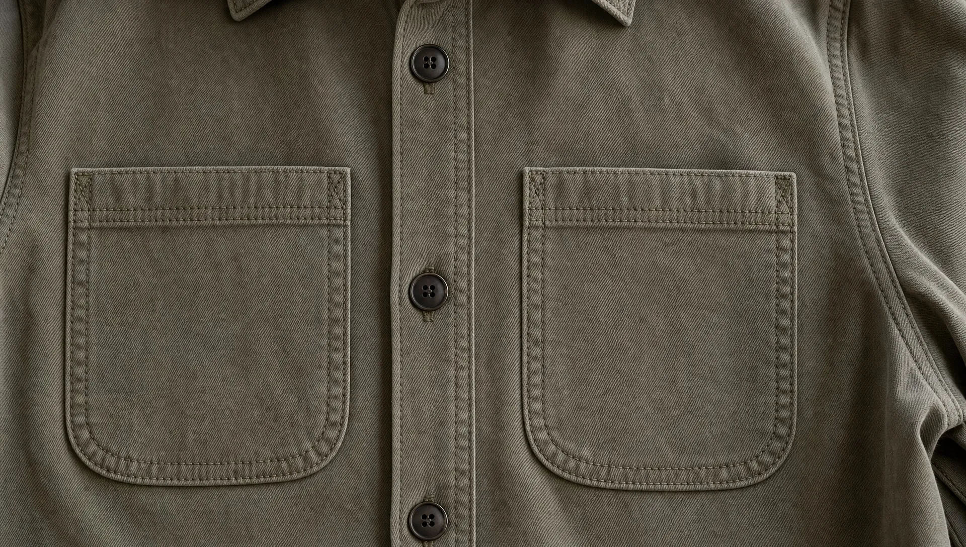
A patch pocket is a separate piece of fabric sewn onto the outside of a garment. Unlike an in-seam pocket hidden inside a side seam or a welt pocket cut into the garment body, a patch pocket is visible by design. Its outline, stitching and placement become part of the garment’s look.
That visibility is why patch pockets are common on chore coats, denim jackets, camp shirts, aprons, uniforms, overshirts, children’s clothing and casual pants. They can be flat and minimal or dimensional and rugged. They can blend into the base fabric or contrast boldly as a design feature.
Pockets have also carried social and practical meaning for centuries. The V&A history of pockets traces how pockets evolved from separate tie-on accessories to integrated garment features. Today, the same basic idea still matters: useful clothing should give the wearer secure, accessible storage without getting in the way.
Start with the pocket’s job
A good patch pocket is not just a rectangle sewn onto fabric. Its size, depth, opening angle and reinforcement should come from the way the wearer will use it.
A chest pocket on a camp shirt may only need to hold sunglasses, a cardholder or a pen. A lower pocket on a chore jacket might need room for gloves, a small notebook or tools. A pocket on a children’s jacket needs to survive pulling, stuffing and frequent laundering. If you design every pocket the same way, some will look fine on a flat sample but fail in daily wear.
| Garment or use case | Patch pocket approach | Key design detail |
|---|---|---|
| Camp shirt or overshirt | Flat chest pocket | Keep the opening easy to reach without distorting the shirt front |
| Chore coat or work jacket | Large reinforced pocket | Add bar tacks or dense stitching at the upper corners |
| Utility vest | Multiple pockets with varied shapes | Match each pocket to a specific object or activity |
| Kidswear | Rounded pocket with strong stitching | Avoid sharp corners that lift or fray after washing |
| Fashion jacket | Oversized or contrast pocket | Use placement and proportion to support the silhouette |
| Apron or maker garment | Deep lower patch pocket | Test for sagging when filled with tools or supplies |
This job-first approach prevents a common problem: attractive pockets that are awkward to use. A pocket should be easy to enter with one hand, stable when loaded and proportional to the garment.
Placement controls comfort and usefulness
Patch pocket placement looks like a styling choice, but it is also ergonomic. A pocket that sits too high on a jacket can feel cramped. A pocket that sits too low on pants may swing, bulge or hit the thigh while walking. On shirts, chest pockets should relate to the wearer’s body, not only to the center line of the garment pattern.
For tops and jackets, consider where the wearer’s hand naturally lands. Lower patch pockets often work best when they sit slightly forward of the side seam, where the hand can slide in without twisting the wrist. Chest patch pockets should be high enough to feel secure but not so high that the opening lands under the arm or collarbone.
Symmetry matters too, especially for front-facing garments. Two pockets that are technically the same distance from the center front can still look uneven if the garment has a placket, darts, curved seams or a dropped shoulder. Always review placement on a body or dress form, not only on a flat pattern.
Shape affects access, wear and style
Patch pockets can be square, rectangular, rounded, angled, curved, pointed or pleated. Each shape changes both function and personality.
Square and rectangular pockets feel classic and straightforward. Rounded lower corners soften the look and reduce the chance of corners lifting over time. Angled openings can make hand entry easier on jackets and vests. Curved scoop openings feel casual and work well on aprons, kidswear and utility garments.
Flaps add security and visual weight. They are useful for outerwear, uniforms and bags, especially when the wearer may bend, move quickly or carry items outdoors. A flap that is too short can curl or expose the pocket opening. A flap that is too deep can make the pocket slow to access.
Bellows or pleated patch pockets create extra capacity by allowing the pocket to expand outward. They are common on cargo garments and field jackets. The tradeoff is bulk, so they need careful placement and fabric selection. On lightweight garments, a bellows pocket can pull the garment front out of shape if it is not balanced with structure.
Stitching and reinforcement make the difference
The upper corners of a patch pocket take the most stress. Every time someone slides a hand in, pulls an item out or catches the pocket edge, those corners absorb force. A clean sample can tear quickly if those stress points are not reinforced.
Common reinforcement choices include bar tacks, small triangular stitch patterns, dense backstitching or an extra row of topstitching near the pocket edge. Workwear and uniforms often need stronger reinforcement than fashion shirts. Denim, canvas and twill can handle visible stitching that becomes part of the design, while fine shirting may need a lighter approach to avoid puckering.
Topstitching also affects perception. A single row close to the edge looks minimal. Double rows feel more rugged and can make the pocket appear more durable. Contrast thread highlights the pocket shape, while tonal thread keeps attention on the garment silhouette.
The fold at the pocket opening deserves special attention. A narrow single fold may twist or stretch out. A deeper hem or double fold creates a sturdier edge and gives the wearer a cleaner hand feel when reaching into the pocket.
Fabric choice changes pocket performance
A patch pocket can be made from the same fabric as the garment, a contrast fabric or a reinforced version of the base material. Matching fabric creates a clean, integrated look. Contrast fabric draws attention and can help define a collection’s visual identity.
Weight is the first thing to check. A pocket made from fabric that is too light may sag when filled. A pocket made from fabric that is too heavy may create stiffness, seam bulk or visible drag on the garment front. On stretch garments, the pocket and base fabric need compatible recovery. A stable woven pocket on a stretchy knit can restrict movement, while a stretchy pocket on a stable woven can grow out of shape.
Lining or interfacing can help when the pocket needs more structure. For example, a shirt pocket that carries sunglasses may benefit from a slightly firmer opening. A jacket pocket that carries tools may need reinforcement on the inside of the garment, not only on the visible pocket piece.
Closures add security when the pocket needs it
Not every patch pocket needs a closure. Open pockets are faster to use and often look cleaner. For many shirts, aprons and casual jackets, an open top pocket is enough.
Closures become valuable when the garment is meant for movement, travel, outdoor use or work. Buttons give a classic appearance and are easy to understand. Snaps feel more practical and can be used one-handed. Zippers add security but also change the pocket’s visual language. Hook-and-loop closures are useful for gear and uniforms, though they can add noise and collect lint.
The closure should match the user’s routine. A pocket designed for a phone should not require a slow closure if the wearer checks the phone often. A pocket meant for a badge, tool or travel document may need more security even if access is slightly slower.
Capacity is about volume, not just size
A large flat pocket does not always hold more than a smaller dimensional pocket. Capacity comes from usable volume, pocket depth, opening width and the way the fabric moves when filled.
For phone storage, test with real devices and cases. For workwear, test with the actual objects the pocket is expected to hold. For retail samples, place items in the pocket and review the garment from the front, side and back. A pocket that stores well but creates an unattractive bulge may not satisfy the wearer.
Depth also affects security. A shallow pocket makes items easy to grab, but they can fall out when the wearer sits or bends. A deeper pocket holds items better, though it may be harder to reach into. Angled or curved openings can help balance those needs.
Branding can live on or around the pocket
Because patch pockets are visible, they are natural branding areas. The key is to make the branding feel intentional rather than added at the end.
A small woven label at the side seam of a chest pocket can create a subtle signature. A woven patch centered on a utility pocket can make the pocket a focal point. A branded tab at the pocket opening can add recognition without covering the garment fabric. For a more dimensional look, a fabric or embroidered patch can sit on the pocket itself, as long as it does not make the pocket stiff or uncomfortable.
If you are deciding between a tag and a more visible branded element, HiLabels explains when a woven label patch works better than a standard tag for garments and accessories. For pocket-level decoration that adds texture and identity, the guide to fabric patches that elevate apparel and accessories can help you compare options before committing to a production direction.
Brand placement should respect the pocket’s function. Avoid putting a thick patch where a hand needs to slide in smoothly. Avoid placing labels where they will rub against the wearer’s wrist or catch items being removed. The best branding detail supports the pocket instead of competing with it.
Prototype patch pockets before production
Patch pockets are easy to underestimate because they look simple on a technical drawing. Sampling reveals whether the design works on a real garment.
Before production, review the sample while standing, sitting, walking and reaching. Put realistic items in the pocket. Wash or steam the sample if the final garment will be laundered. Check whether the pocket corners lift, the opening ripples, the base fabric puckers or the pocket pulls the garment out of balance.
A practical pocket review should include:
- Access: The wearer can reach the pocket naturally with one hand.
- Security: Items stay in place during normal movement.
- Strength: Stress points do not distort after repeated use.
- Appearance: The pocket looks balanced when empty and when lightly filled.
- Comfort: The pocket does not rub, poke or restrict movement.
Small adjustments at the sample stage can prevent costly production issues. Moving a pocket half an inch, changing the top fold depth or adding corner reinforcement may be enough to turn a nice-looking detail into a durable one.
Common patch pocket mistakes to avoid
The most common mistake is designing from the flat sketch only. Pockets live on a moving body, so they need to be judged in motion.
Another issue is poor scale. Oversized patch pockets can look stylish, but they may overwhelm a smaller garment size or create sagging. Tiny pockets may suit a minimalist design but frustrate wearers if they cannot hold anything useful. Size grading matters as well. A pocket that looks balanced on a medium sample may look too large on the smallest size or too small on the largest size.
Weak upper corners are another frequent failure point. If a pocket is meant to be used, reinforce it. Decorative pockets can be lighter, but functional patch pockets need construction details that anticipate repeated stress.
Fabric mismatch can also cause trouble. A rigid pocket on a soft base fabric can pull and pucker. A soft pocket on a structured garment can collapse. When in doubt, sew a test panel before building a full sample.
FAQ
What are patch pockets used for? Patch pockets are used for visible storage on shirts, jackets, pants, aprons, bags and uniforms. They can hold everyday items, support workwear function and add visual detail to a garment.
Are patch pockets durable? Patch pockets can be very durable when they are properly reinforced. The most important areas are the upper corners, the pocket opening and the seam where the pocket attaches to the garment body.
What is the best shape for a patch pocket? The best shape depends on the garment. Rectangular pockets are classic, rounded corners are good for softness and durability, angled openings improve hand access and pleated pockets add capacity.
Should patch pockets have closures? Closures are useful when the wearer needs extra security. Open pockets work well for quick access, while buttons, snaps, zippers or flaps are better for movement, travel, outdoor garments and uniforms.
Can patch pockets be branded? Yes. Patch pockets can carry woven labels, small tabs, custom patches or contrast stitching. The branding should not interfere with hand access, comfort or the pocket’s ability to hold items.
Make your pocket details feel finished
Patch pockets are functional, but they are also one of the most visible places to show care in construction and branding. The right label, patch or trim can make a useful pocket feel like a finished design feature.
If you are developing garments with pocket details, HiLabels can help you create custom woven labels, patches, ribbons, zipper pulls and care labels that support your brand identity and production needs.


