How to Create a Brand That Looks Consistent on Every Product
A consistent product line does not happen because every item looks exactly the same. It happens because every item feels like it came from the same point of view.
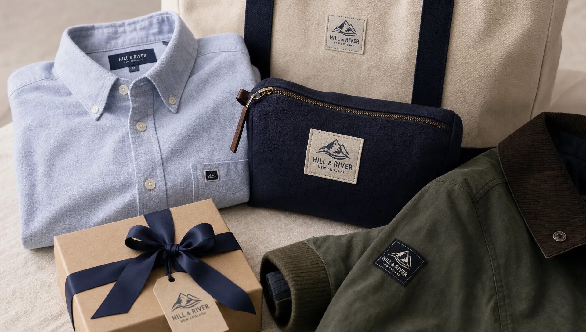
For apparel brands, makers, merch teams and product businesses, that point of view needs to survive many formats: a sweatshirt, a tote bag, a pouch, a box, a ribbon, a patch, a zipper pull and a care label. Each surface has different space, texture and production limits. The goal is to create brand consistency that is flexible enough to work across all of them.
That starts with a system, not a single logo file. A strong brand system tells you what stays fixed, what can change and how each product detail should support recognition without fighting the product itself.
Start With the Parts of Your Brand That Should Never Change
Before choosing label sizes or patch styles, define the few visual choices that customers should recognize every time. These are your non-negotiables.
Your core brand elements usually include your primary logo, a simplified logo or mark, a color palette, typography rules and a small set of graphic details. For physical products, texture and material also matter. A soft woven label communicates something different from a bold rubber patch or a satin ribbon, even when the same logo is used.
The mistake many brands make is treating each new product as a fresh design project. That can be exciting at first, but it quickly creates a scattered collection. A hoodie label uses one version of the logo, the pouch uses a different typeface and the packaging ribbon uses a color that almost matches but not quite. Customers may not name the inconsistency, but they feel it.
To create brand recognition across different products, decide what must remain steady. A simple brand control sheet can include:
- Approved logo versions and when to use each one
- Primary and secondary brand colors
- Minimum logo size for woven, printed or embroidered details
- Preferred label placements for each product category
- Material preferences, such as woven labels for garments or ribbon for packaging
- Rules for limited editions, seasonal colors and collaborations
This does not need to be a long brand book. For a growing product line, one clear page is often more useful than a 60-page document nobody opens.
Build a Product Identity Hierarchy
Every product has multiple branding opportunities, but they should not all speak at the same volume. A consistent brand uses hierarchy: one detail leads, one or two details support and practical information stays clear.
For example, a jacket might use a woven neck label as the primary identity, a small sleeve patch as a secondary detail and a care label inside the seam for required product information. A candle bag or gift box might use custom ribbon as the primary visible branding, then a woven label or small patch as a keepsake detail.
| Brand touchpoint | Main role | Consistency rule | Common use |
|---|---|---|---|
| Woven label | Permanent brand signature | Keep logo, color and size consistent by product family | Neck labels, hem labels, bag labels |
| Patch | Visible statement detail | Use when the brand should be seen from the outside | Jackets, hats, bags, workwear |
| Ribbon | Packaging and presentation | Match color, logo spacing and finish to the product experience | Gift wrap, product bundles, retail packaging |
| Zipper pull | Functional brand detail | Keep the mark simple and tactile | Outerwear, bags, pouches |
| Care label | Practical trust signal | Keep information readable and aligned with brand typography | Apparel, textiles, accessories |
Care labels are especially easy to overlook, but they affect trust. In the United States, the Federal Trade Commission provides guidance on complying with the Care Labeling Rule, so apparel and textile brands should treat care information as part of both compliance and customer experience.
Once you assign each detail a role, you avoid over-branding. The product looks intentional because each label, patch or ribbon has a job.
Translate Digital Design Into Physical Production Rules
A logo that looks perfect on a website may not work on a half-inch woven label. Thin lines can disappear, small letters can fill in and subtle color gradients may not translate to thread or textured materials.
This is where many brands lose consistency. They approve artwork on a screen, then each supplier interprets it differently. To create brand continuity, your production rules need to be as clear as your visual rules.
Start with logo versions. A detailed logo may work for packaging or a large patch, but a simplified mark is often better for small woven labels or zipper pulls. If your logo includes fine typography, test it at the actual size before production. HiLabels has a deeper guide on how to design a logo that works at label size if your current mark feels too detailed for small product details.
Color also needs translation. Digital colors are made with light. Woven labels and patches are made with physical materials, so the same color value can appear different depending on thread, base fabric, lighting and neighboring colors. If you use Pantone values or other color references, include them in your artwork notes, but still review a proof or sample when exact matching matters.
A practical production spec should include the final label dimensions, fold style if needed, logo file, thread or material colors, placement notes and any wording that must stay unchanged. This is how you create brand guidelines that a production partner can actually follow.
Create Flexible Rules for Different Product Types
Consistency does not mean putting the same label in the same place on every item. A beanie, dress, backpack and ribbon-wrapped box have different needs. Instead, create rules by product type.
For garments, decide where the customer should first encounter your brand. Neck labels feel classic and retail-ready. Hem labels add a subtle outside detail. Sleeve patches can make the brand more visible, especially on outerwear or uniforms. For accessories, a side seam label, woven patch or zipper pull may be more natural than a large centered logo.
Packaging can carry the same identity in a more temporary way. Ribbons, branded bands or coordinated textile details create an unboxing moment without permanently changing the product. If your products are often gifted, packaging may be one of the strongest places to reinforce your look.
A consistency matrix helps you choose the right detail without redesigning from scratch.
| Product category | Primary brand detail | Supporting detail | What should stay consistent |
|---|---|---|---|
| T-shirts and basics | Woven neck or hem label | Care label | Logo version, label color, fold style |
| Hoodies and outerwear | Woven label or patch | Zipper pull or care label | Patch shape, thread colors, logo placement |
| Bags and pouches | Woven patch or side label | Zipper pull | Mark size, material tone, placement logic |
| Gift packaging | Ribbon | Small label or sticker alternative | Brand color, logo repeat, spacing |
| Limited editions | Special label or patch | Standard care label | Core mark, quality level, base typography |
This approach gives you room to launch new products while keeping the collection connected. If you are designing labels for a full apparel range, HiLabels also covers how to design your own woven labels for a consistent collection with more focus on label systems.
Match Materials to the Brand Experience
Material choice is part of branding. A premium knitwear brand, a streetwear label and a handmade children’s line may all use woven labels, but the right size, fold, thread contrast and placement will differ.
Think about the customer’s physical interaction with the product. Will they feel the label against their skin? Will the patch be seen from a distance? Will the ribbon be photographed during unboxing? Will the zipper pull be touched every day?
For soft apparel, comfort and durability are essential. A label that looks good but irritates the wearer will not support the brand. For outerwear, bags or caps, a patch can add structure and visibility. For packaging, ribbon creates a polished presentation and can make even a simple box feel more considered.
The strongest product branding usually feels integrated rather than applied at the last minute. This is why it helps to choose materials early in product development, not after the garment or package is finished. When labels, patches and ribbons are part of the original plan, placement and proportions are easier to control.
For a broader framework, you can explore how to create custom labels that match your brand system across materials, colors and production details.
Keep One Master File for Every Approved Brand Detail
If several people touch your products, consistency can break down quickly. A designer exports one version of the logo, a production assistant sends an old label file and a manufacturer guesses the placement. None of these mistakes are unusual, especially when a brand is growing.
Create one master folder for approved product branding assets. It should include final artwork files, mockups, production specifications, past order details and photos of approved finished products. Label files clearly so nobody has to guess which version is current.
A good file name is boring but useful. For example, “brandname_woven-neck-label_black-cream_25x50mm_final” is much better than “label-new-final-v4.” When you reorder, expand into new products or work with a new supplier, clear files reduce the chance of mismatched details.
Quality control should also be repeatable. Before approving a new batch, compare the finished item with your approved reference. Look at logo clarity, color, placement, stitching, fold direction and readability. Small checks prevent a collection from drifting over time.
Common Consistency Mistakes to Avoid
Most product branding problems are not caused by bad design. They come from missing rules. Watch for these issues before you order labels, patches or packaging details:
- Using too many logo versions across the same collection
- Choosing colors from memory instead of approved references
- Scaling detailed artwork down until it becomes unreadable
- Treating care labels as purely technical instead of part of the product experience
- Changing label placement without a reason
- Ordering from old artwork files because there is no master folder
- Making every product identical instead of building a flexible system
The last mistake matters. Consistency should create familiarity, not sameness. A customer should be able to move from your T-shirt to your tote bag to your packaging and feel the relationship between them, even when the branding details are adapted to each format.
Frequently Asked Questions
How do I create brand consistency across different products? Start with a small set of fixed rules for your logo, colors, typography, materials and placement. Then adapt those rules by product type so each item feels connected without forcing the exact same design onto every surface.
Do all products need the same label to look consistent? No. A consistent line can use different label types, such as woven labels, patches, ribbons and zipper pulls. The key is to keep the logo system, color direction, quality level and placement logic aligned.
What is the best label type for a clothing brand? Woven labels are a strong choice for many clothing brands because they are durable, professional and stay with the garment. Patches, care labels and zipper pulls can support the main woven label depending on the product.
How can small brands look more professional? Small brands can look more professional by using approved artwork, consistent label sizes, readable care information and repeatable product details. Even a simple label system can make handmade or small-batch products feel more retail-ready.
When should I update my product branding? Update product branding when your logo no longer works at physical sizes, your collection has become visually inconsistent or your current labels do not match the quality of your products. Keep recognizable elements where possible so returning customers still know it is your brand.
Build Consistent Product Details With HiLabels
When you are ready to turn your brand system into physical details, HiLabels can help you create custom woven labels, ribbons, patches, zipper pulls and care labels online. You can upload artwork, use the online label creation process and choose bespoke options that fit your product line.
With more than 31 years of experience and European loom quality, HiLabels is built for brands that want durable, polished details across every product. Create brand rules once, then carry them through the labels and finishing touches your customers see, feel and remember.


