Why Woven Fabric Labels Look More Premium
Premium is rarely created by one dramatic design decision. In apparel, accessories, and soft goods, it is often built through small cues: the handfeel of the fabric, the neatness of the stitching, the weight of the packaging, and the label a customer touches every time they put the product on.
That is why woven fabric labels often look more premium than printed alternatives. The brand mark is not sitting on top of the material. It is built into the fabric itself, thread by thread. That gives the label texture, depth, and permanence, all qualities customers naturally associate with better craftsmanship.
For emerging brands, designers, boutiques, makers, and established apparel companies, the label is more than a name tag. It is a finishing detail that tells customers what kind of product they are holding.
The premium effect starts with construction
Woven labels are made by interlacing threads to form the design. Instead of printing ink onto fabric, the logo, name, border, and background are created directly in the weave.
This distinction matters because the human eye reads woven detail differently. A printed label can look sharp, especially for care instructions or very small text, but it remains visually flat. A woven label has physical structure. It catches light differently across the threads. It creates subtle relief. It feels like part of the garment rather than an added graphic.
That sense of integration is one reason luxury, heritage, outdoor, and designer brands so often choose woven branding. When the label feels like a textile component, it supports the idea that every part of the product was considered.
Why texture signals higher quality
People judge products through touch as much as sight. A heavier fabric, a smoother zipper, a cleaner seam, and a textured label all influence perceived value before a customer reads a single word.
Woven fabric labels have a tactile quality that printed surfaces usually cannot replicate. Depending on the thread, weave density, and finish, they can feel soft, smooth, substantial, or structured. This matters most in places where customers interact with the label directly, such as neck labels, waistband labels, hem tags, sleeve labels, scarf labels, bag labels, and branded patches.
Texture also creates a subtle contrast against the garment. On a cotton T-shirt, a satin-weave label can add polish. On denim or canvas, a heavier woven label can reinforce ruggedness. On outerwear or sportswear, a clean woven badge can communicate durability and technical quality. When shoppers browse curated apparel and sporting goods from retailers such as Fabbrica Ski Sises, the products that feel most complete are often the ones where every detail, from fabric to trim to labeling, supports the same quality story.
Woven labels look intentional, not disposable
Premium products rarely feel temporary. They feel built to last. Woven labels support that impression because thread-based branding suggests permanence.
A printed label may work beautifully for certain uses, especially care labels with dense information. But if a main brand label fades, cracks, or feels flimsy, it can weaken the product’s perceived value. A well-made woven label keeps its identity visible through repeated wear and handling, provided it is designed, attached, and cared for appropriately.
This is not only about durability in a technical sense. It is about what the customer believes before they have owned the item for years. A woven label visually says the brand expected the garment to stay in circulation.
Woven fabric labels vs. other label types
The best label type depends on the product, artwork, budget, and use case. Woven labels are not always the only answer, but they are often the most premium-looking option for visible branding.
| Label type | How the design appears | Premium strengths | Best uses |
|---|---|---|---|
| Woven fabric labels | Formed with threads in the fabric | Texture, depth, lasting brand presence | Main brand labels, hem tags, outerwear, accessories, bags |
| Printed labels | Ink applied to a surface | Fine detail, small text, flexible information | Care labels, size labels, detailed logos, interior tags |
| Heat transfers | Graphic bonded to garment | Smooth, tagless feel, minimal bulk | Activewear, performance pieces, childrenswear |
| Embroidered patches | Stitched design on a patch base | Dimensional, bold, highly tactile | Caps, jackets, uniforms, bags |
A strong brand often uses more than one label type. For example, a premium sweatshirt might use a woven neck label, a printed care label, and a small woven hem tag. Each element has a role.
The design details that make woven labels feel upscale
A woven label does not automatically look premium just because it is woven. The design still has to respect the medium. Woven labels shine when the artwork is clean, legible, and scaled properly.
If your logo includes very fine lines, small lettering, gradients, or detailed illustration, it may need to be simplified before weaving. The goal is not to remove personality. The goal is to translate the design into thread in a way that still looks sharp at label size.
Strong woven label design usually follows a few practical rules:
- Keep the logo simple enough to be woven cleanly.
- Choose strong color contrast for readability.
- Avoid cramming too much information into a small space.
- Match label size to the garment and placement.
- Use border, fold, and finish choices intentionally.
- Review the proof carefully before production.
For more practical guidance, see HiLabels’ tips for better custom design woven labels, especially if you are preparing artwork for the first time.
Color and thread create depth
Thread color has a different visual character than ink. It can look richer because the fibers catch and reflect light. Even a simple two-color label can feel elevated when the thread has a clean sheen and the weave is precise.
This is why restraint often looks more premium than complexity. A black label with off-white lettering, a cream label with navy detail, or a tonal label with subtle contrast can feel more expensive than a crowded multicolor design. Premium does not always mean elaborate. Often, it means confident.
Color also affects brand recognition. If your label uses the same core colors across garments, packaging, hang tags, and ribbons, customers begin to connect those cues with your brand. HiLabels covers this connection in more depth in its guide to stronger brand recognition with woven labels.
Placement changes the perceived value
A beautiful label in the wrong place can feel awkward. A simple label in the right place can feel refined.
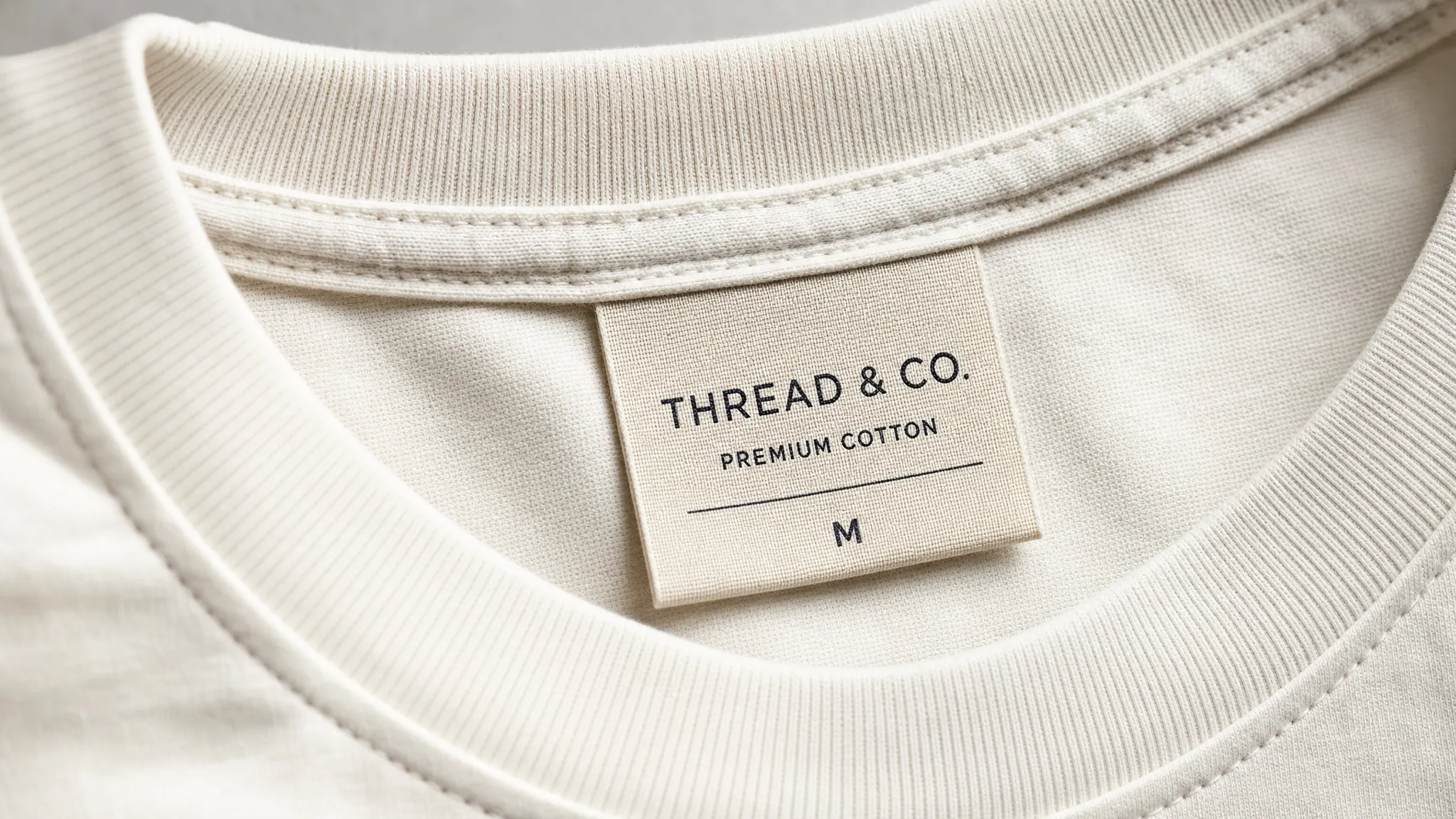
Neck labels remain a classic choice because they introduce the brand at the moment of wearing. Hem tags are popular because they create a discreet external signature. Side seam labels add a retail-ready touch without overwhelming the garment. For accessories, a woven label placed on a pocket, flap, strap, or lining can make the product feel finished.
The key is to align placement with the customer experience. If the label touches skin, softness matters. If it appears on the outside of the garment, visual balance matters. If it is used on bags, hats, or outerwear, attachment strength and scale matter.
What buyers subconsciously notice
Most customers will not say: this label has great weave density. They will say: this feels well made. The label contributes to that reaction in several quiet ways.
The first is consistency. If a brand’s website, packaging, garment quality, and label all feel aligned, the customer experiences the product as more trustworthy. A cheap-looking label on an otherwise beautiful garment creates friction.
The second is confidence. Woven labels tend to feel less like an afterthought. They suggest the brand invested in a permanent identity.
The third is memory. A customer might forget the exact cut of a T-shirt, but they may remember the label they saw each time they wore it. That repeated exposure turns a small textile detail into a brand asset.
Common mistakes that make woven labels look less premium
The most common label mistakes are not production problems. They are design and planning problems. A premium result starts before the label is woven.
| Mistake | Why it reduces perceived quality | Better approach |
|---|---|---|
| Too much tiny text | Small woven details can become hard to read | Use a larger label or simplify the wording |
| Low contrast colors | The logo blends into the background | Choose thread colors with clear separation |
| Poor placement | The label distracts or feels uncomfortable | Match placement to garment use and customer comfort |
| Oversized branding | The label competes with the product | Scale the label to feel intentional |
| Ignoring the proof | Small issues become permanent in production | Review size, spelling, folds, and colors carefully |
A premium label should feel like it belongs. It should enhance the product, not fight with it.
When woven fabric labels are the right choice
Woven labels are especially strong for brands that want a durable, polished, and tactile identity. They work well for apparel collections, handmade goods, uniforms, denim, outerwear, accessories, childrenswear, home textiles, bags, and limited-edition merchandise.
They are also valuable when your brand depends on repeat recognition. A customer may remove packaging, recycle a hang tag, or forget a social post, but the sewn-in label stays with the product.
That said, woven labels are not ideal for every detail. If you need long washing instructions, fiber content, compliance text, or very small typography, a printed care label may be more practical. The most professional solution is often a combination: woven for brand presence, printed for information.
How to make your woven labels look more premium
The difference between a standard label and a premium-looking label usually comes down to clarity, proportion, and finish. Start by deciding what the label needs to do. Is it the main brand identifier? A subtle signature? A size marker? A decorative detail?
Once the role is clear, design with that role in mind. A main neck label can carry your brand name and perhaps a small location or tagline. A hem tag might need only a symbol or monogram. A bag label can be larger and bolder because it is part of the exterior design.
Think about the garment, too. Minimal apparel often benefits from quiet, refined labels. Streetwear can handle stronger contrast and larger visible tags. Heritage goods may feel best with warm neutrals, classic borders, or heavier textures. Children’s products need comfort and softness as much as style.
Finally, treat the proofing stage as part of the design process. Check whether your letters have enough space, whether the logo holds up at the chosen size, and whether the fold style suits the application.
Frequently Asked Questions
Are woven fabric labels better than printed labels? Woven fabric labels are often better for premium brand presentation because they have texture, depth, and a more permanent feel. Printed labels are still useful for care instructions, small text, and detailed information.
Do woven labels work for small clothing brands? Yes. Small brands can use woven labels to make products look more professional and retail-ready. A clean, well-sized label can help even a limited collection feel cohesive.
What kind of logo works best on a woven label? Simple logos with clear shapes, readable lettering, and strong contrast usually weave best. Very thin lines, gradients, and tiny text may need to be adjusted for the best result.
Can woven labels be comfortable against the skin? They can be, especially when the material, fold, size, and placement are chosen carefully. For neck labels or childrenswear, comfort should be considered from the beginning.
Where should I place a woven label? Common placements include the neckline, waistband, hem, side seam, sleeve, pocket, bag exterior, and lining. The best placement depends on whether you want the label to be visible, discreet, decorative, or purely informational.
Create a label that matches the quality of your product
Woven fabric labels look more premium because they make the brand feel built into the product. They add texture, permanence, and polish at a point where customers naturally notice quality.
If you are ready to add that finishing touch, you can create custom woven labels with HiLabels by uploading your artwork and choosing the details that fit your product. With over 31 years of experience, European loom quality, and a user-friendly online ordering process, HiLabels helps brands turn a small label into a stronger brand impression.


